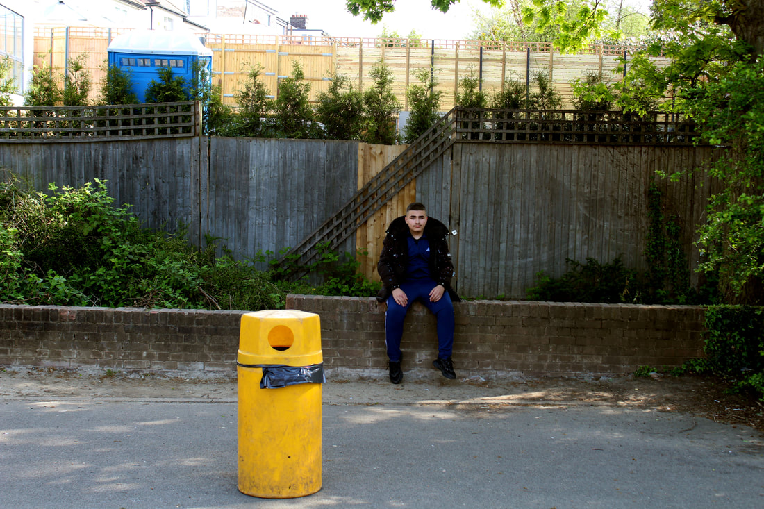
Ordinary to extra ordinary
Edward Weston
Edward Weston (1886-1958) was a 20th century photographer who has been called one of the most innovative and influential of all American photographers and a master of photography. His career spanned 40 years and he photographed an expansive set of subjects, including landscapes, still-life, nudes, portraits, and genre scenes.
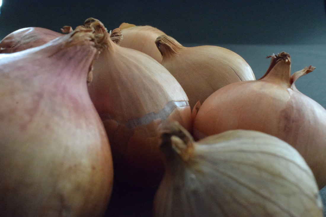
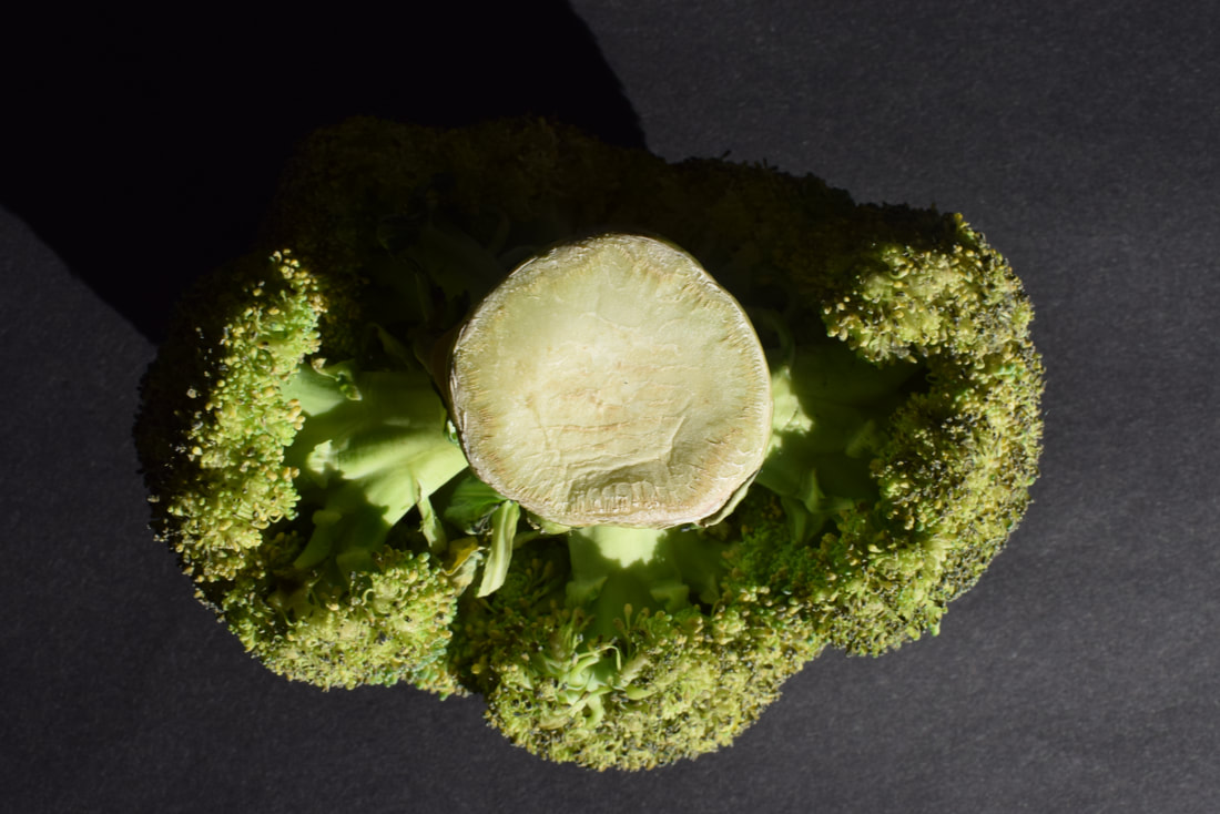
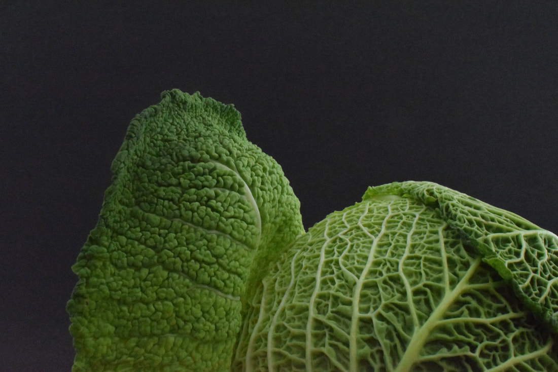
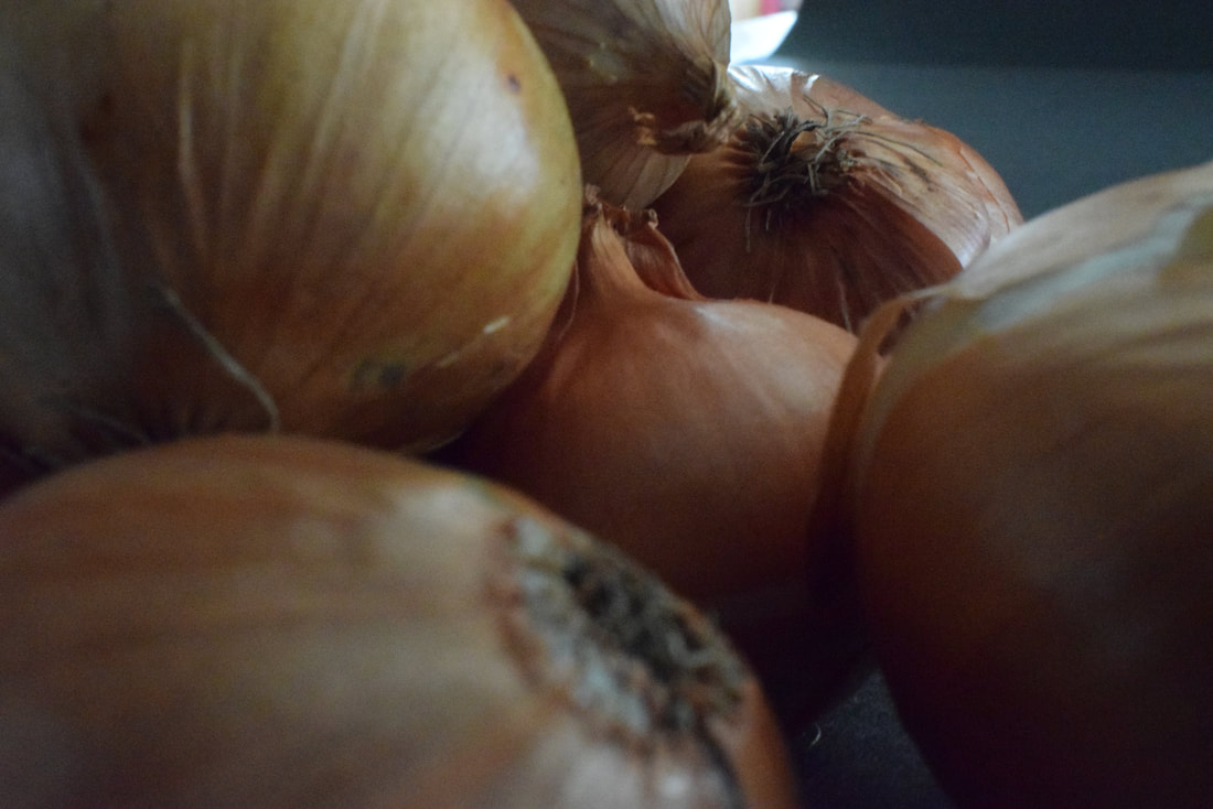
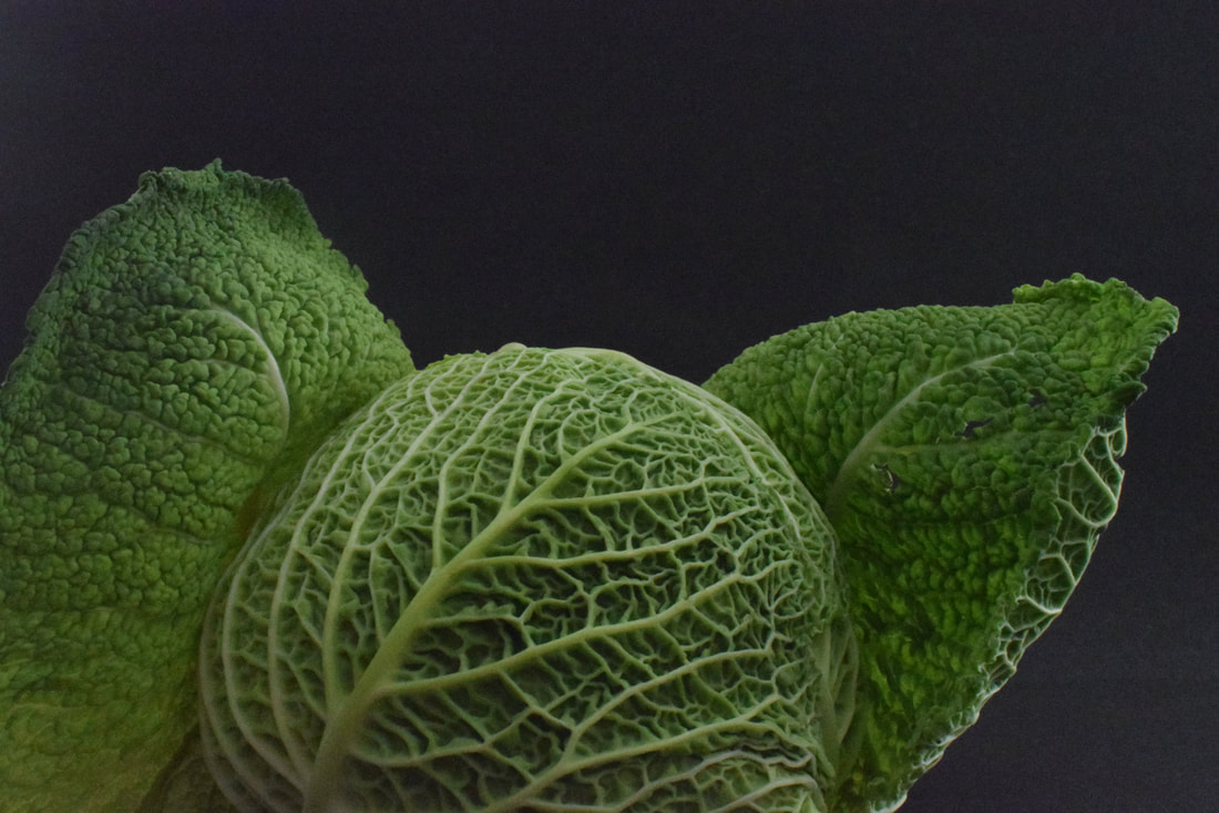
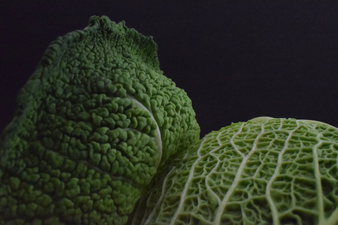
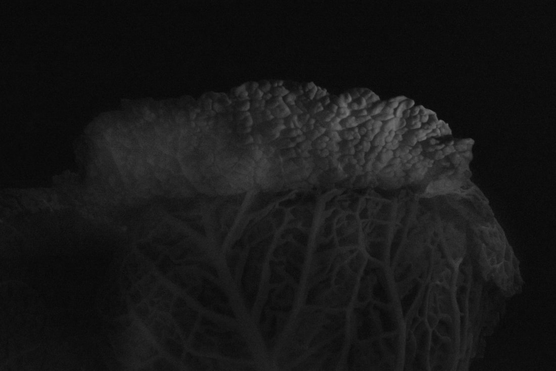
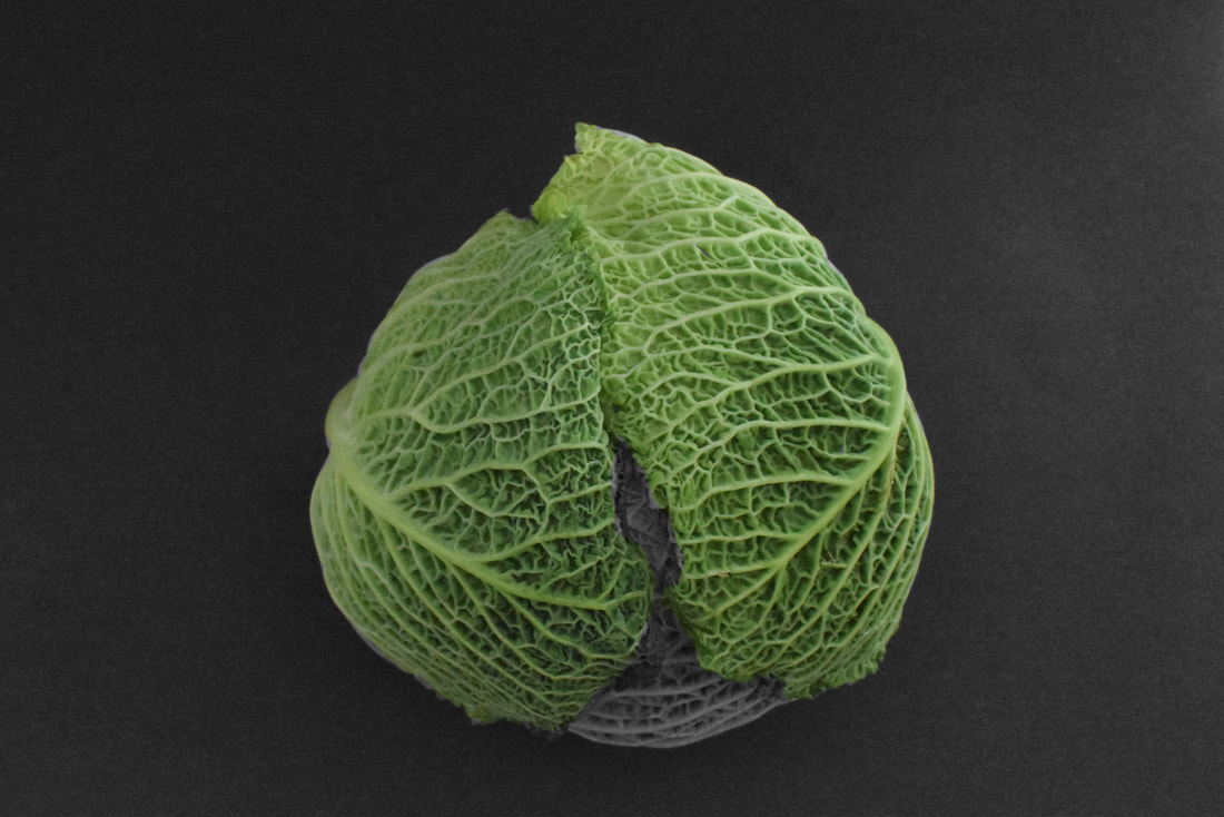
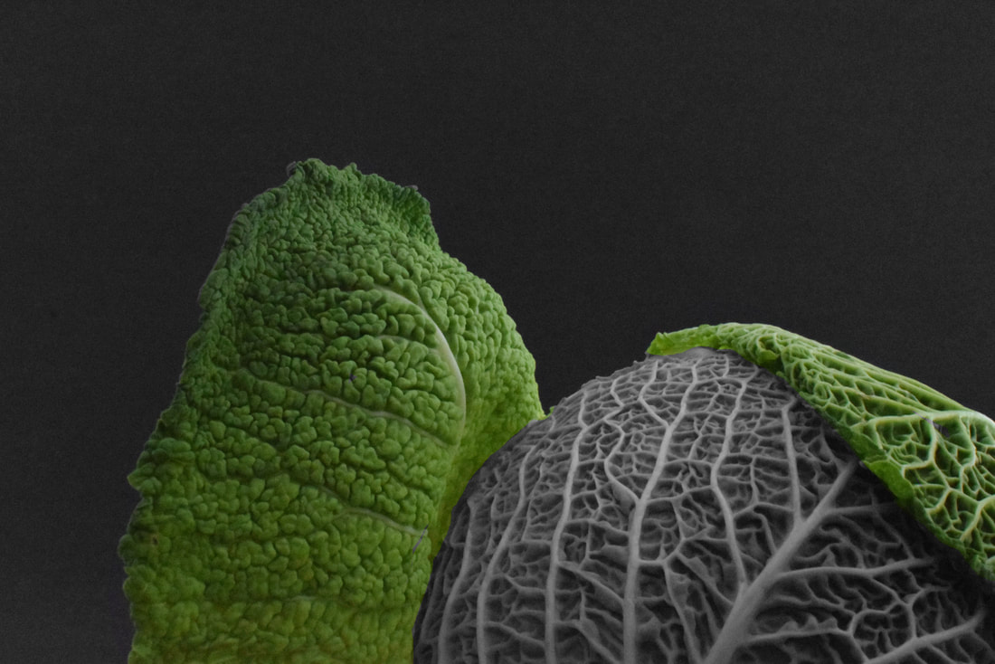
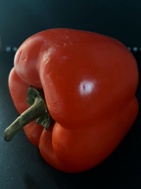
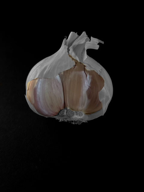
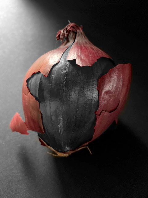
Some of Edward Weston’s most famous work was close-up images of vegetables and fruit, photographed in a way that captured the “essence” of the object, taking them out of context. His manipulation of light to highlight shape, texture and form helped bring photography out of the shadow of painting and stand on its own as a credible art form. Through these photographs he transformed his subjects into abstractions of shapes and patterns.
Some of Edward Weston’s most famous work was close-up images of vegetables and fruit, photographed in a way that captured the “essence” of the object, taking them out of context. His manipulation of light to highlight shape, texture and form helped bring photography out of the shadow of painting and stand on its own as a credible art form. Through these photographs he transformed his subjects into abstractions of shapes and patterns.
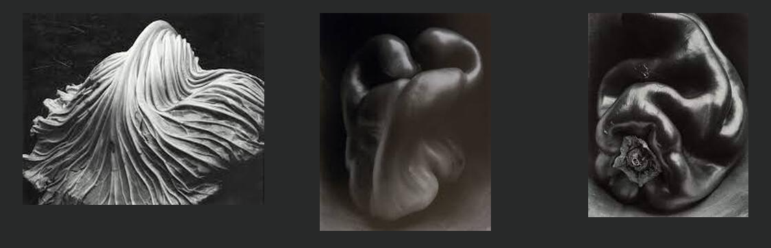
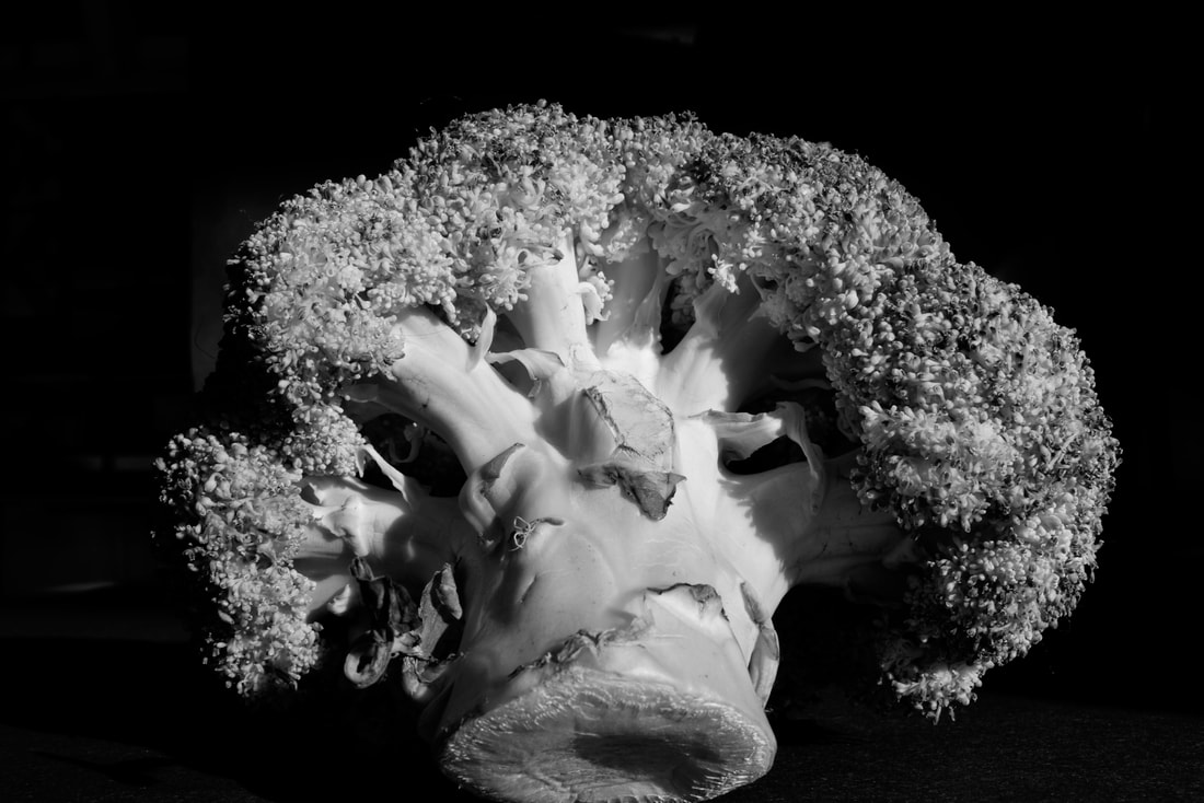
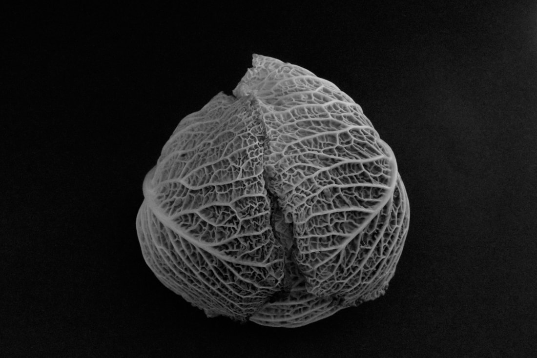
With black card I put different vegetables in direct sunlight and took some pictures with a medium ISO of 400. Furthermore With different angles it was fun to play around and find cool ways to express the vegetables Wrinkles, warps and weird bruises. After I selected a couple to turn into black and white on Photoshop to accentuate the contours on the vegetables.
|
|
|
|
|
|
|
|
|
|
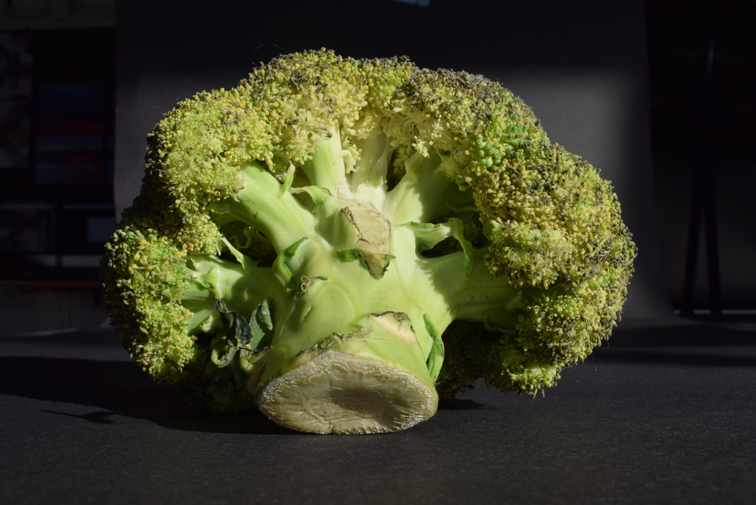
WWW: I managed to capture what Edward Westons essence to get some nice clean shots.
EBI: It would have been nice to direct the light to have more interesting shadows.
Second Response
|
|
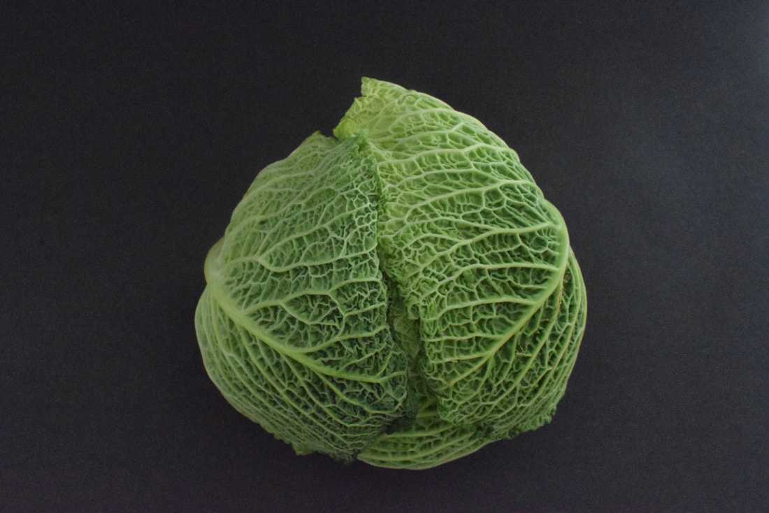
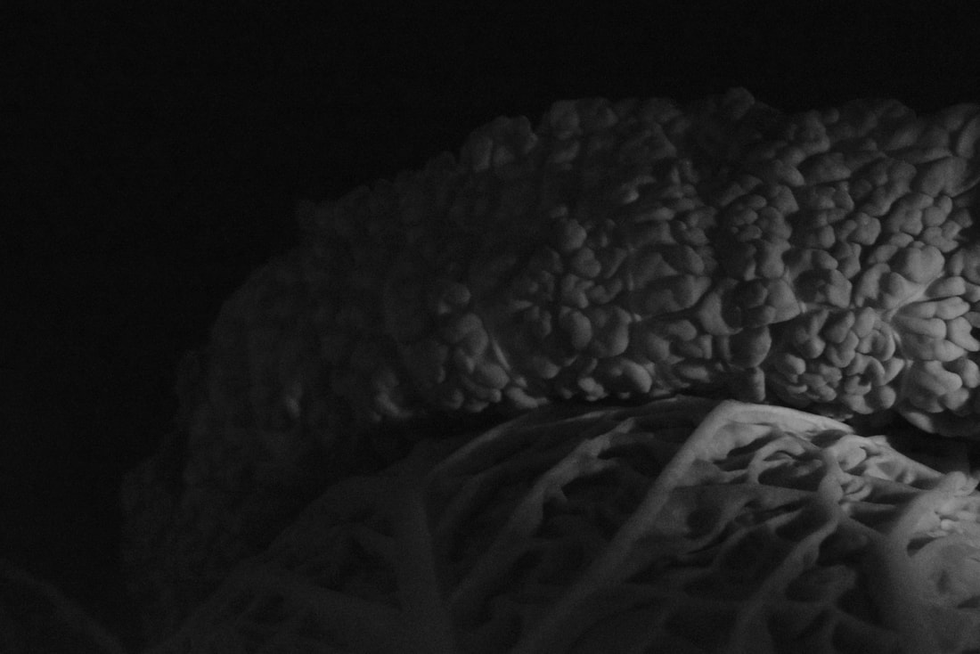
So this time on my second attempt to recreate Edward Weston's style I used directional light to add to the effect and made it black and white to create a more darker tone.
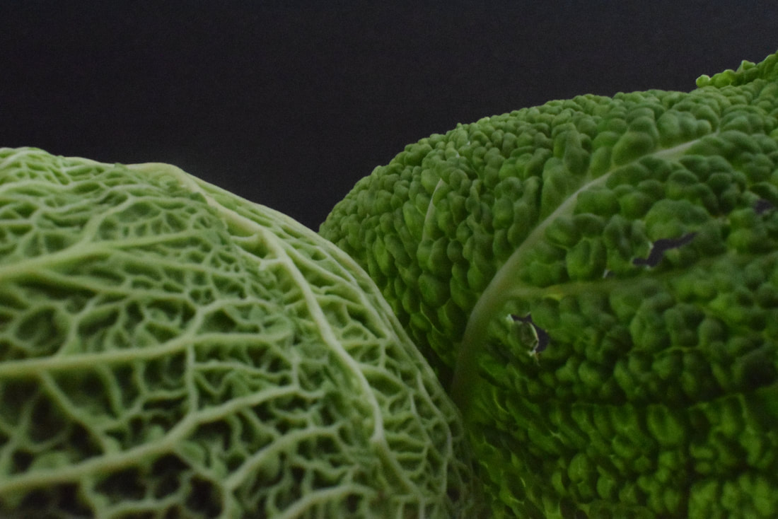
I did a couple more at home
Best of the photoshop edited
Here were some of the best
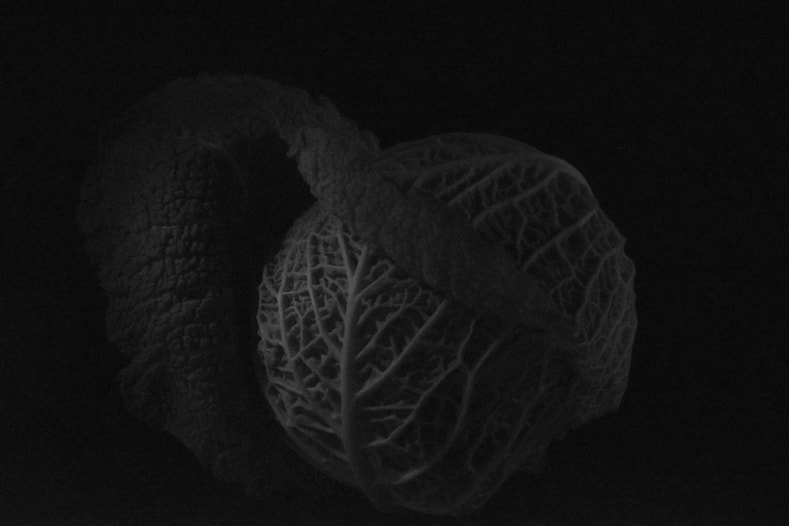
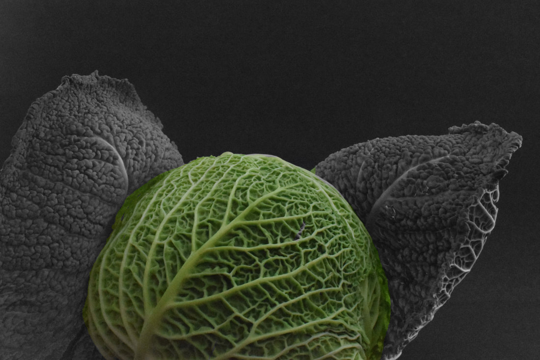
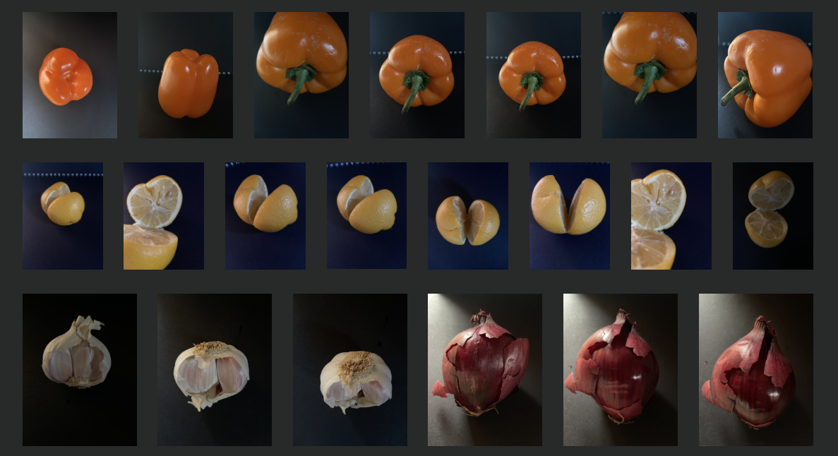
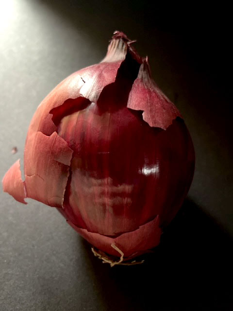
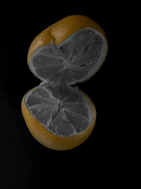
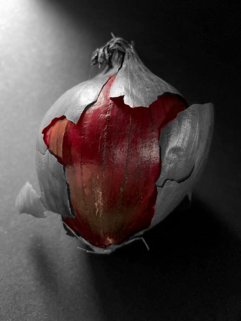
Once I got some of my favourites I went into photoshop and made them look cooler by making some it the vegetable black and white and some bits colour, which I think makes the veggies pop more and accentuates their colour. In addition, I also made a gif comparing different parts of a vegetable highlights to show a comparison.
|
|

|
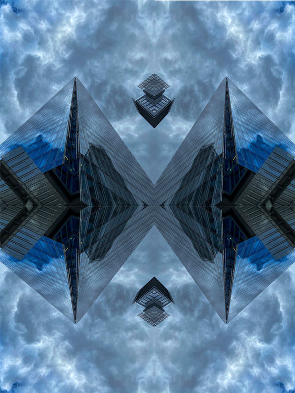
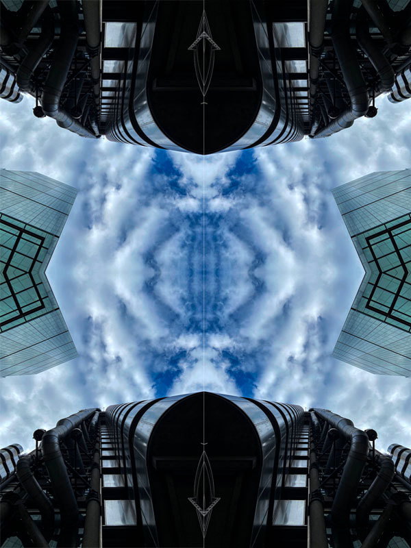
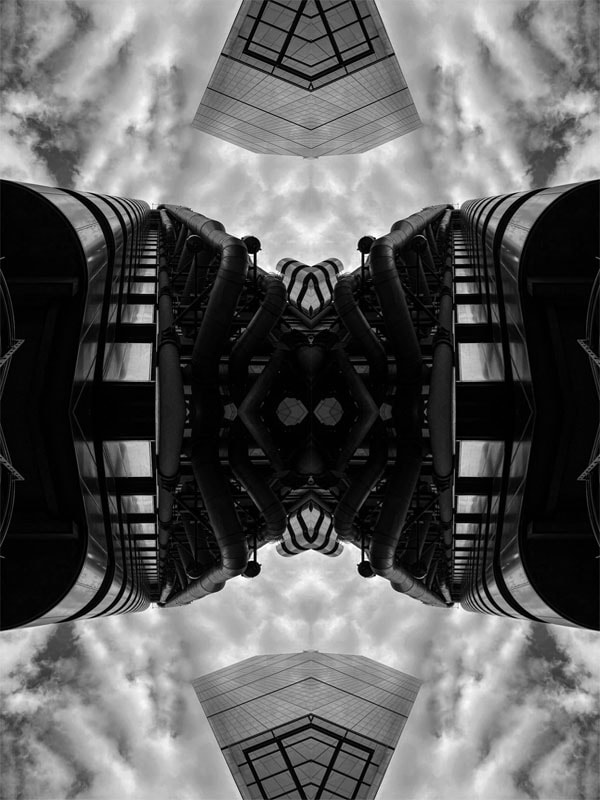
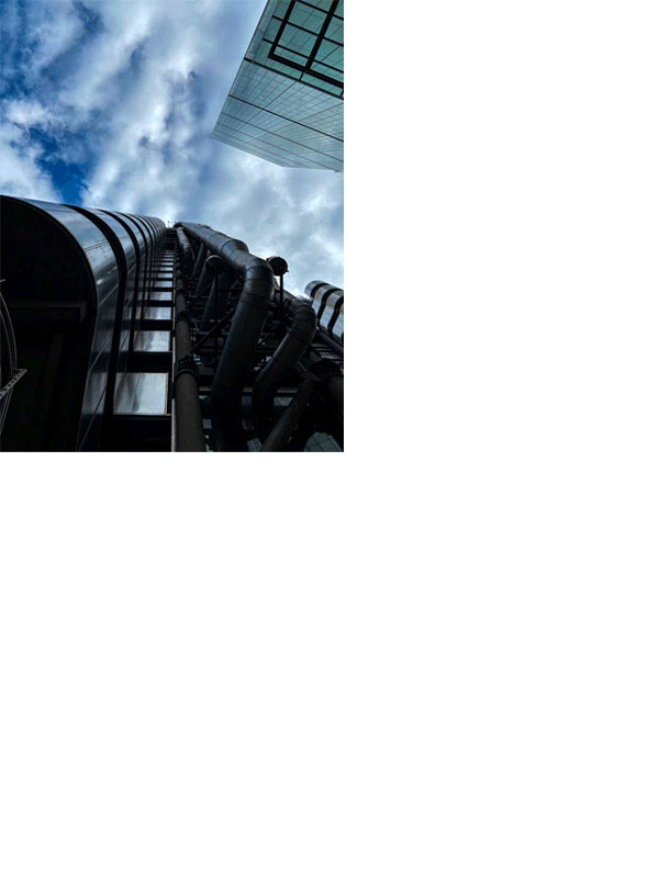
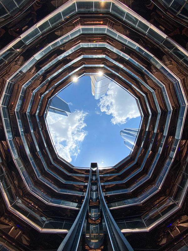
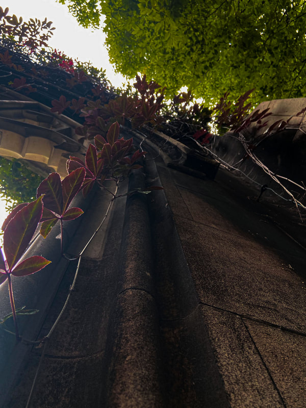
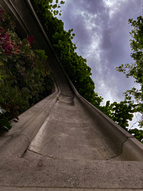
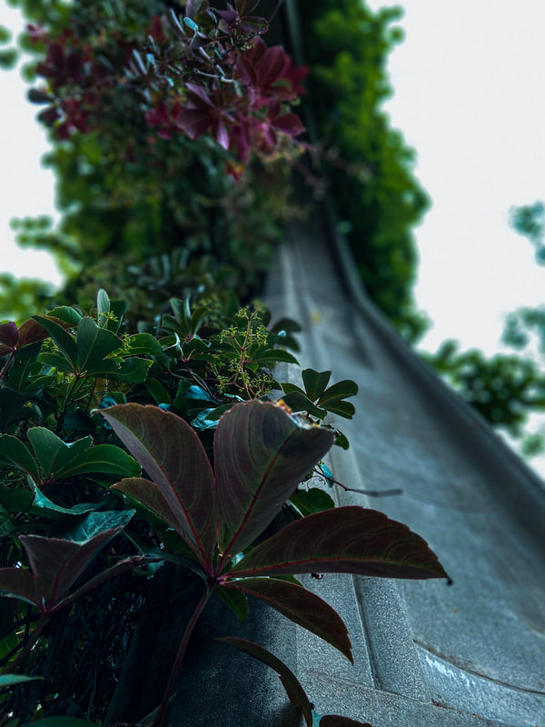
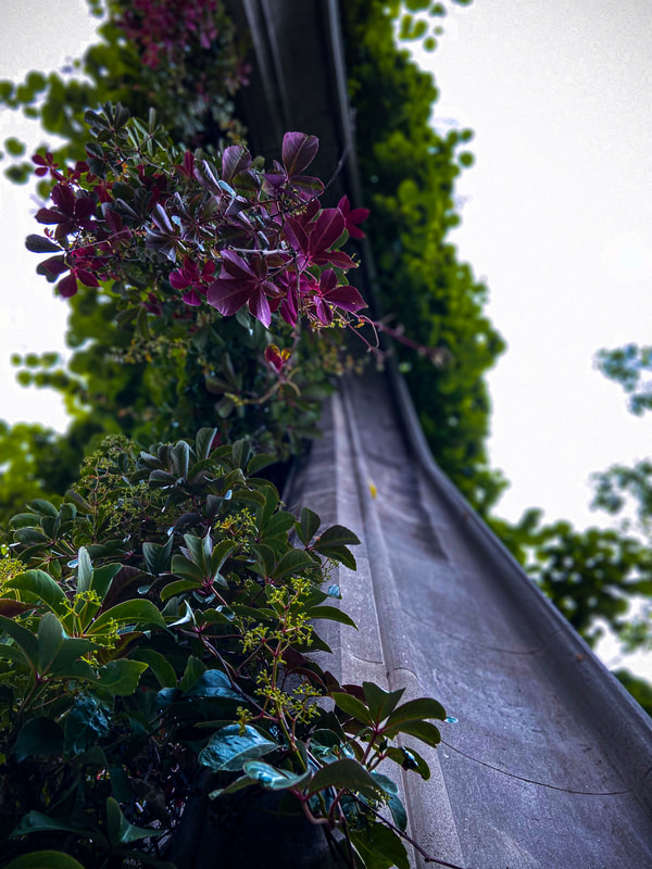
Looking Up
Andy Yeung
Andy Yeung is a photographer based in Hong Kong who focuses on landscape, architecture and aerial photography. Born and raised in Hong Kong, Yeung culls inspiration from the familiar, everyday aspects of the city.

|

|

|

|
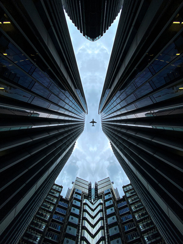
On the photo above I took a picture at worms eye view. Then I put it into photoshop and cut it in half and flipped horizontally to create a mirrored look. Once I did that I went onto google and found a silhouette of a plane and added it as a layer to darken it on its own to create the effect that it is further away than it actually is.
|
|
|
|
|
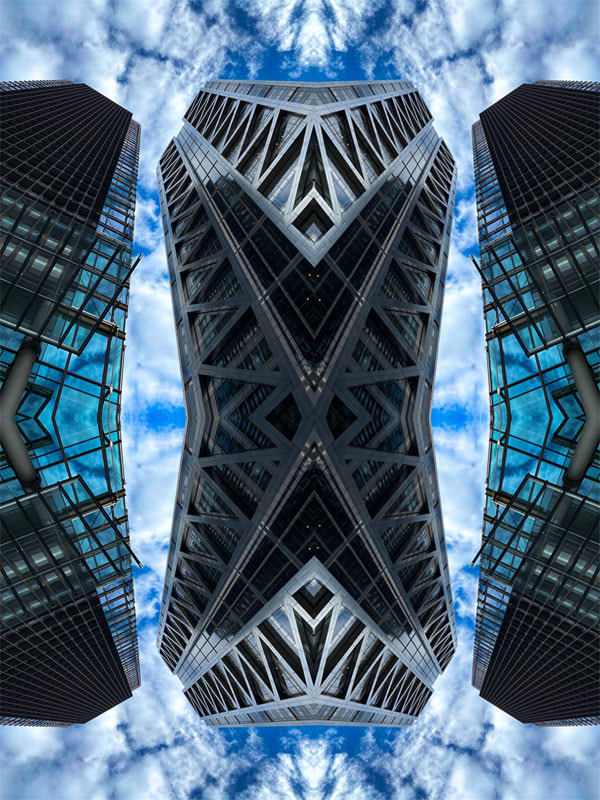
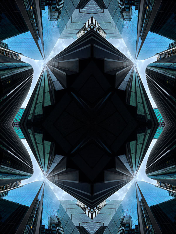
With the reflections I decided to use similar photos of those of tall buildings from worms eye view, which turned out well. More over on one of the reflection pieces I decided to have the sky on the inside and by doing that I put the initial image on the right and then flipped it horizontally. Furthermore, when doing it in black and white I had to fully desaturate it to create the black and white look.

|

|
|
WWW: I managed to successfully complete the task on photoshop and went further with making one of the images black and white. Moreover I made a gif of the reflections and added screen shots of how to do the reflection work on Photoshop.
EBI: If I had managed to on one of Gifs to have a white background like the other.
EBI: If I had managed to on one of Gifs to have a white background like the other.
Composition

|
|

|

|
|
|

|
|

|
|

Framing the Environment
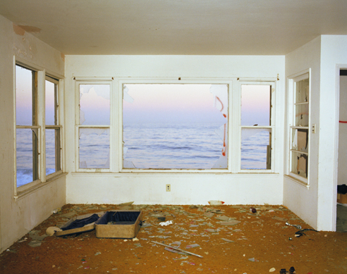
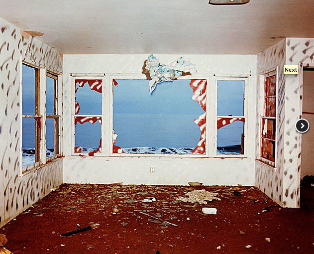
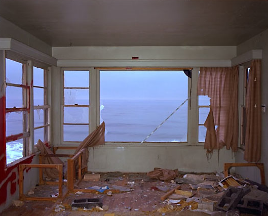
John Divola
|
|
|
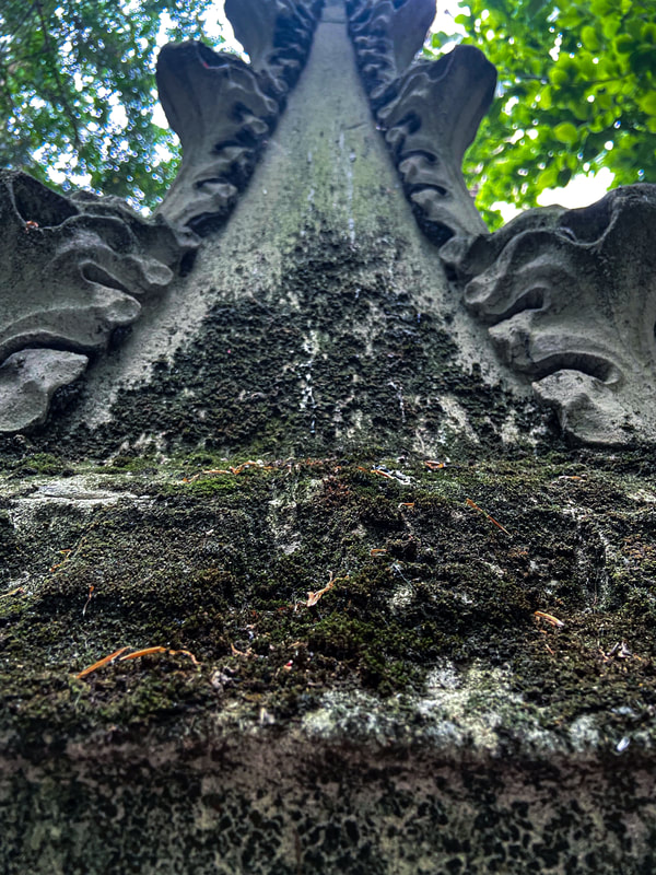
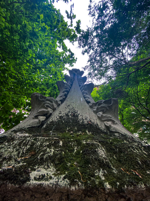
In the 1970s, Los Angeles photographer John Divola began photographing in abandoned, often dilapidated houses. With his series Vandalism (1973–75) and Zuma (1977–78), however, he didn’t just photograph houses. Here, Divola describes how he manipulated the environments with painting and other interventions as a way of “vandalizing the tradition of photography.”


|
|

|
|

|
|

|
|
|
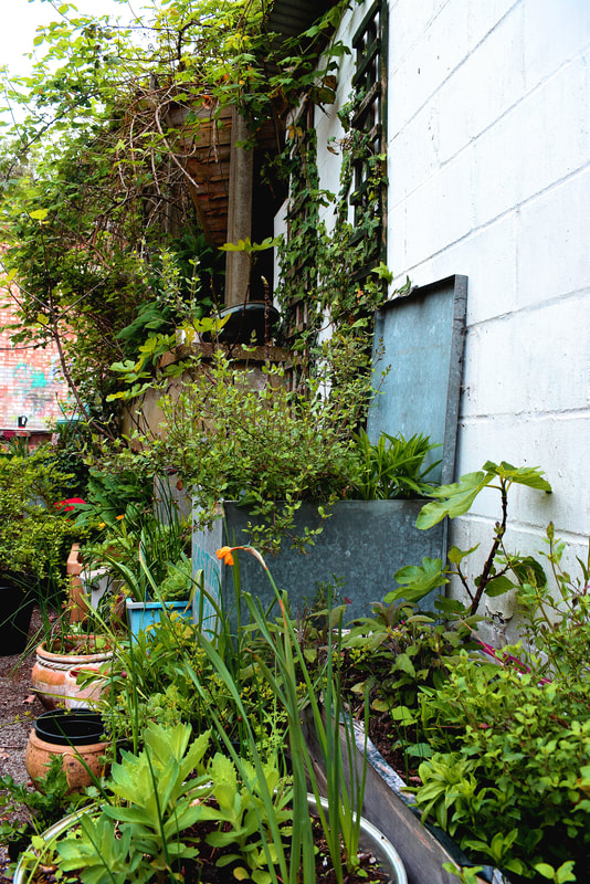
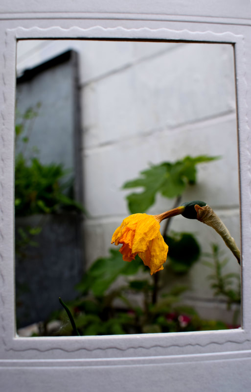
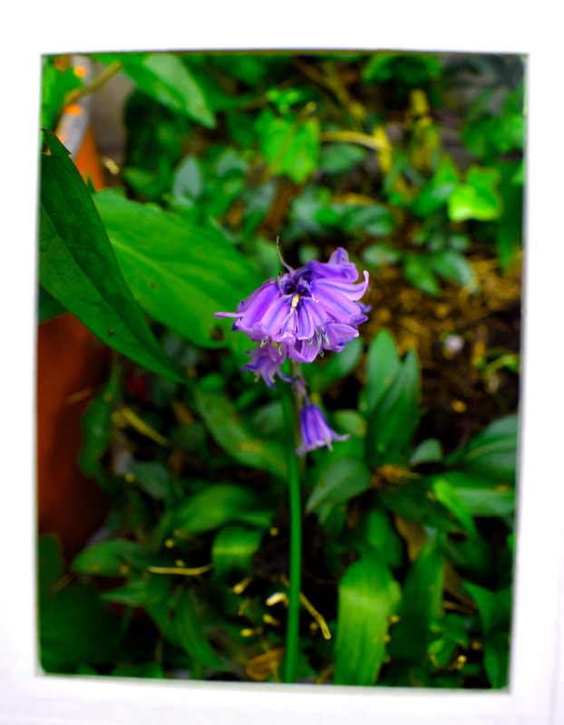
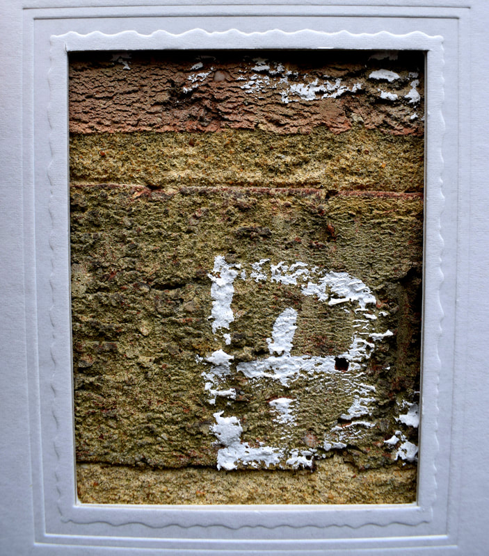
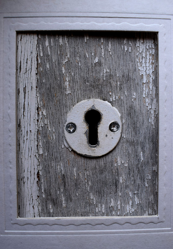
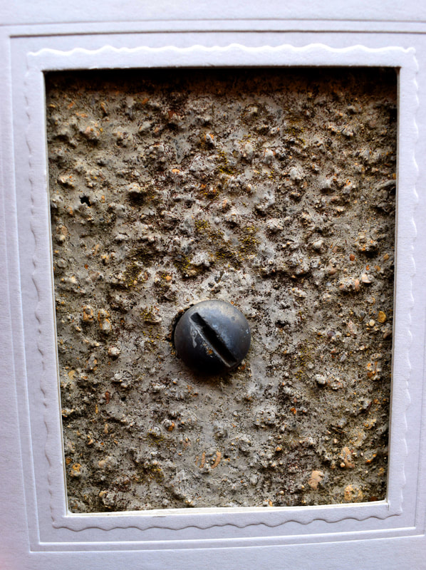
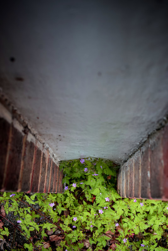
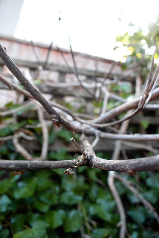
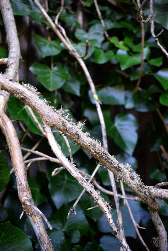
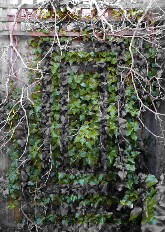
First I grabbed myself a card board frame. Then I went outside and took a photo of an outward look and then placed the frame in front of the lens and I then took a picture of a specific detail in the photograph. The ones above are the 5 best pairs that I picked out and further photoshopped.
|
WWW: I managed to capture and reflect the work of John Divola and captured some nice close ups.
EBI: I could have positioned the frame a bit more straight |
Mixing the 2 images into 1
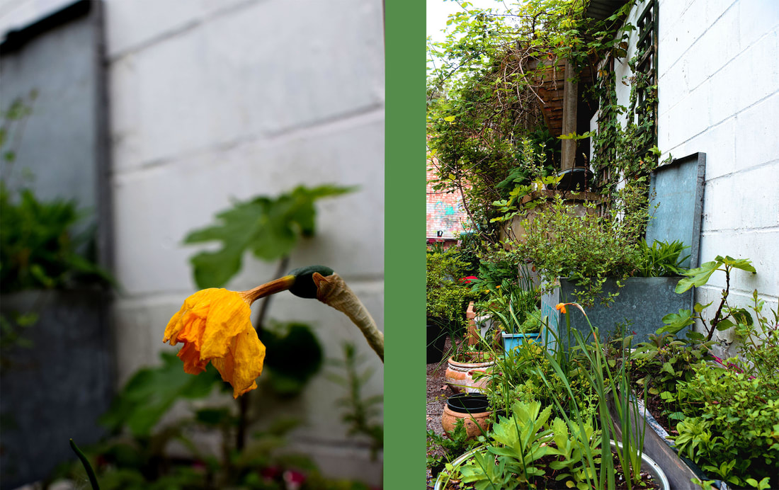
On the first image I put both images next to each other. Then I grabbed a sample of colour from one of the images and created a strip down the middle of the image to create a sense of joining between the two images. On the second image I did the same steps but after I had finished I created a border of no saturation to create a frame for the two images. Moreover, it makes the colours stand out more in the image than before in the previous image.
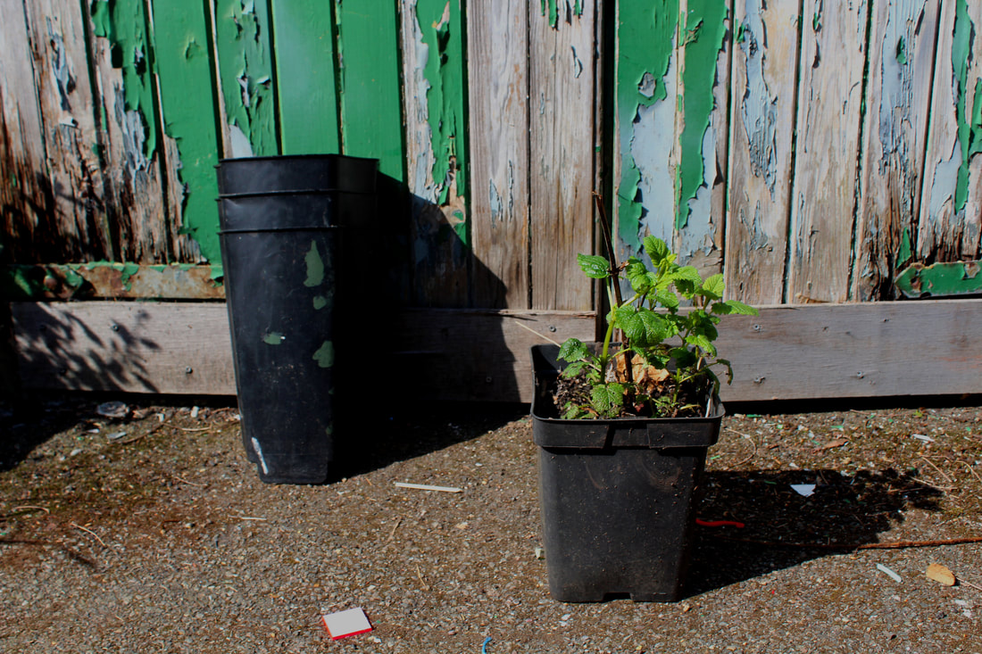
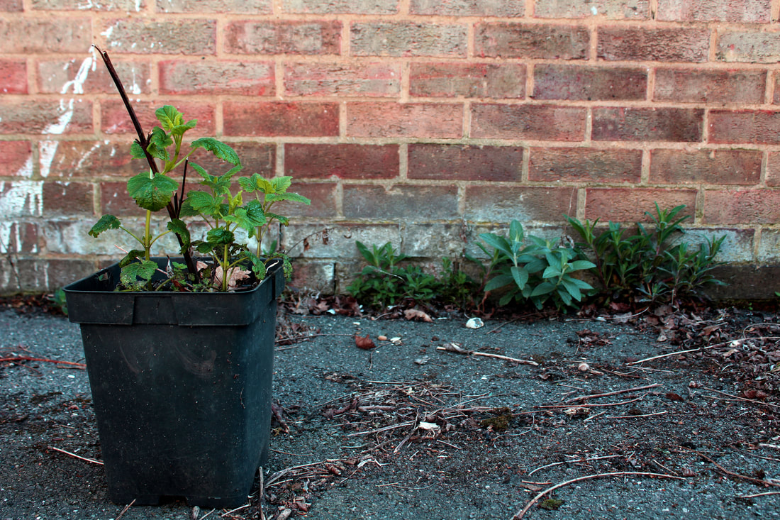
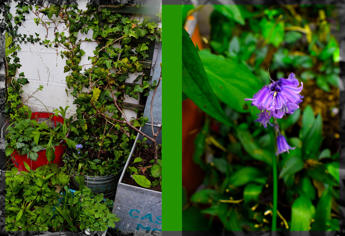
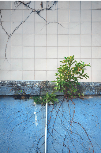
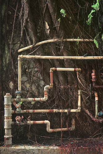
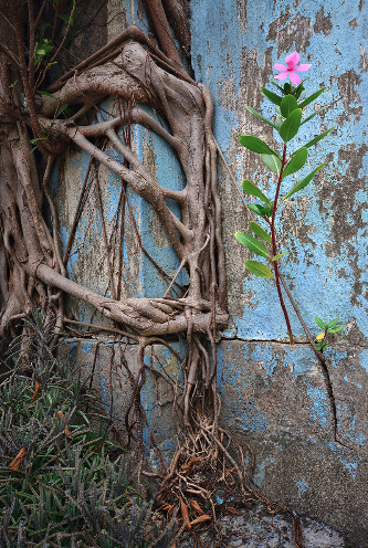
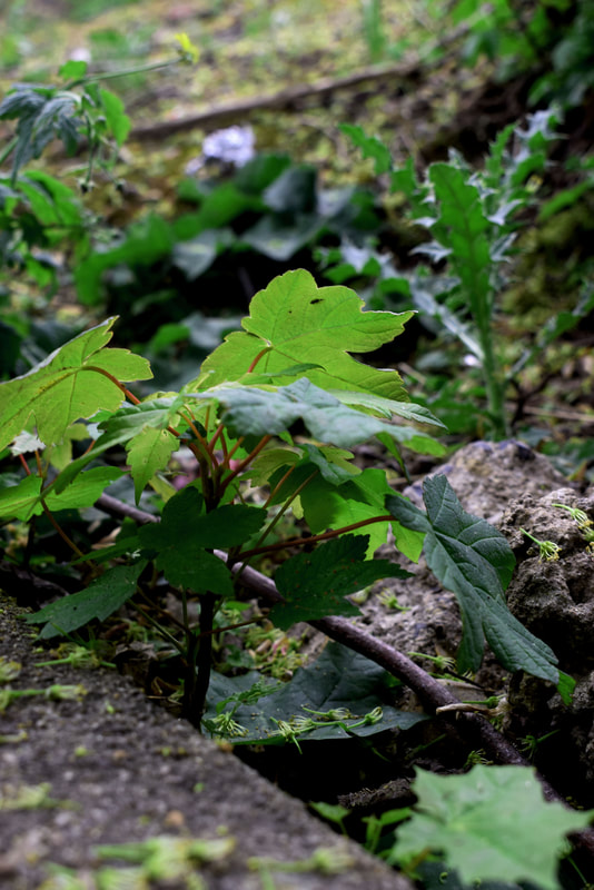
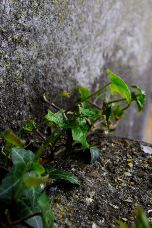
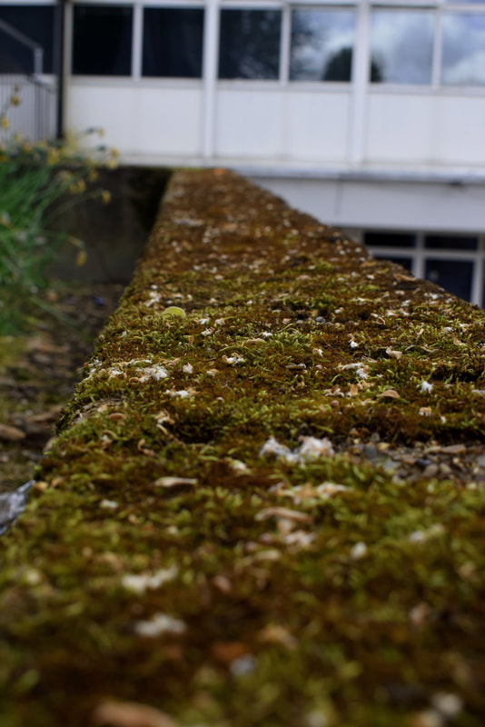
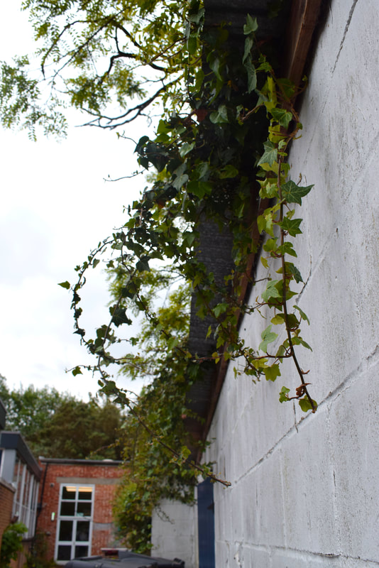
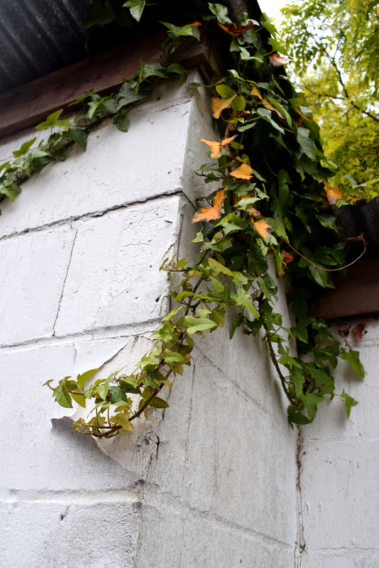
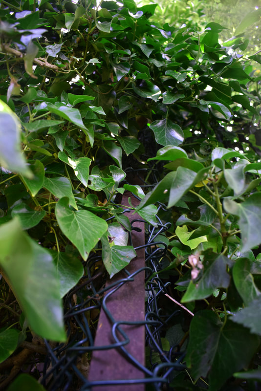
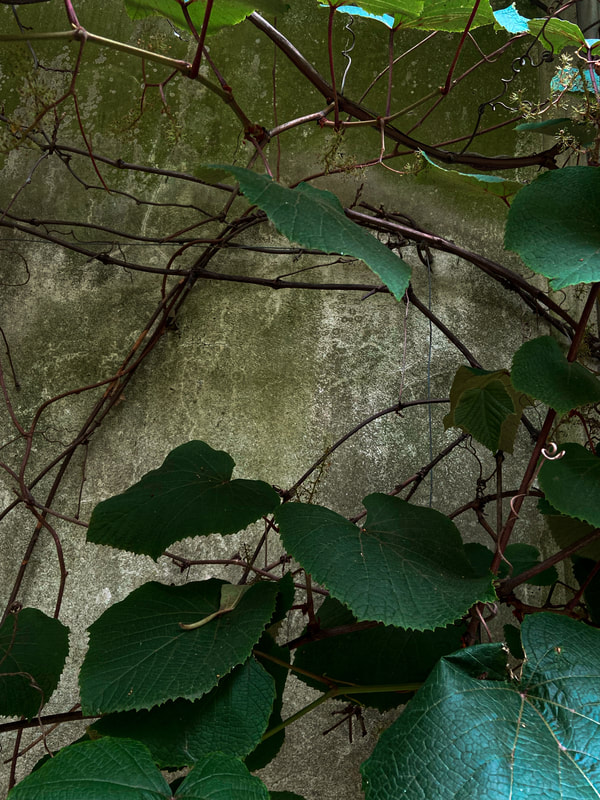
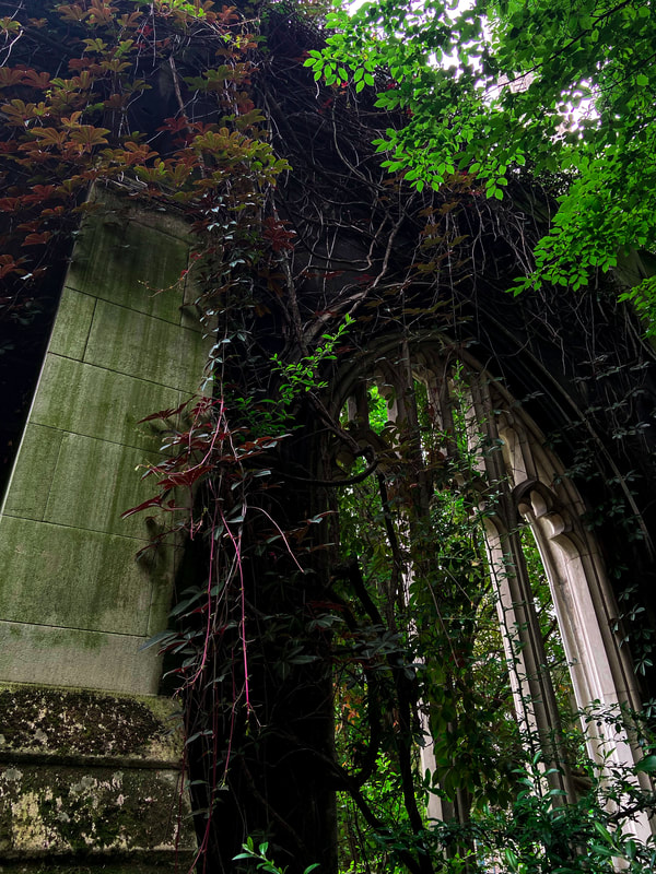
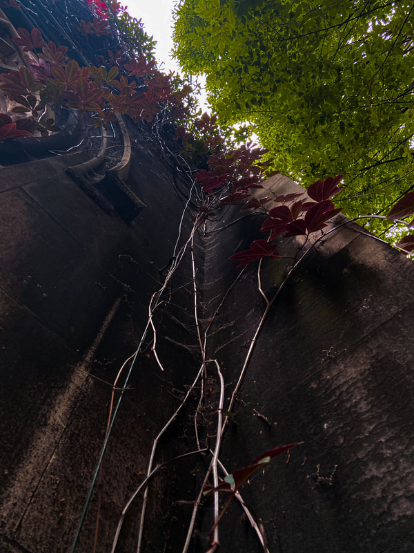
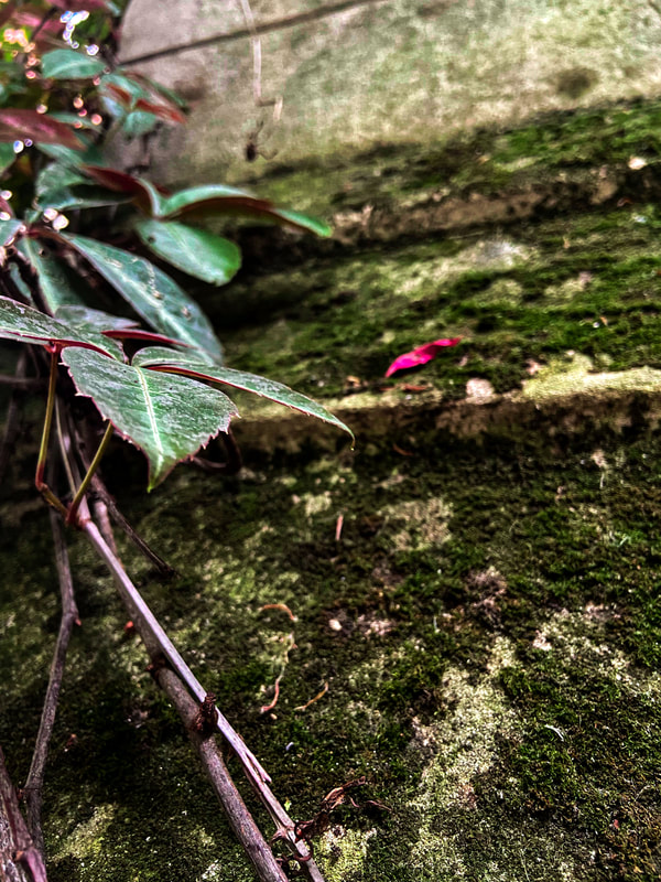
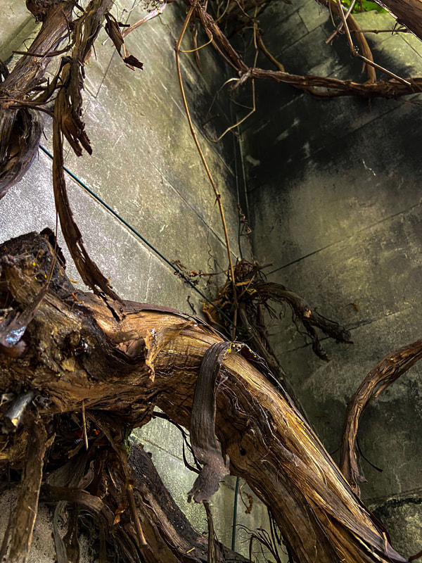
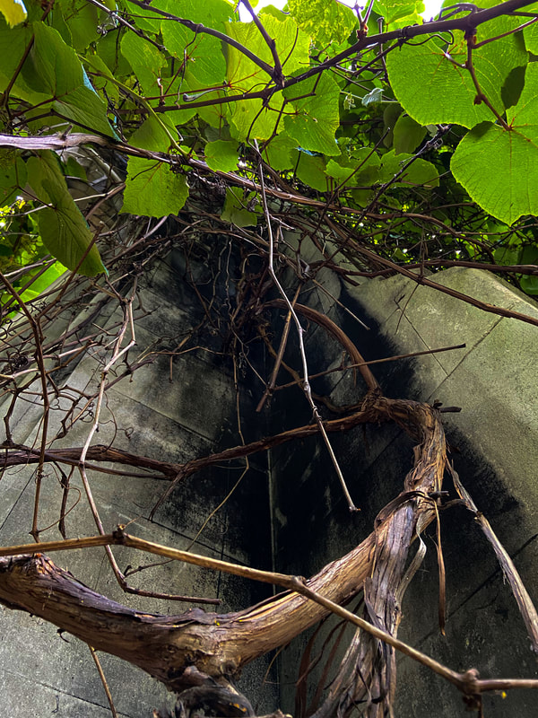
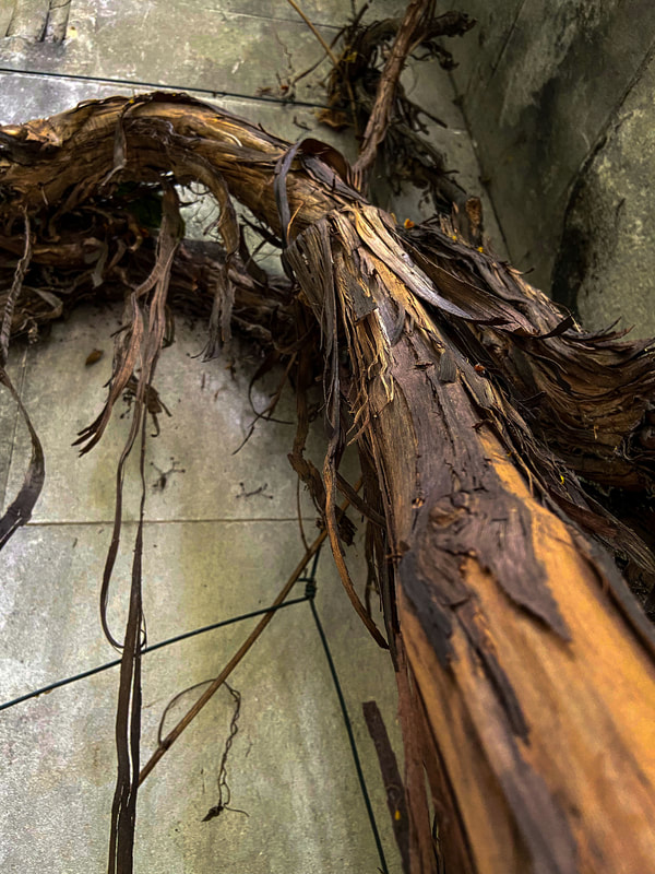
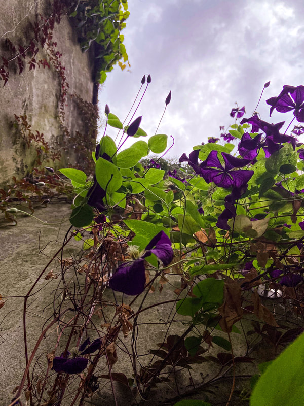
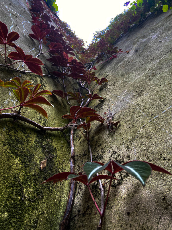
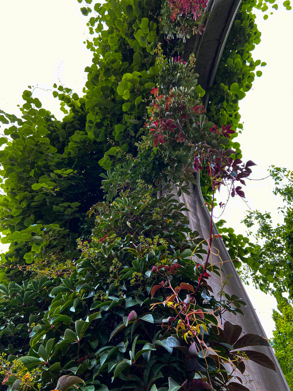
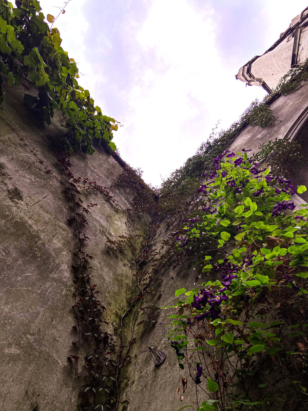
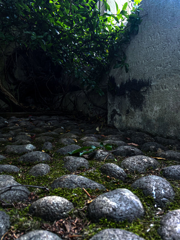
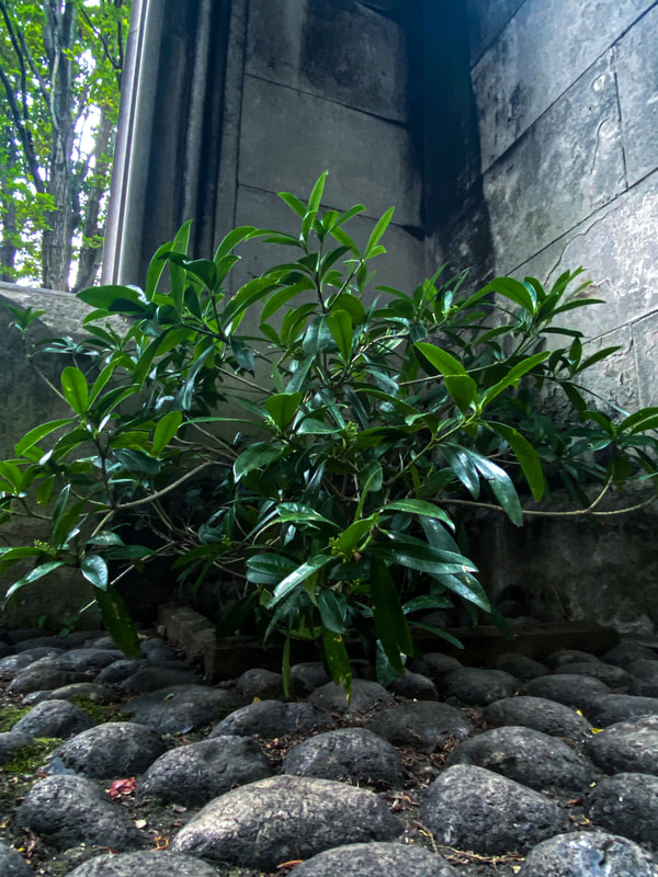
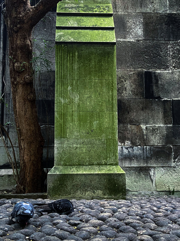
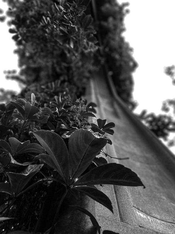
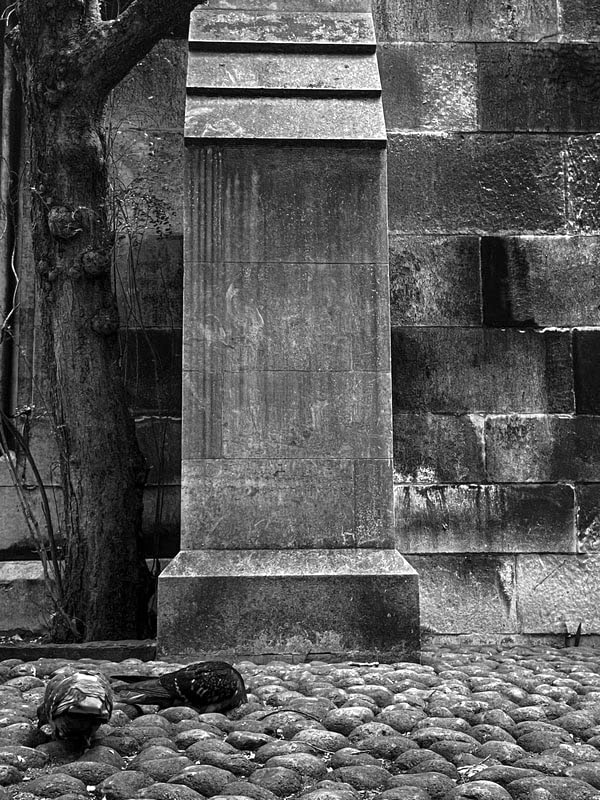
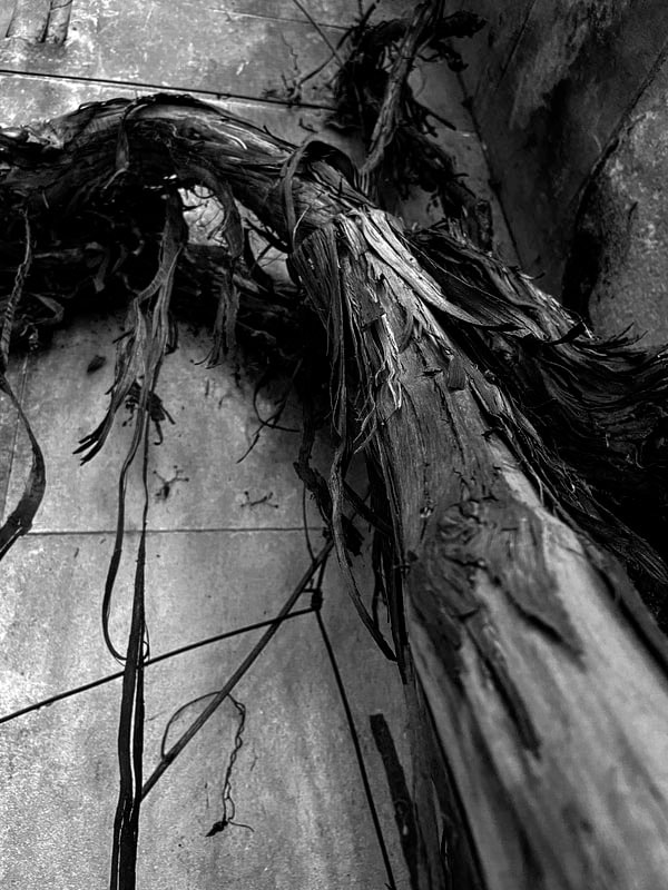
Wild Concrete
Romain Jacquet-Lagrèze
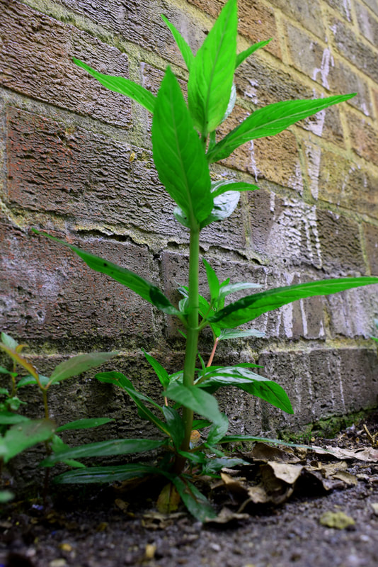
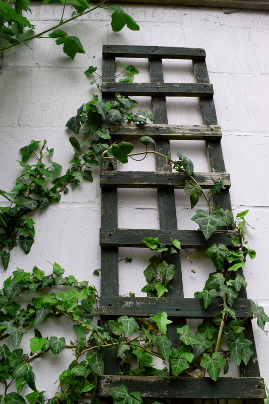
Focusing solely on the phenomena of trees sprouting from residential buildings in Hong Kong, Wild Concrete compares the living conditions between plants and humans. Such peculiar sight of ‘wild concrete’ is by no means exclusive. They can be found everywhere in the heart of the city: roots spiralling down the external pipes of a Mong Kok loft; shoots lurking behind a window frame of an apartment in Central hills; or branches spreading across a residence in Sham Shui Po, collapsing it from the inside out.
|
|
|
First Response


|
|
|
|
|
|
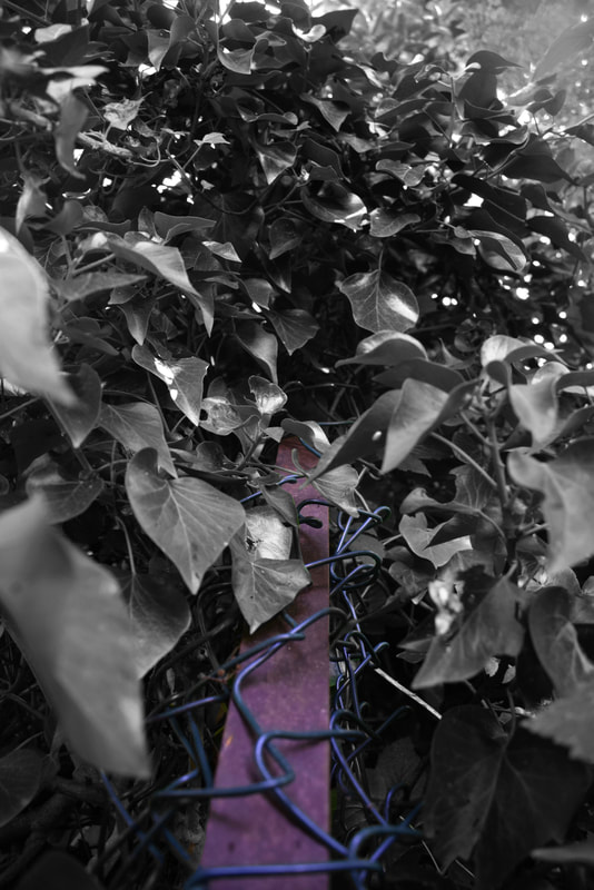
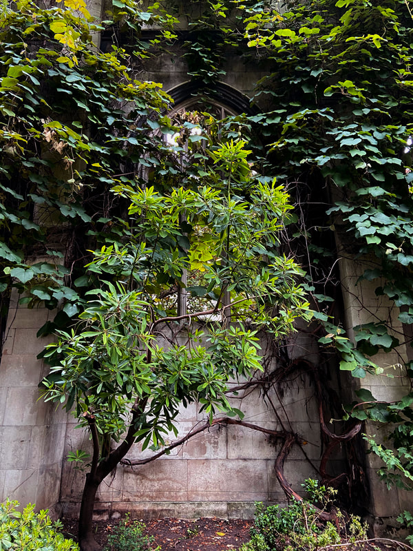
On my first attempt I tried to set up some good composition of layers. On some of the pictures like the one on the bottom left I changed the depth of field down to a low F stop to have a focused foreground with a blurred background. However, on the top left image I decided to go for a different approach by blurring the foreground and having the background in focus to highlight the concrete rather than the flower. On others I changed the hue to a more blue colour to make the green stand out more in contrast top either concrete or other background colours.
WWW: I managed to capture the contrast of plant to man-made buildings, like concrete. Therefore, trying to replicate Romain Jacquet-Lagreze. Also, I thought the use of a smaller F-stop significantly helped some of the photos look better.
EBI: Some of the colour in my pictures did not have enough contrast in colours.
Second response


|
|
|

|
|
|
|
|
|
|
|
|
|
|
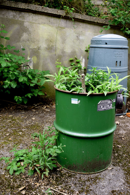
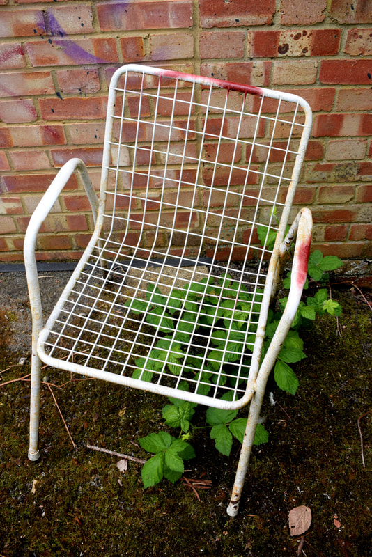
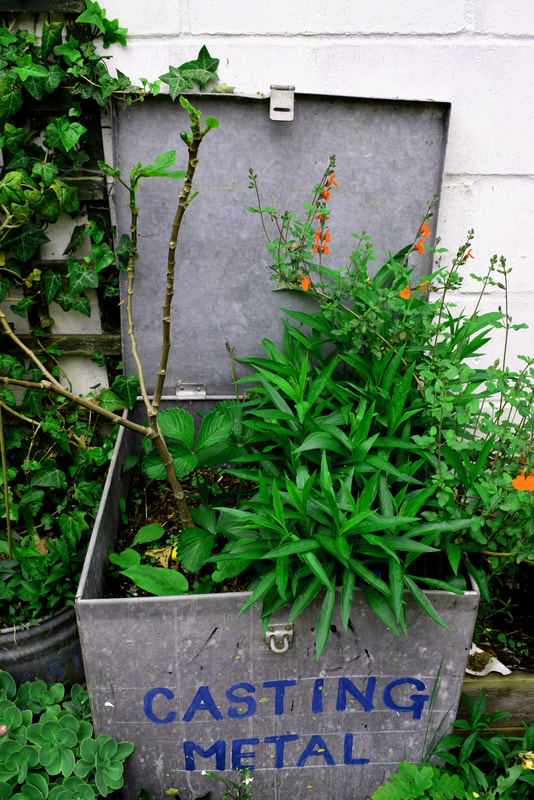
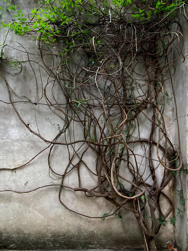
The images that are big are the ones that I decided to photoshop on my second response. With the majority of the photos I tried to accentuate the green leafs again with the slight blue hue. As for composition, the second row of images and on the right the can of over flowing leaves was placed on the right hand side of the frame to perform the rule of three rule to make the photo more appealing. Next, underneath that very photo there is a picture of a flower. I decided to take this image with a low F-stop, which is what I liked and thought went well in the previous response. Moreover, the image just below that one I thought had an interesting composition, as the top angle adds mystery to what is underneath the chair you can also see through the chair to see the leaves below which is what I was going for as it directly relates to the artist, of which photos I was trying to replicate.
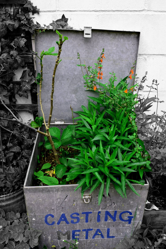
The images above I chose as the most successful. Firstly, the image on the left was successful because it shows the box open presenting the overflown flowers and plants out of it which I thought was very interesting. In addition, when photoshopping the image I put a blue hue on, to not only accentuate the green leaves but also the blue sign. Talking about the sign, the blue sign is on the opposite of orange on the colour wheel which is exactly the same colour of the flowers in the photo which makes this image so appealing and satisfying. Now, the image on the left I thought was also great because of the composition. Using triangles to lead the viewers eyes towards the leaves helped bring the photograph up another level. With the good composition and the blurred out leaf in the foreground, the viewers eyes move towards the middle of the image helping the image stand out. Additionally, the picture has a black and white border which I thought emphasised the plants comparison to the concrete background.
The images above I chose as the most successful. Firstly, the image on the left was successful because it shows the box open presenting the overflown flowers and plants out of it which I thought was very interesting. In addition, when photoshopping the image I put a blue hue on, to not only accentuate the green leaves but also the blue sign. Talking about the sign, the blue sign is on the opposite of orange on the colour wheel which is exactly the same colour of the flowers in the photo which makes this image so appealing and satisfying. Now, the image on the left I thought was also great because of the composition. Using triangles to lead the viewers eyes towards the leaves helped bring the photograph up another level. With the good composition and the blurred out leaf in the foreground, the viewers eyes move towards the middle of the image helping the image stand out. Additionally, the picture has a black and white border which I thought emphasised the plants comparison to the concrete background.
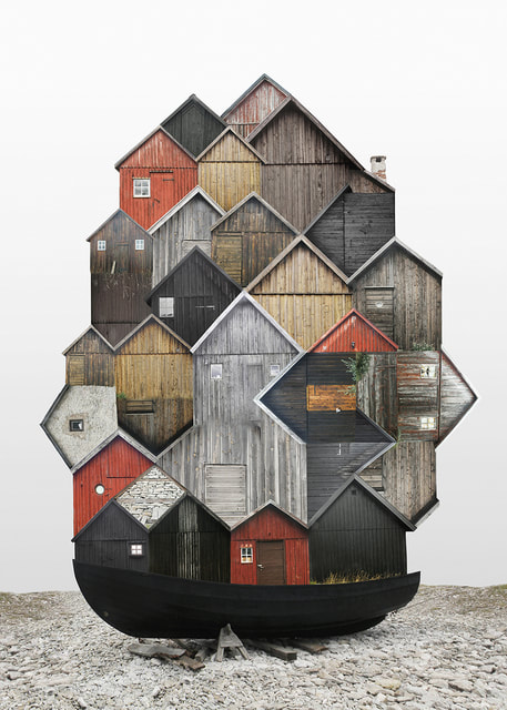
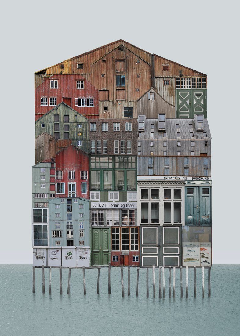
Layered Landscapes
Anastasia Savinove
Anastasia Savinova is a Russian-born artist living in Sweden. A background in architectural studies led her to create these large scale photo collages. Each collage is comprised of multiple layers of photoshop shot in various European capital cities.
|

|
|
My Attempt
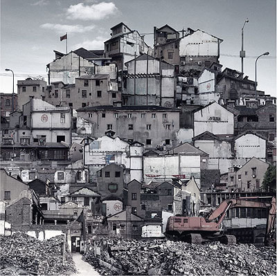
Sun Ji
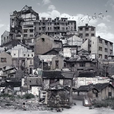
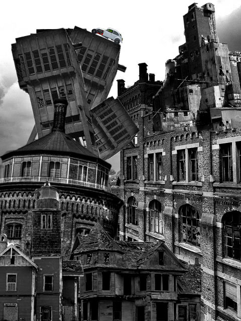
The work in Sun Ji's "memory city" are architectural collages that speak of urban transformations as destruction and displacement of the old must make way for the new. The artist began in 2005 where he photographed separate pictures of houses and rubble. He recreated impressions from his childhood.
|

|
|
My Attempt

|

|
Environmental Development
Wild Concrete
Romain Jacquet-Lagrèze - Development
First Response


WWW: After my first shoot and taking many photos I was happy with my first response and thought I managed to capture some good photos. Also with taking some of the photos I thought the composition was good using the rule of three and triangles and other composition methods to take an excellent photo. Furthermore, on the edited photos above like the colour and non-colour photo I thought that emphasised the hidden man made structure enveloped by the over grown greenery. Moreover, the photo above on the left with the colour and non-colour rings going in toward the centre was a new and creative idea of mine and thought it turned out well, although the rings seem to clash with the desaturated section which was not what I as going for.
EBI: With taking the original photos some of them seemed to bright which made them have a white tint or flair to them.
EBI: With taking the original photos some of them seemed to bright which made them have a white tint or flair to them.
|

|
|
|

|
|
|
|

|
WWW: I think that my photoshop edits were unique and interesting forming different concepts and ideas that were different and still rather similar to the artists form and ideology of the work.
EBI: I think my composition could have improved on the angles and the way I generally decided to take the photo.
EBI: I think my composition could have improved on the angles and the way I generally decided to take the photo.
Second response
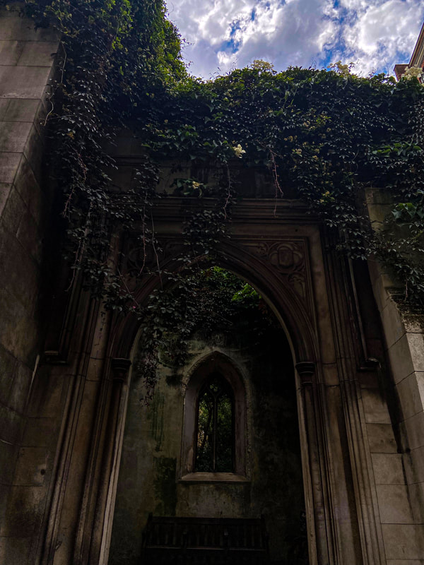
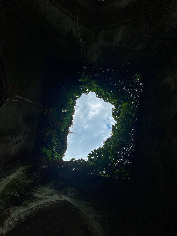
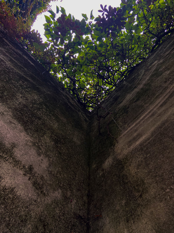
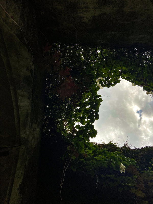
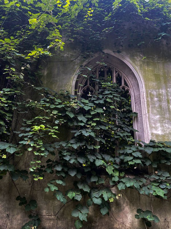
St Dunstan in the east


|
|

|
|
|
|
|

|
|
|
|
|
|
|
|
|
|
|
|
|
|
|
|
|
|
|
|
|
|
|
Black and White
|
|
|

WWW: I managed to capture great moments of concrete contrasting to nature. Moreover, while editing the photos I turned up the vibrance to make the plants stand out, while also slightly turning down the saturation on some of them to make the concrete more bold. I think I successfully managed to recreate Romain's work.
EBI: Some photos where rather hazy which was a negative on a couple of the pieces.
EBI: Some photos where rather hazy which was a negative on a couple of the pieces.
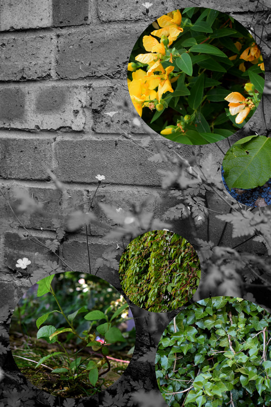
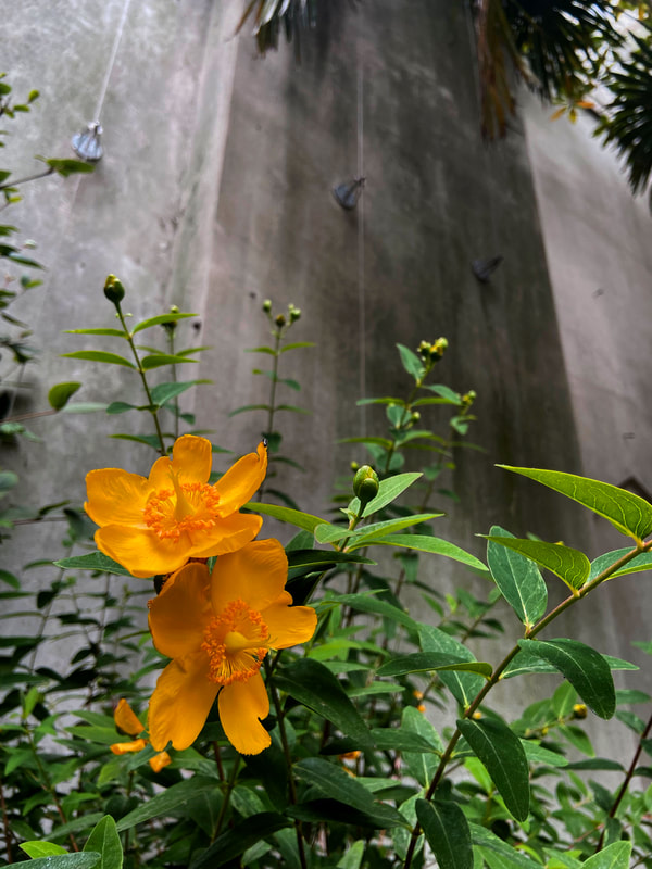
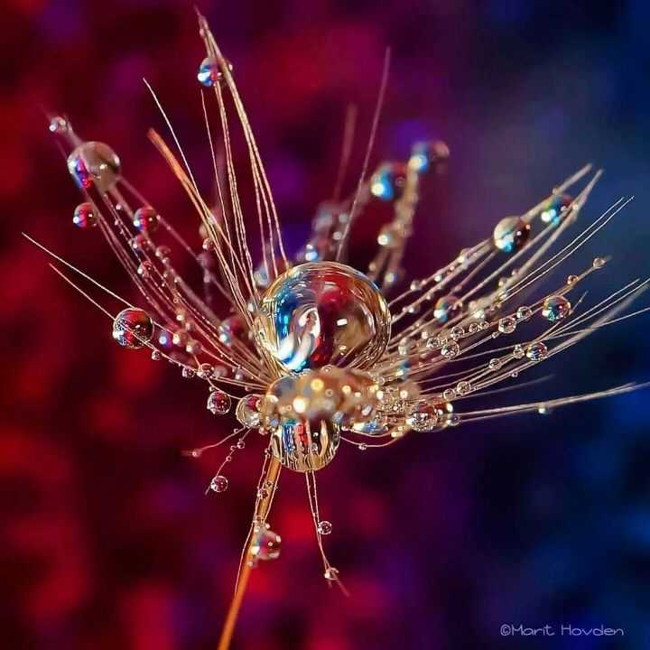
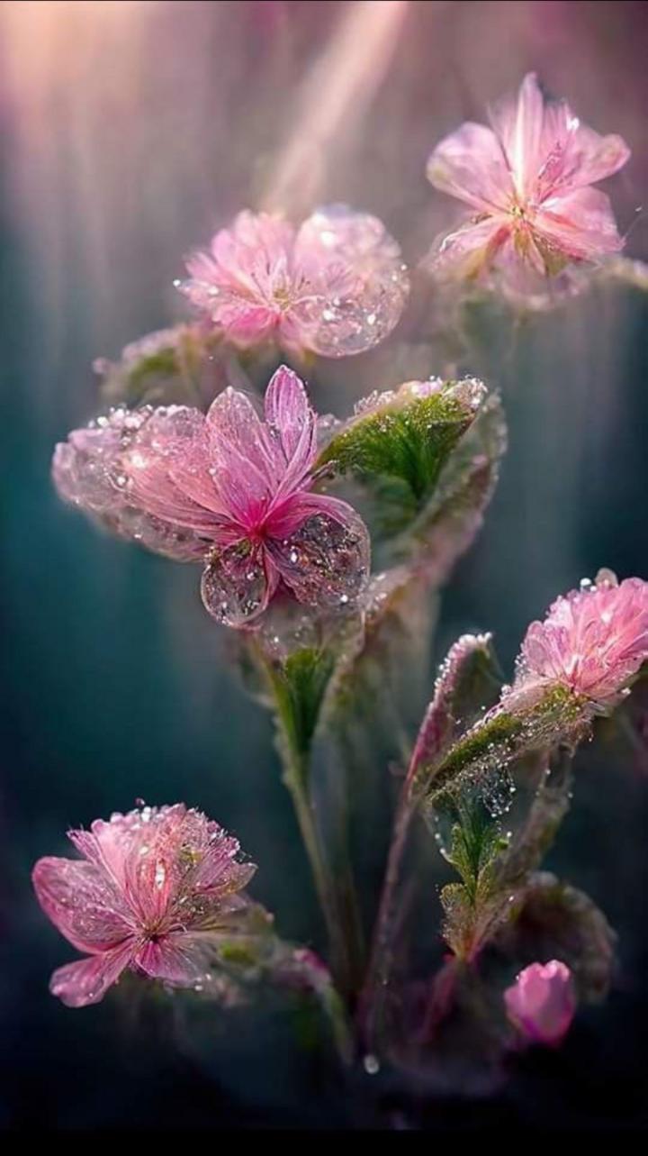
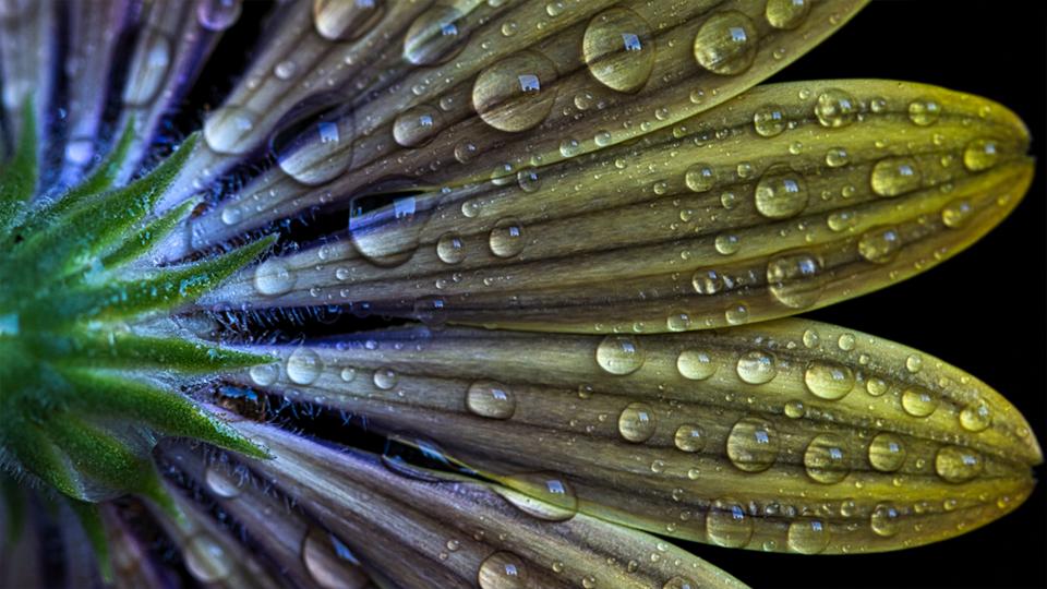
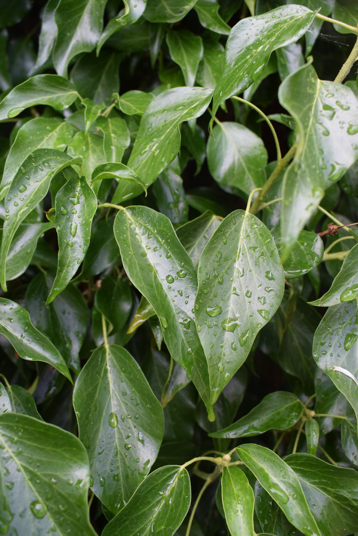
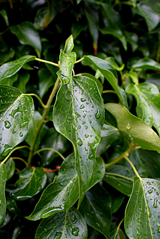
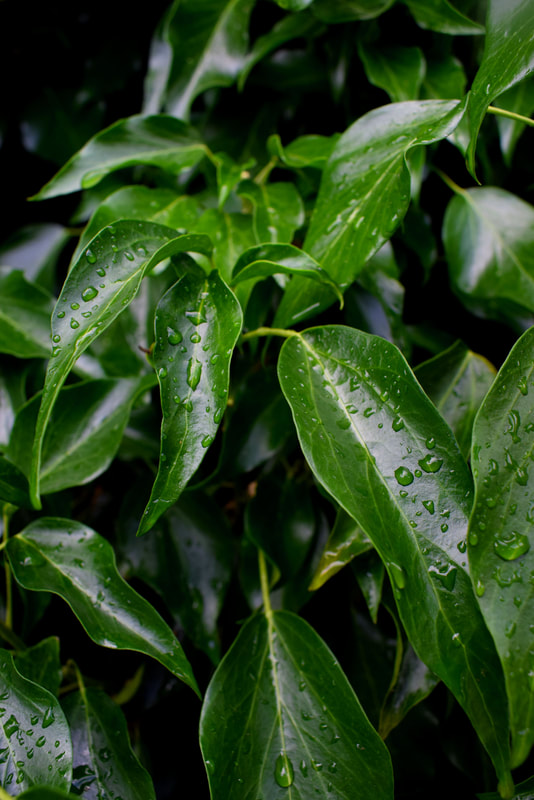
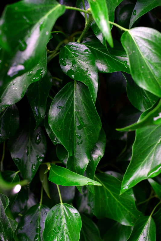
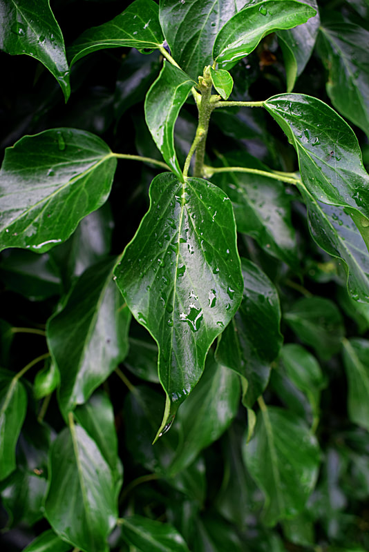
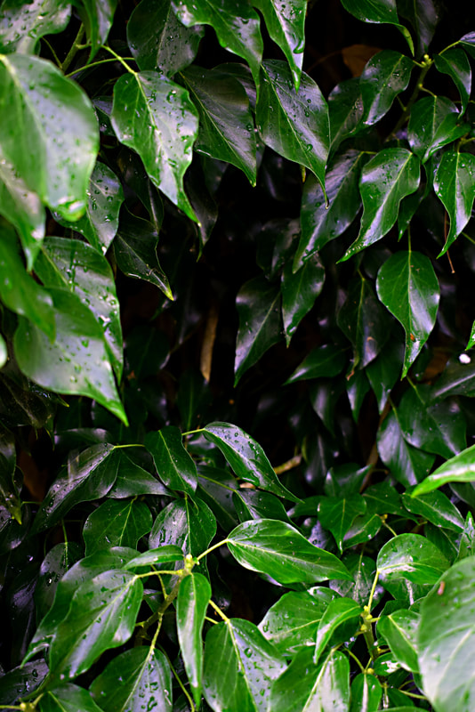
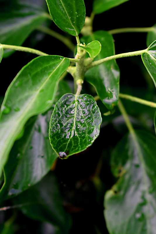
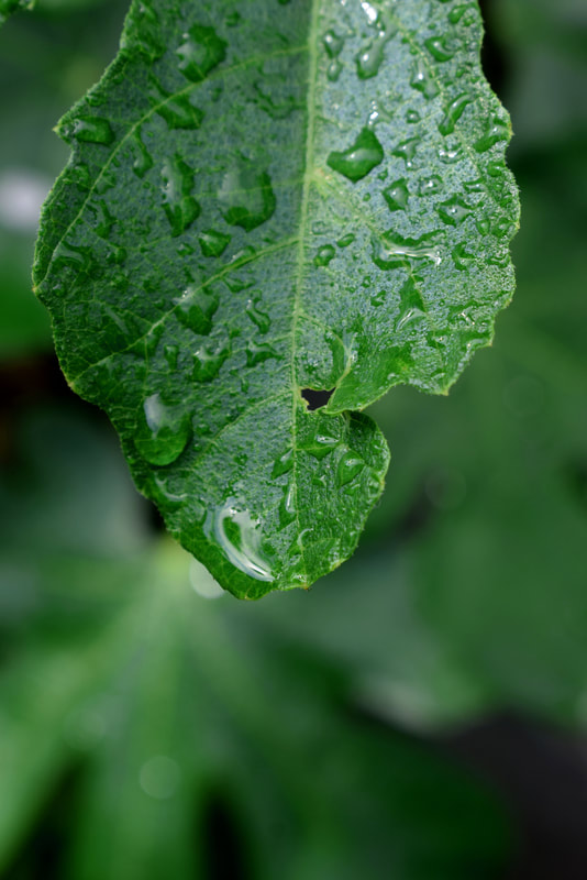
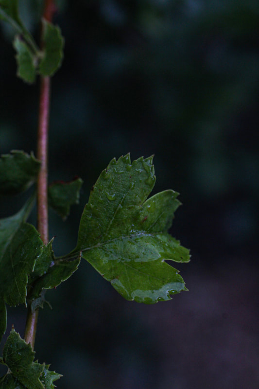
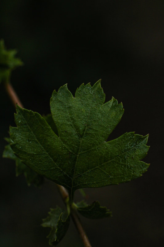
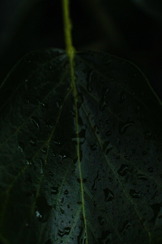
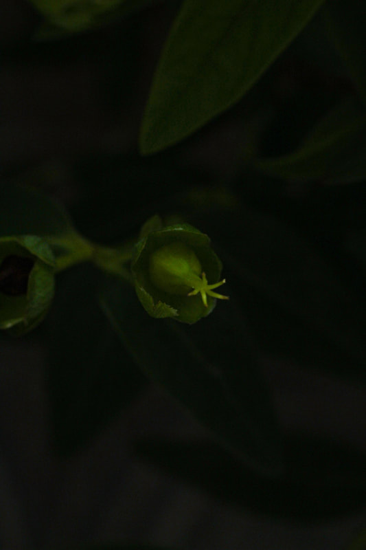
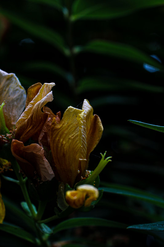
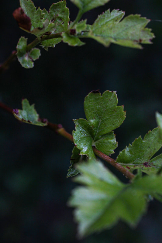
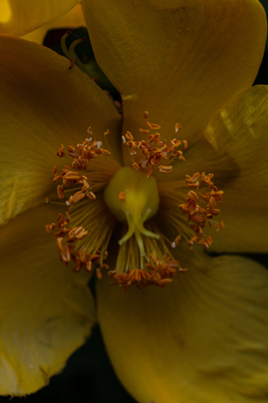
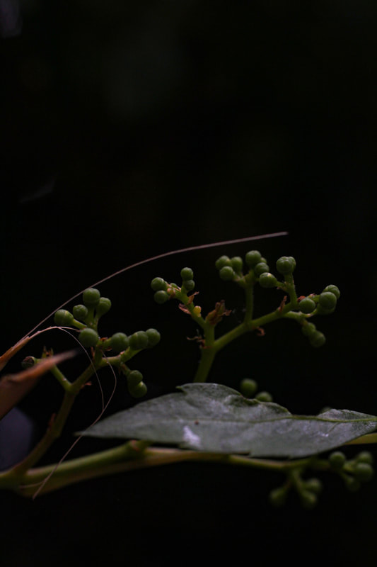
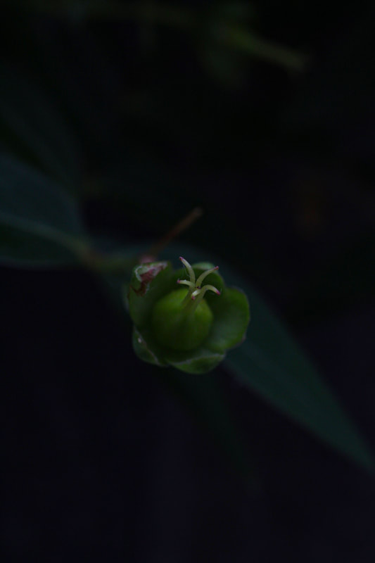
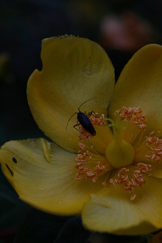
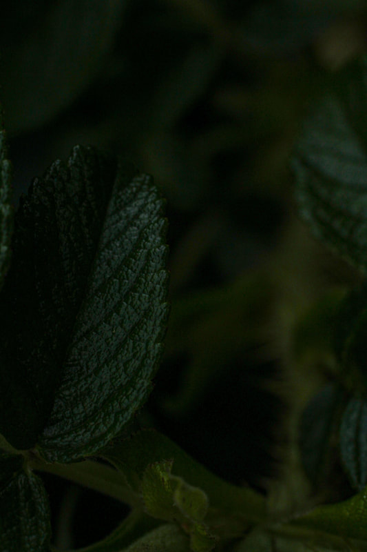
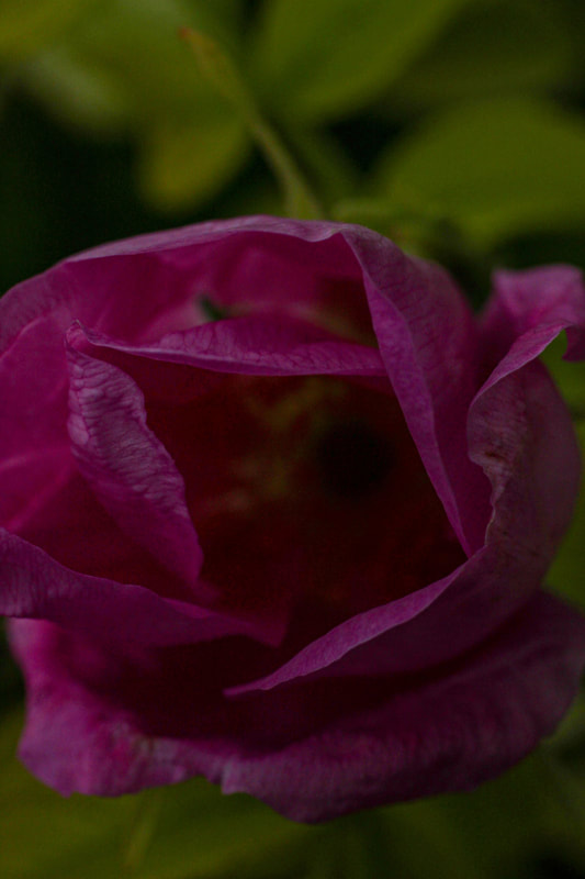
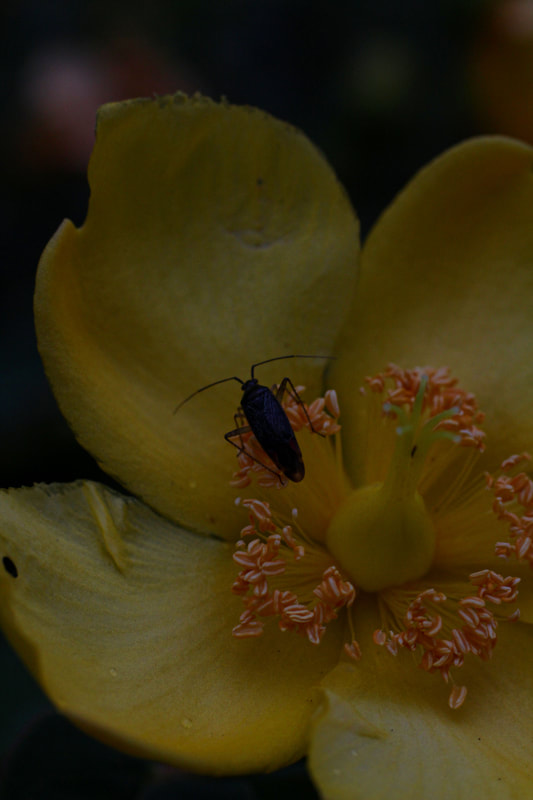
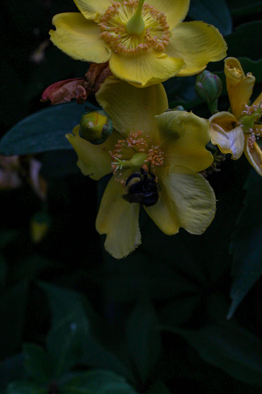
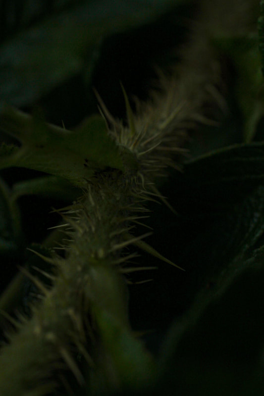
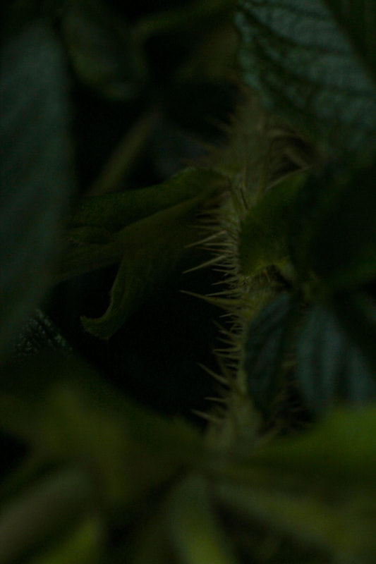
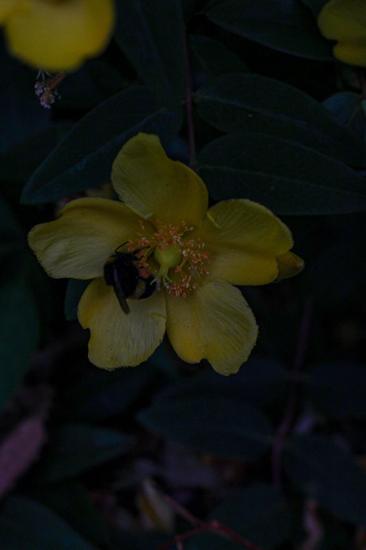
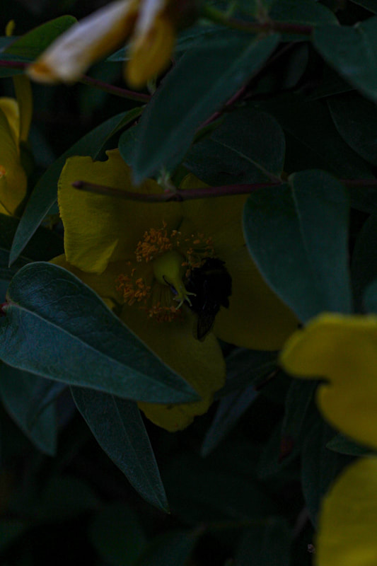
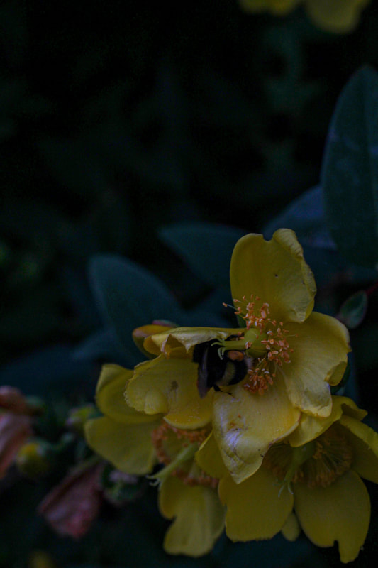
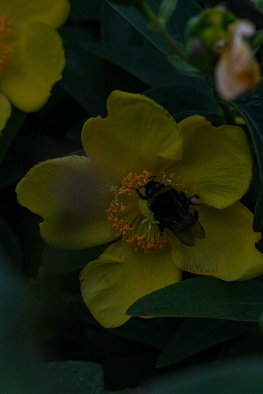
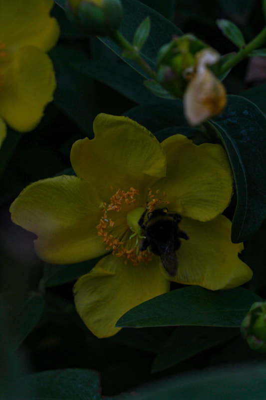
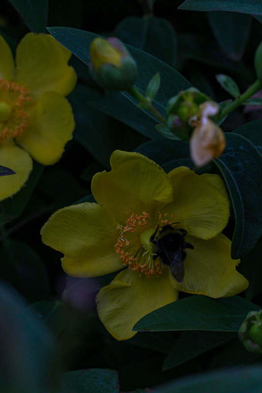
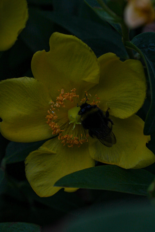
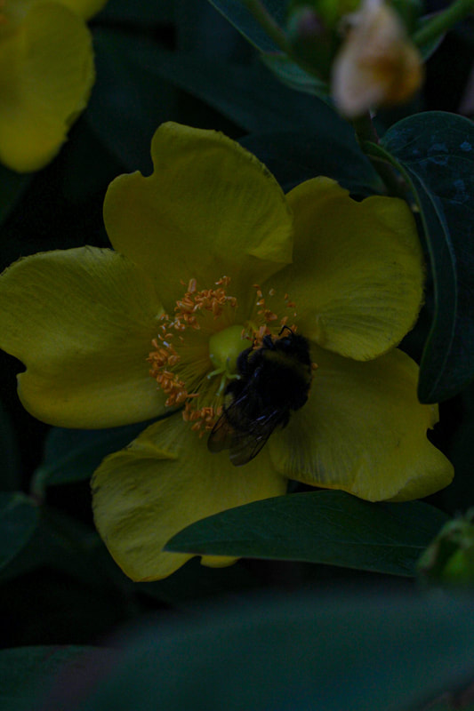
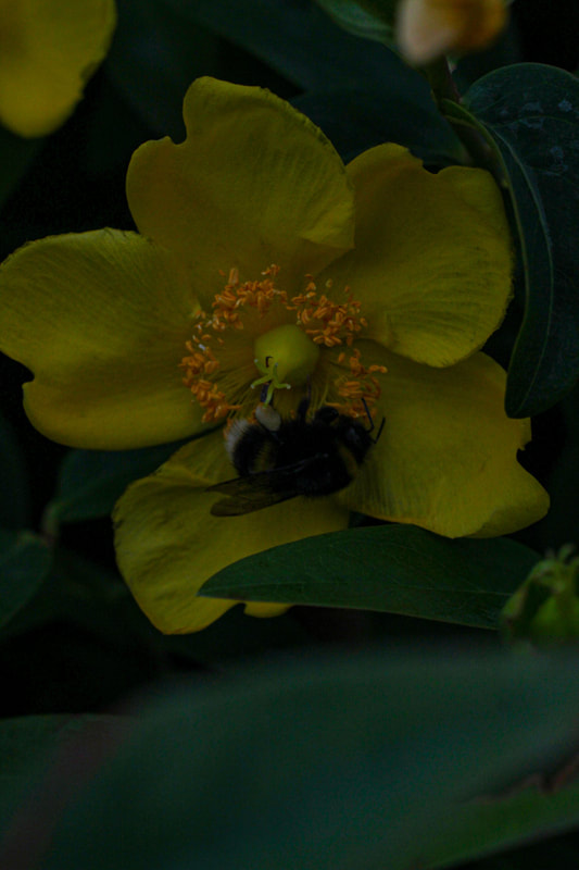
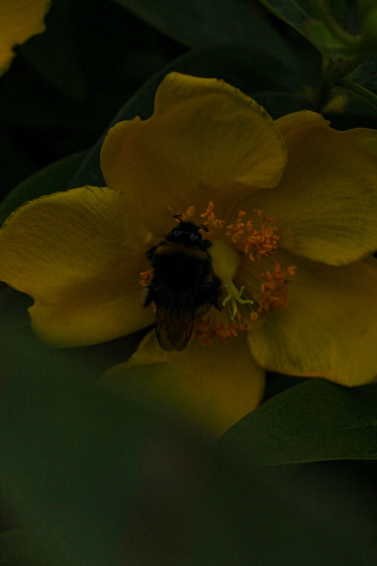
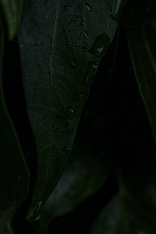
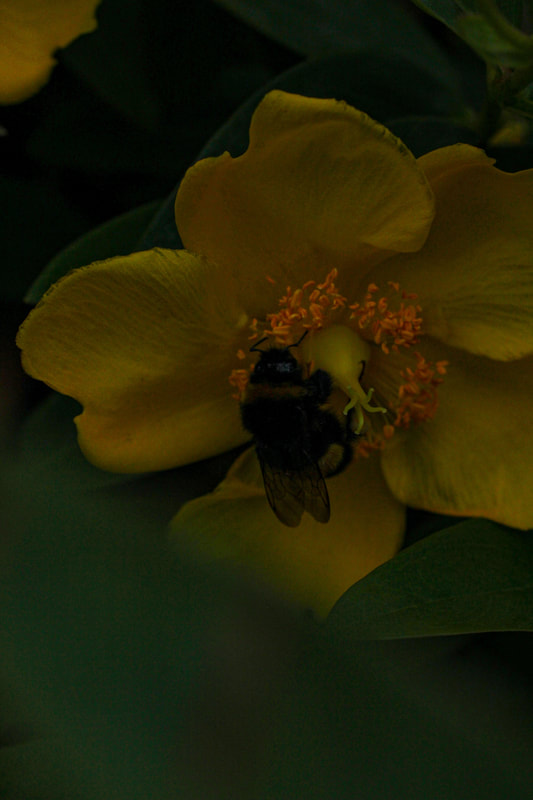
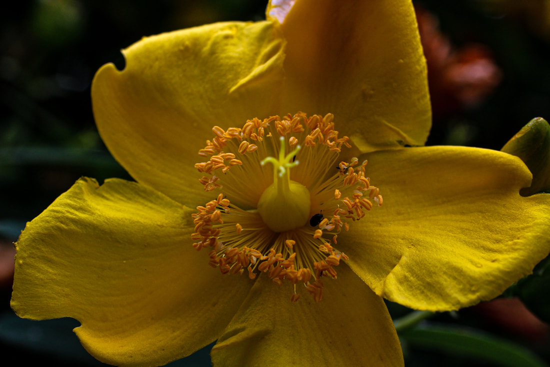
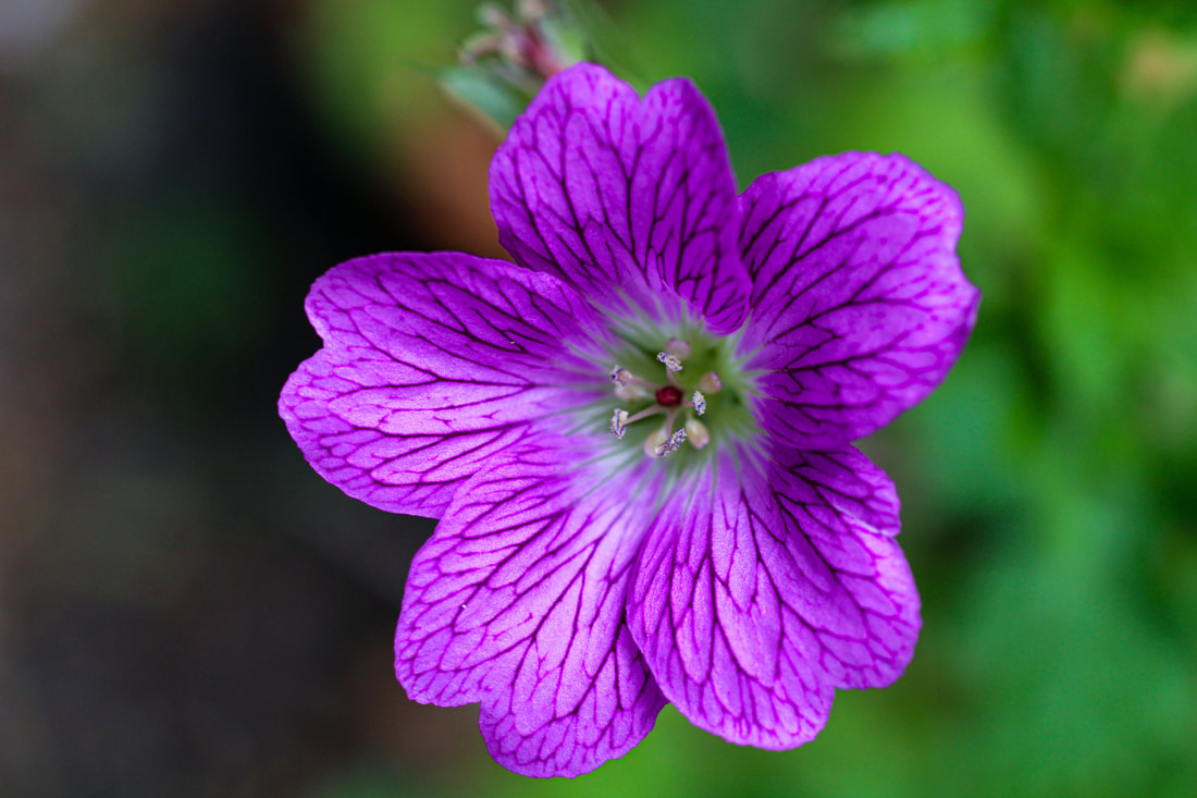
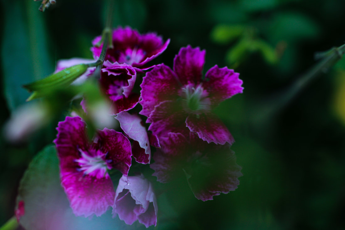
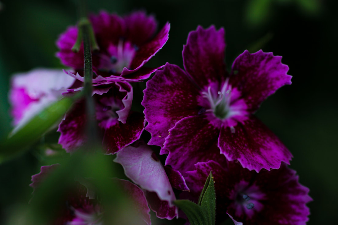
Development: Macro Photography
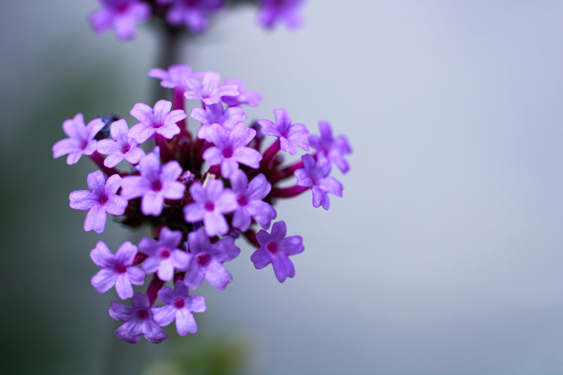
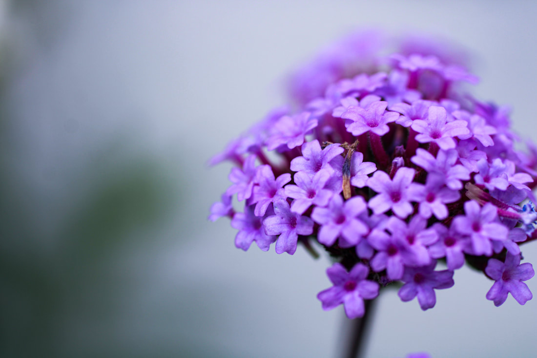
Marit Hovden
Marit Hovdens' main subjects are drops, which she captures in stunning photographs. Her images are magical. The droplets look like tiny pearls and she plays with reflecting and background in them.
|
|
|
First Response


|
|
|
|
|
|
|
|
WWW: I think I achieved my initial goal using macro photography by taking close ups of different plants.
EBI: I will use a macro lens next time as I only used a normal lens for this last shoot.
EBI: I will use a macro lens next time as I only used a normal lens for this last shoot.
Second Response
|
|
|
|
|
|
|
|
|
|
|
|
|
|
|
|
|
|
|
|
|
|
|
|
|
|
|
|
|
|


Third Response

|

|

|

|

|

|
|
|
|
|
|
|
|
|
|
|


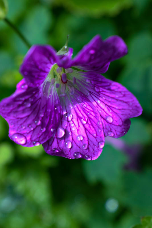
Final Photos
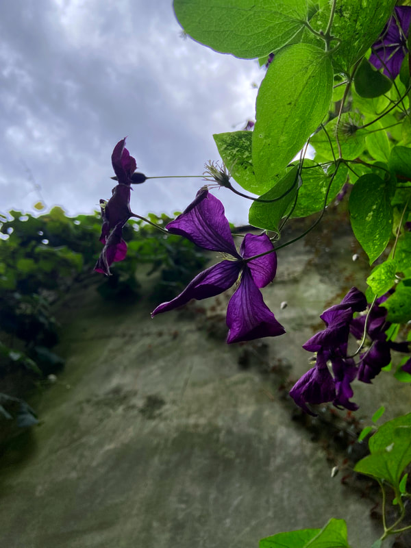
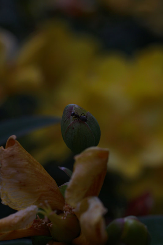
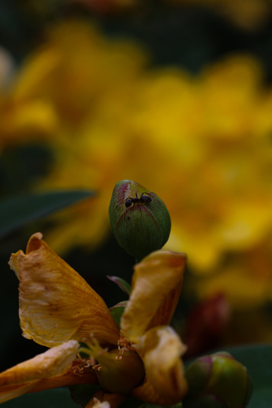
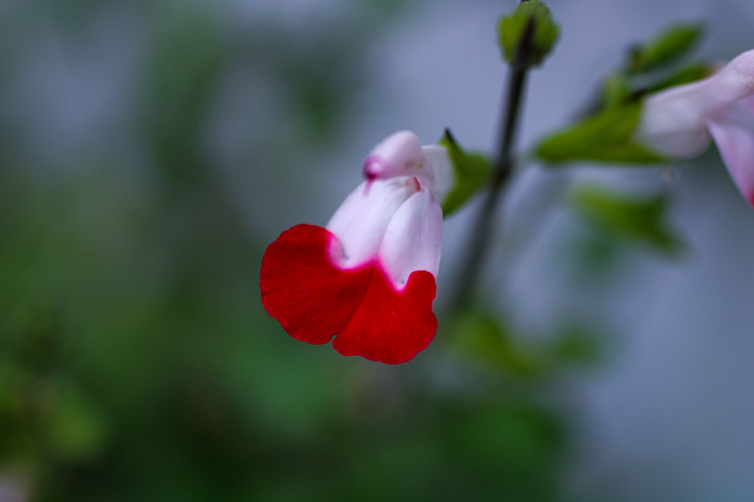
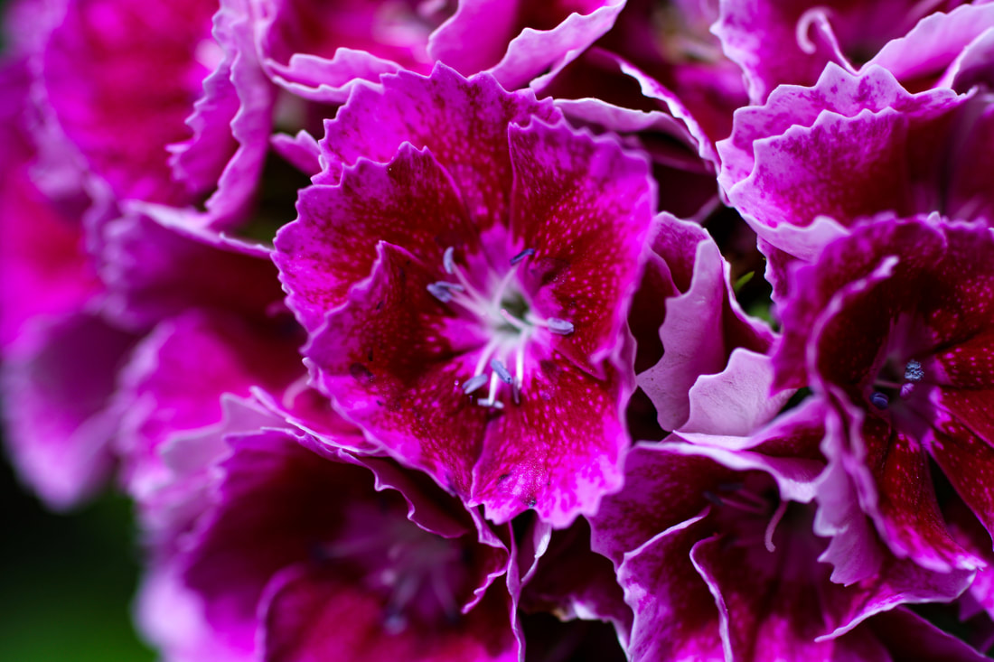
I chose this as one of my final three because I love the way the purple contrasts with the black and white and also the detail is amazing. I think that this image demonstrates Marit Hovden's work excellently. I managed to get very close to the flower and using the macro lens really helped get the detail perfectly.

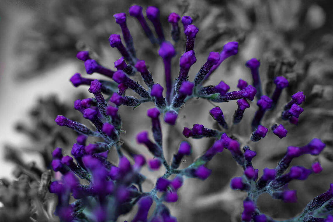
I chose this photo as one of my final pieces because the edit I did was pure, moody and dark. I liked the white of the flowers and the dark background with the blurry areas and great in-focus shot because it perfectly depicts macro photography as a genre. Moreover, the way the flowers are splayed make it look like a firework exploding.
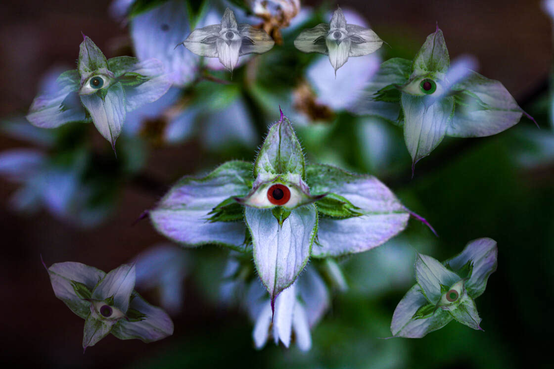
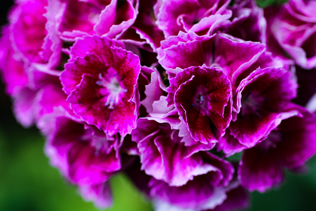
As my final piece, I decided to complete this final image as eyes staring back at you. I did this for a number of reasons. First, I photoshopped this image because of the influence of the artist, Romain Jacquet-Lagrèze, at the beginning of Wild Concrete. The reason I base his work on some of the things I photoshopped in this image was the eyes staring back. I did this to represent empathy and nature looking at us. The fact that Romain Jacquet-Lagrèze takes pictures of concrete and wild life infused, is in my opinion, to show the suffering of how plants are not where they should be, and are trapped and confined beneath the hold of the urbanising world that is developing around us today. Furthermore, the red eye in the centre depicts a devil brooding in the flower, representing anger and evil in the flower. This gives it character or personality. Moreover, I put many flowers around the centre flower to represent the juxtaposition between good and evil of the red eyed flower in the centre and the different coloured eyes on the other flowers representing different emotions and characteristics. The black and white flowers at the top represent characteristics undeveloped and the personalities finding themselves, which could be reflected to other people to represent hardship, or people trying to find themselves. Finally, I think this piece was well executed and accurately depicted using, not only the macro photography genre, but also Romain Jacquet-Lagrèze work.
