David Hockney
David Hockney is connected to the Pop art movement. This movement was interested in responding to Popular Culture
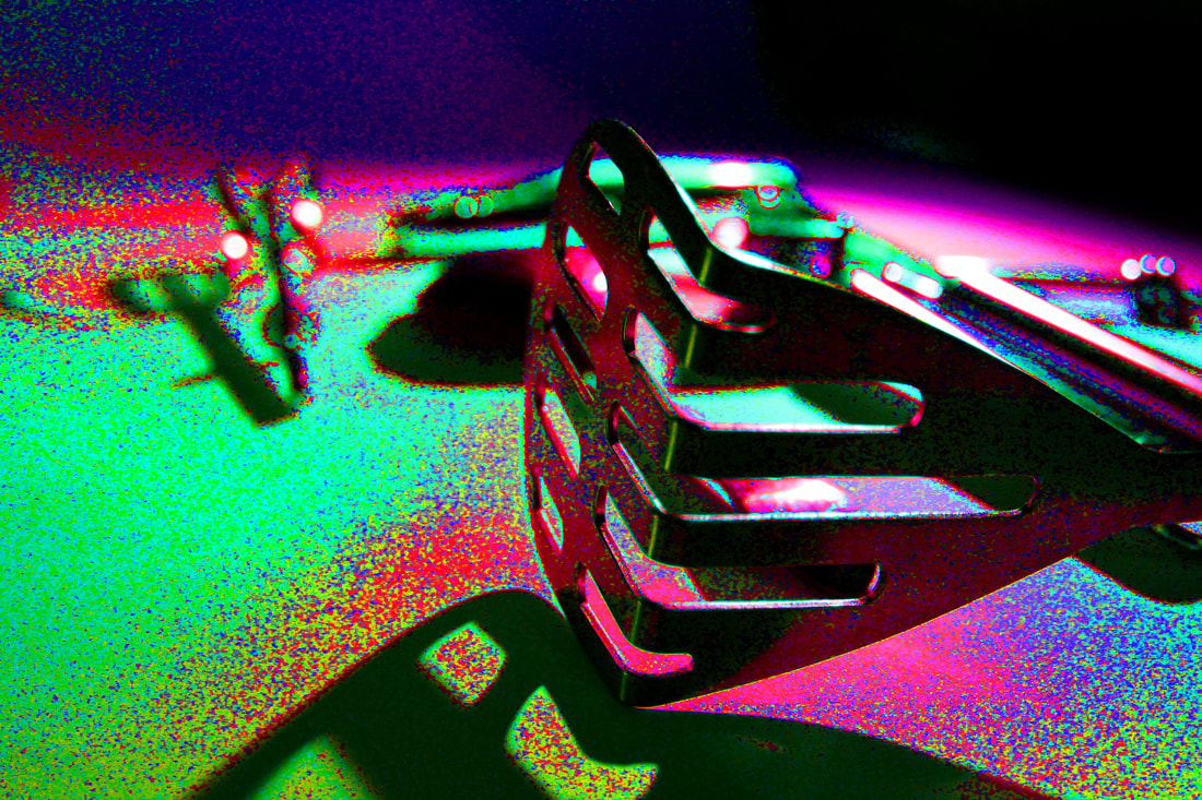
Hockney created photo joiners that consisted of photographs taken of the same object from different perspectives. The images were then collaged together to recreate the place, person or object even though the overall appearance may look distorted. This work connects with the Cubist movement, one of Hockney's major aims. Hockney would cleverly compose patchwork of photos and call it 'joiners'. Hockney's connection to cubism was after he had completed one of his photo joiners he said he owed much to cubism and said he found it to be 'turn on'.
Hockney created photo joiners that consisted of photographs taken of the same object from different perspectives. The images were then collaged together to recreate the place, person or object even though the overall appearance may look distorted. This work connects with the Cubist movement, one of Hockney's major aims. Hockney would cleverly compose patchwork of photos and call it 'joiners'. Hockney's connection to cubism was after he had completed one of his photo joiners he said he owed much to cubism and said he found it to be 'turn on'.

|

|

|

|
What went well: I managed to connect all the photo making it look like the subject you where meant to see. Also i managed to do what i wanted where i wanted to make the chair not loo completely normal but still slightly real.
Even better if: It would have been better if the photos where more seamless when connected, and there wasn’t a white background prominent. |
Second responce

Cactus inspired by David Hockney.
|
In this task I was required to take different perspectives of an object, I chose a cactus, and combine them to make a mix and match of different perspectives into one collective shape. This relates to David Hockney's work as our image layouts are quite similar. My intention was to create a Hockney piece as authentic and like his photos as i could.
|
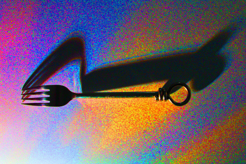
This second time, to add on to my 'even better if' i decided to cut some of the photos to make it seem more seamless when one photo is above another. Also when i took the photos and tried to have a plain background to make the wooden cactus stand out more.
Simplified Images
Thomas Danthony
Thomas Danthony was a photographer who specifically focussed his skills into simplified images. Here is some of his work below.

|

|

|

|
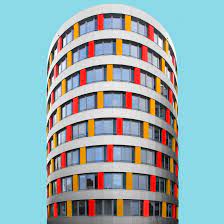
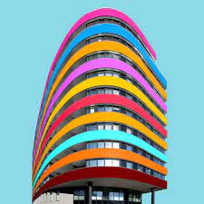
Paul Eis
Here are some examples of Paul Eis's work.
|
|
|
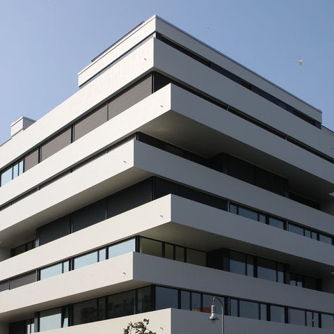
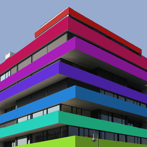
Paul Eis Made his photos have lots of colour because he thought that buildings looked too boring. I tried to do the sam thing and also do a gif
Here are some of my attempts
|
|

|
|
|
|

|
|

|
Form over function
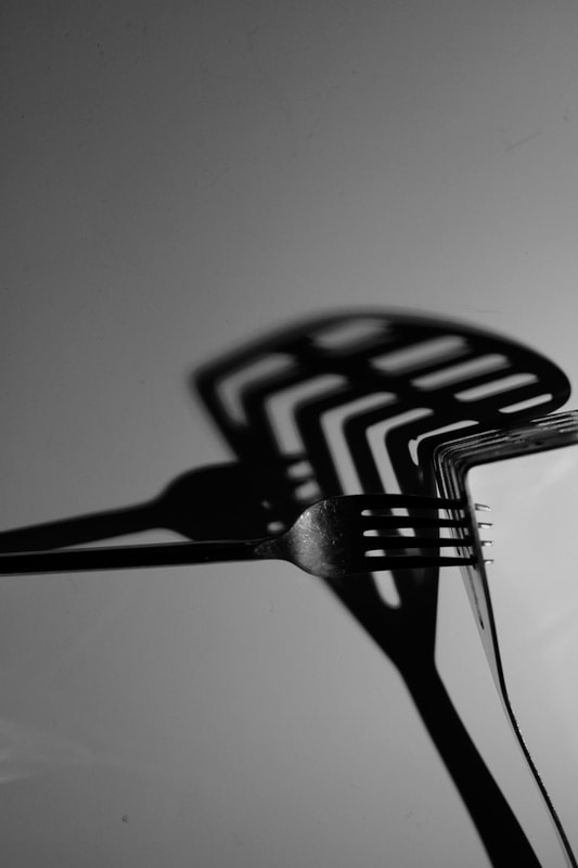
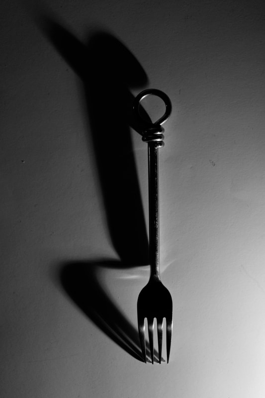
Andre Kertesz
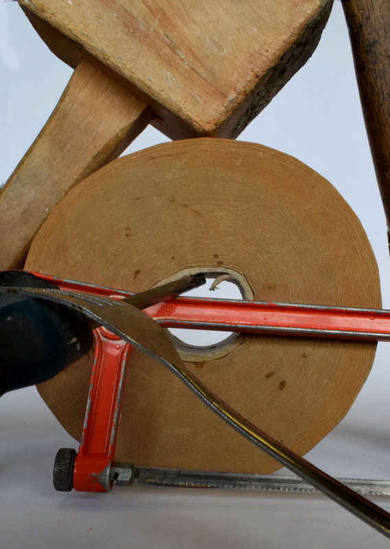
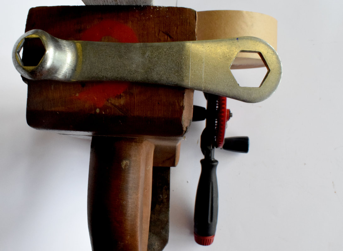
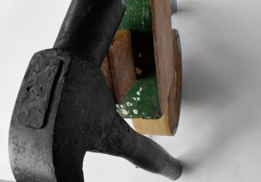
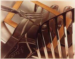
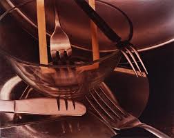
He is a Hungarian artist not specifically known for his Photography but still managed to influence how to take pictures of a domestic object in such an amazing way of making, for instance forks, more unique and creative.

|

|

|
I then gave it a go
|

|
|
I placed the forks in different positions to try and get an interesting shadow withe the light and also try to replicate Andre Kertesz's work. I put the camera on a low iso to bring out the light and once i took the photos i put them in photoshop to make them black and white. Also i changed the exposure and levels to accentuate the forks's shadows and the fork itself.
WWW: I managed to get some nice contrast with the light and dark.
EBI: I could have shot the first one in better focus in setting it to auto rather than manual.
Attempt 2.

|
|
|

|
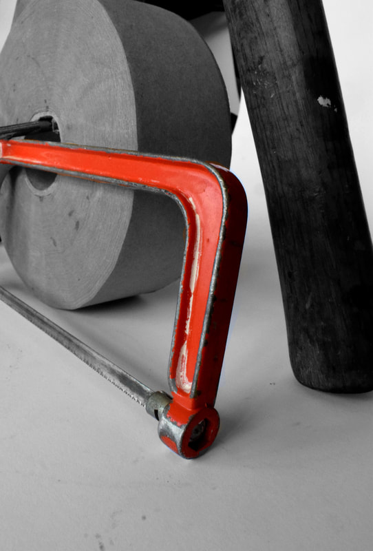
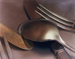
This time I included more utensils to create and experiment with different shadows and the way light effects the shadow to make cool and different view points. The spatula worked well with its shadow and i managed to create abstract shadows with it. This time i managed to also get the pictures more in focus which is what I decided to pin point on because of my Ebi from attempt 1.
|

|
|
|
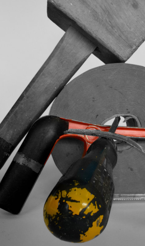
I decided to go one step further and added colour through the means of hue and saturation.
I used a tripod to make every shot equal and also i used different colours to make the gif look cooler and more unique. Furthermore i cropped every image the same size so that it was more seamless and looked much nicer.

Ordinary to extra ordinary
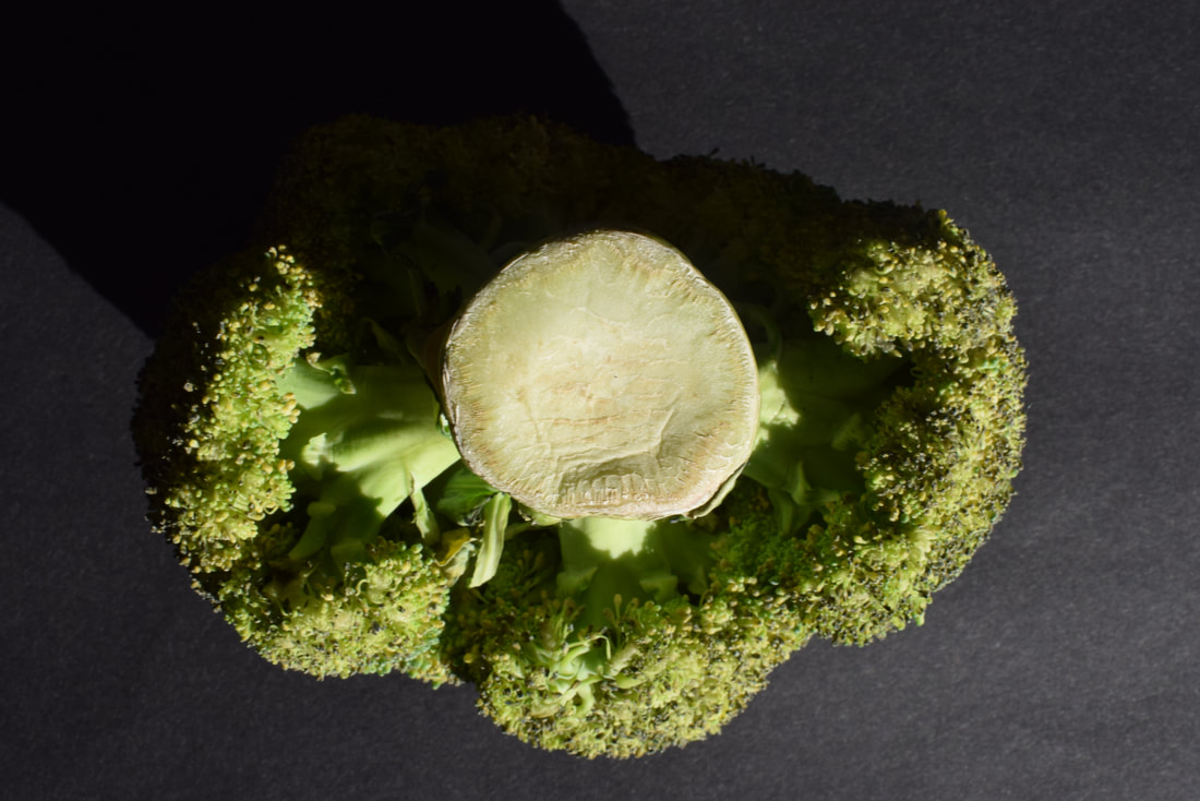
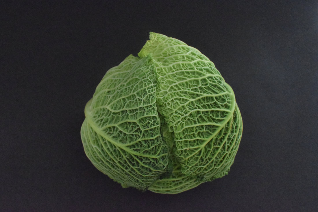
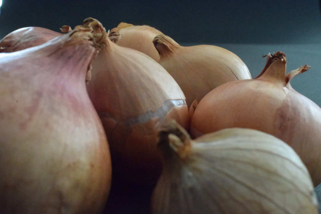
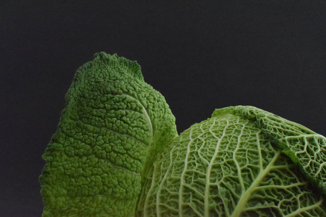
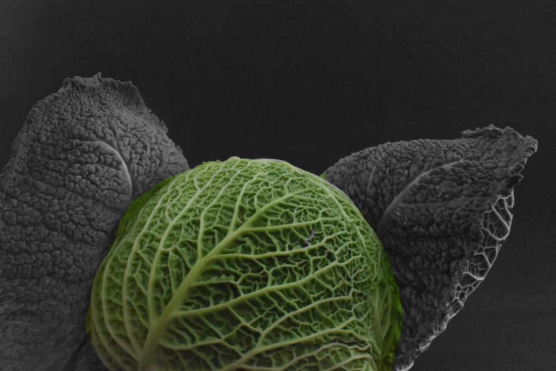
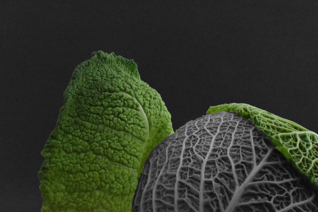
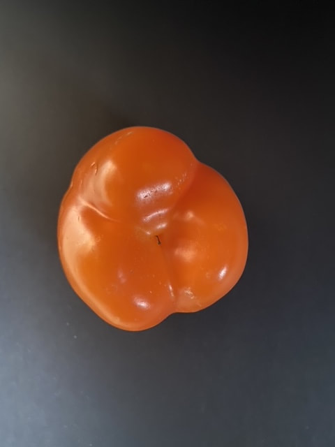
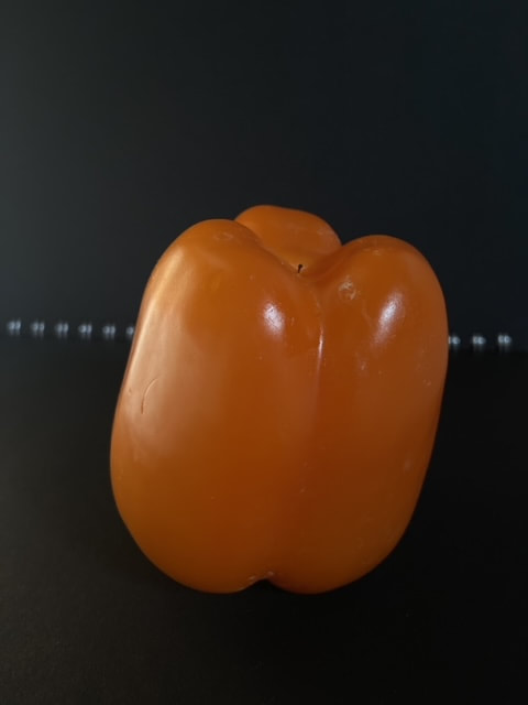
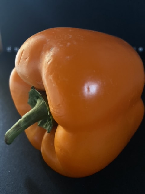
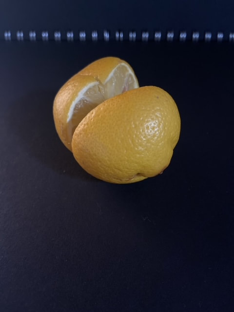
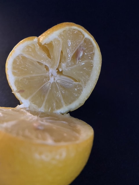
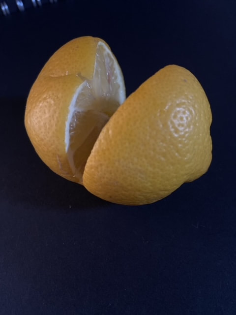
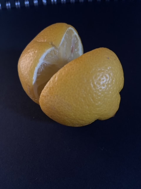
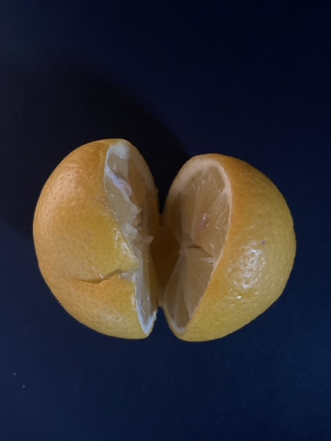
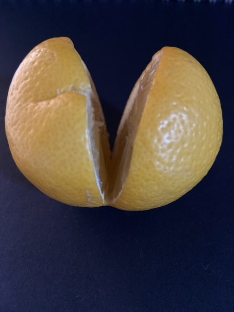
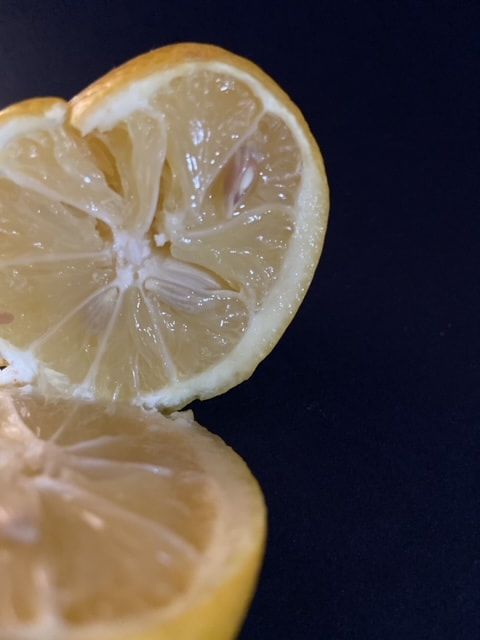
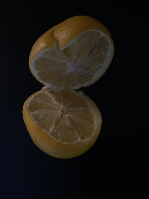
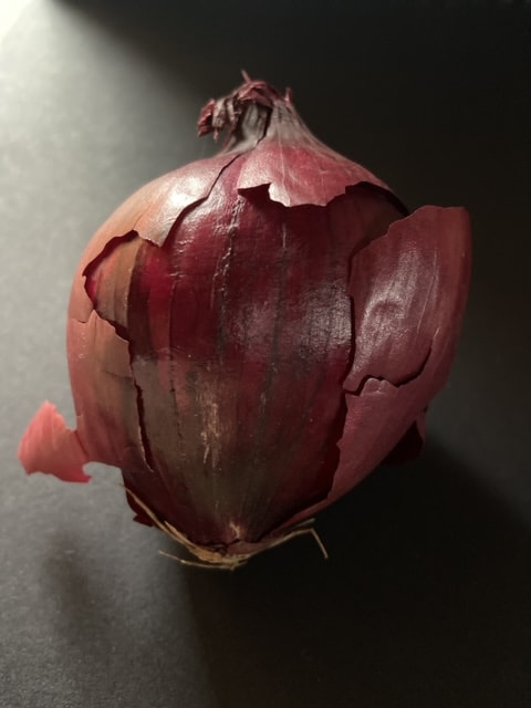
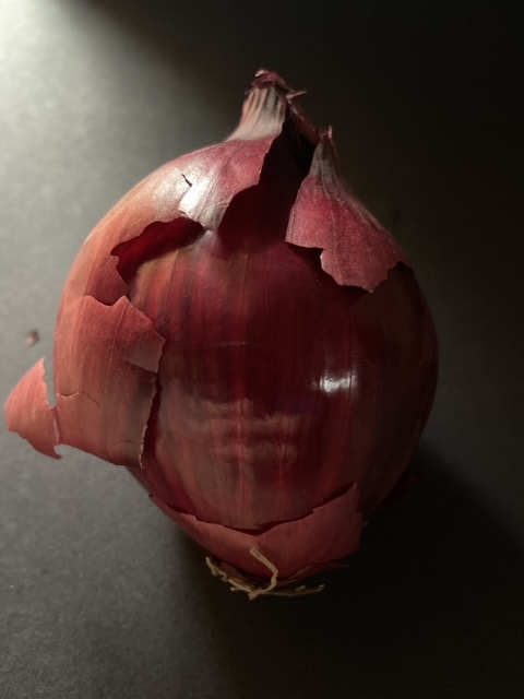
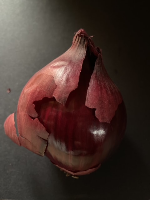
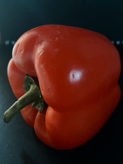
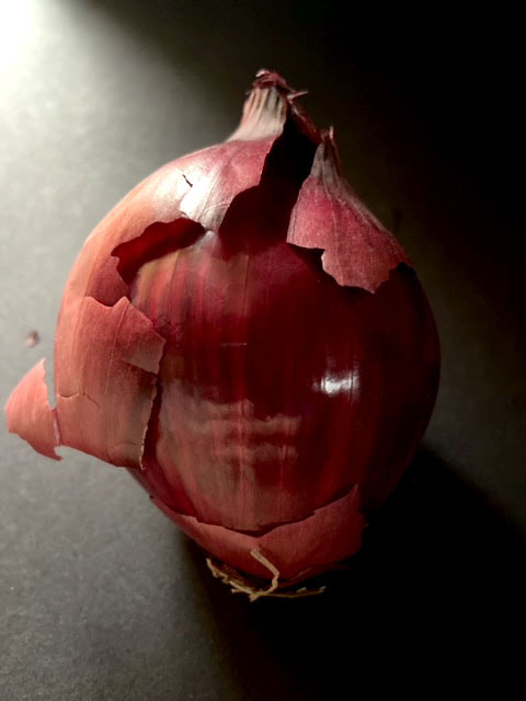
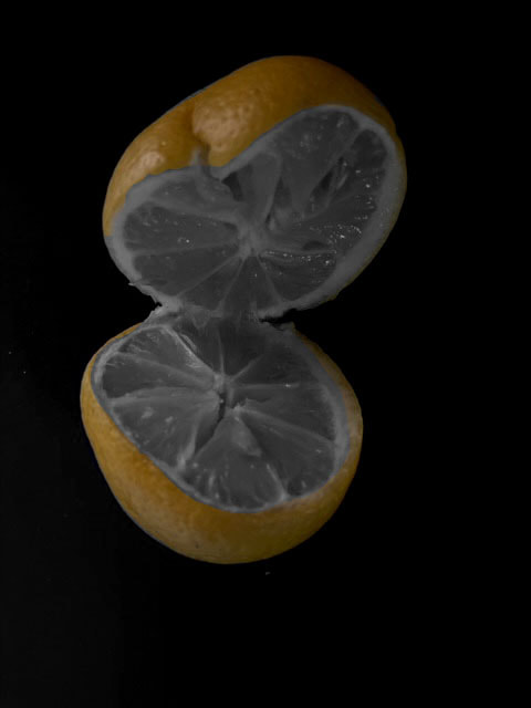
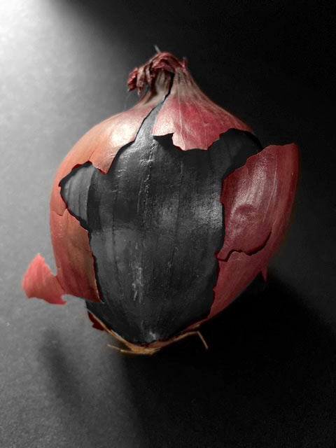
Edward Weston
Edward Weston (1886-1958) was a 20th century photographer who has been called one of the most innovative and influential of all American photographers and a master of photography. His career spanned 40 years and he photographed an expansive set of subjects, including landscapes, still-life, nudes, portraits, and genre scenes.
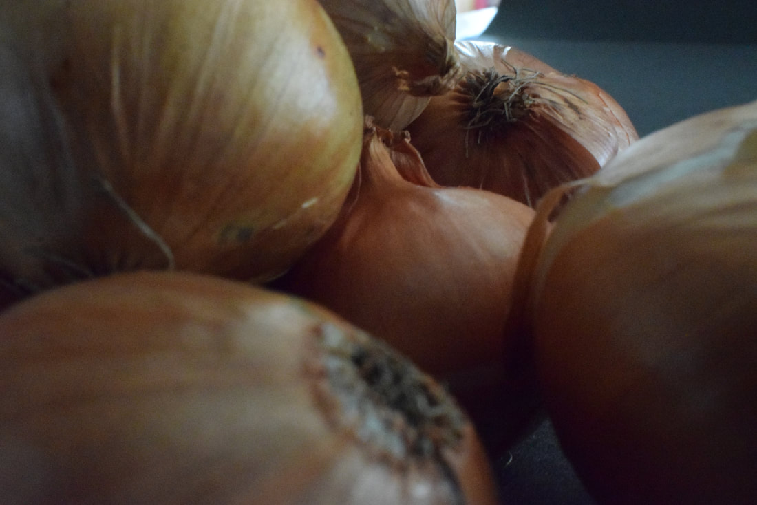
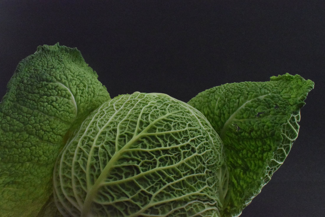
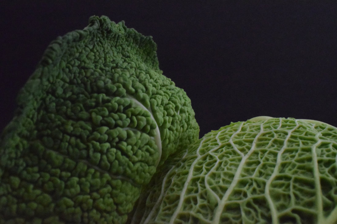
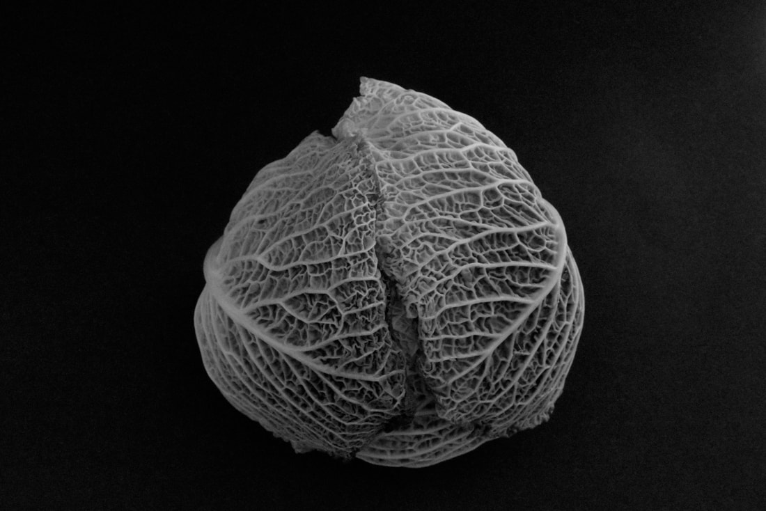
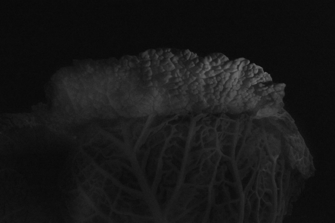
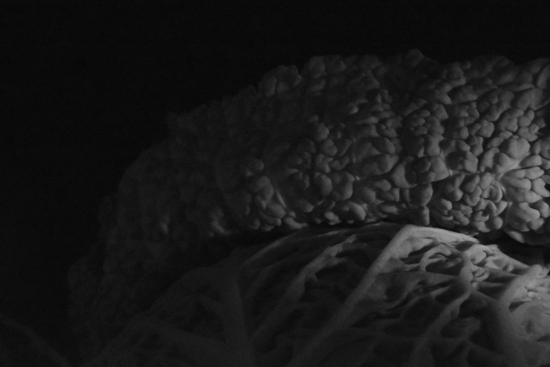
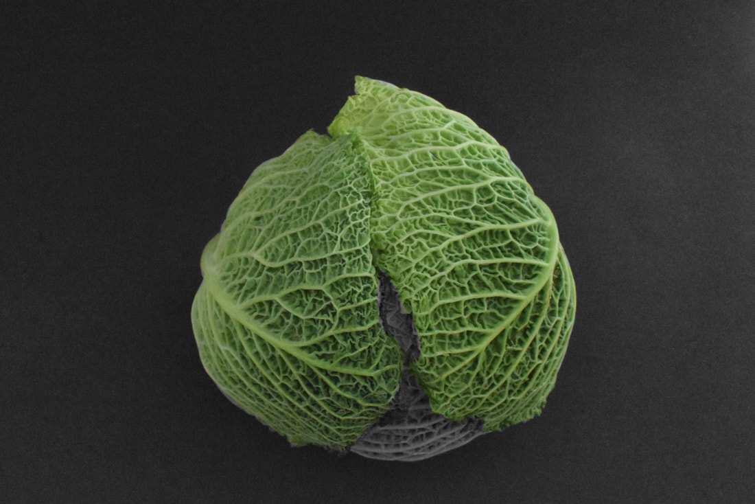
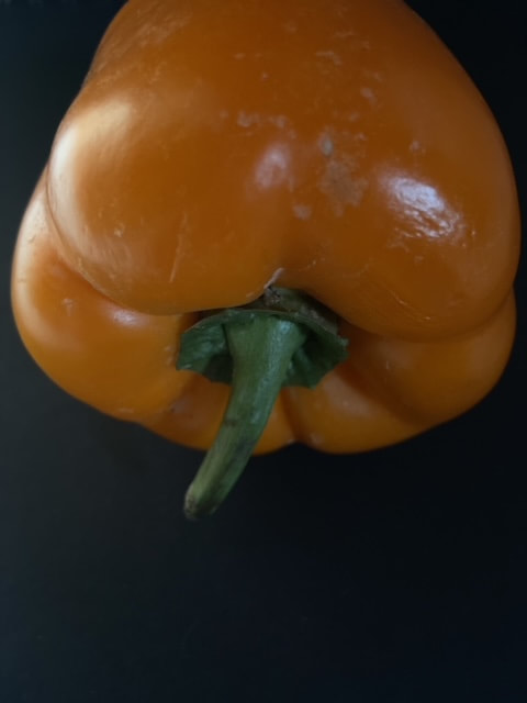
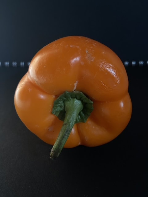
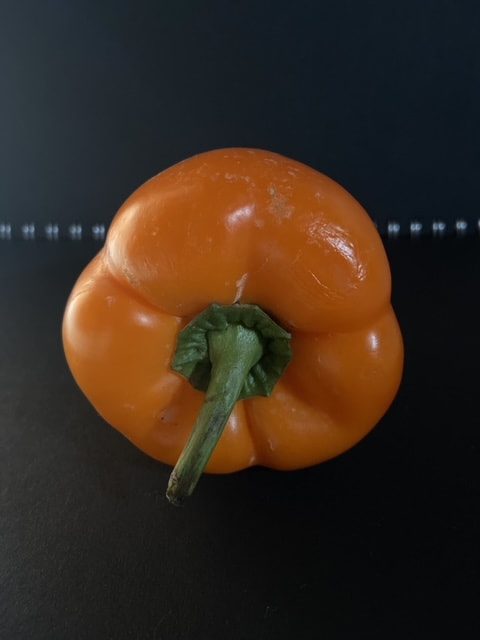
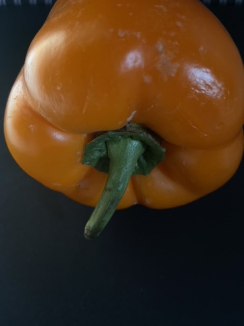
Some of Edward Weston’s most famous work was close-up images of vegetables and fruit, photographed in a way that captured the “essence” of the object, taking them out of context. His manipulation of light to highlight shape, texture and form helped bring photography out of the shadow of painting and stand on it’s own as a credible art form. Through these photographs he transformed his subjects into abstractions of shapes and patterns,
Some of Edward Weston’s most famous work was close-up images of vegetables and fruit, photographed in a way that captured the “essence” of the object, taking them out of context. His manipulation of light to highlight shape, texture and form helped bring photography out of the shadow of painting and stand on it’s own as a credible art form. Through these photographs he transformed his subjects into abstractions of shapes and patterns,

|

|

|
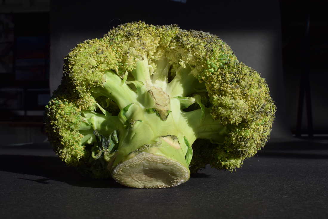
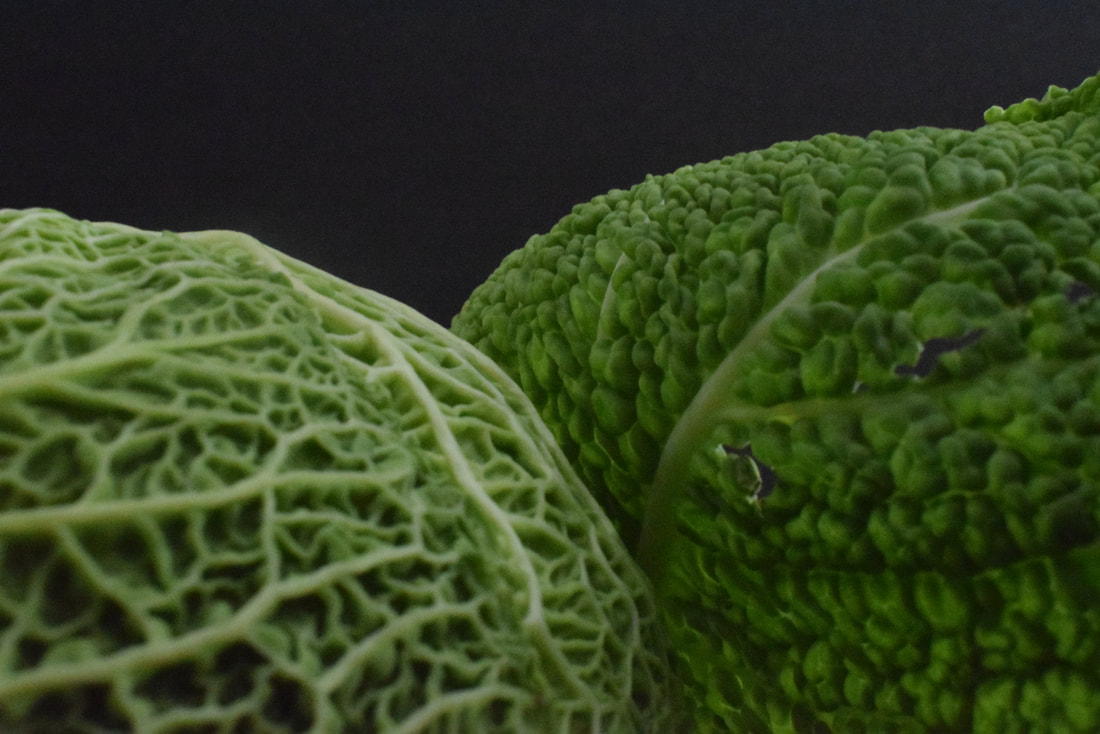
With black card I put different vegetables in direct sunlight and took some pictures with a medium ISO of 400. Furthermore With different angles it was fun to play around and find cool ways to express the vegetables Wrinkles, warps and weird bruises.After I selected a couple to turn into blacka nd white on Photoshop to accentuate the contours on the vegetables.
|
|
|
|
|
|
WWW: i managed to capture what Edward Westons essence to get some nice clean shots.
EBI: It would have been nice to direct the light to have more interesting shadows.
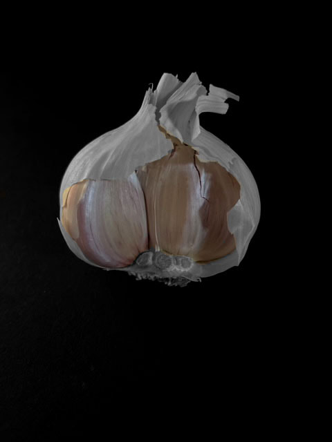
Second responce
|
|

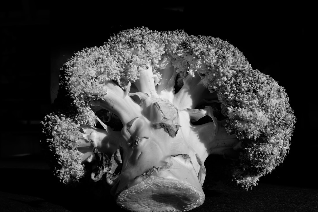
So this time on my second attempt to recreate Edward Weston's style i used directional light to add to the effect and made it black and white to create a more darker tone.
|
|
I did a couple more at home
|
|
|
|
|
|
|
|
|
|
|
|
|
|
|
|
|
|
|
|
|
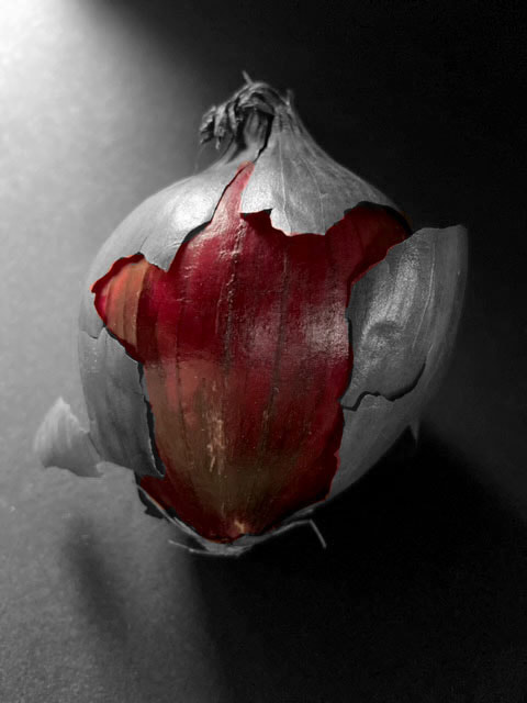
Best of the photoshop edited
|
|
Here where some of the best
Once I got some of my favourites i went into photoshop and made them look cooler by making some it the vegetable black and white and some bits colour, which I think makes the veggies pop more and accentuates their colour. In addition, I also made a gif comparing different parts of a vegetable highlights to show a comparison.
|
|
|
|

|
Every day sculptures
Sharon Randish
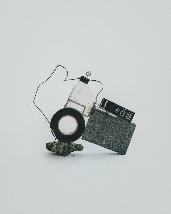
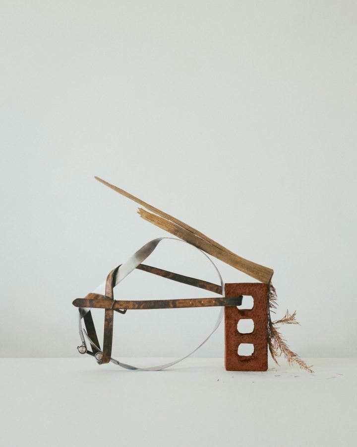
In response to lockdown as a result of the COVID-19 emergency, New York based photographer Sharon Randish created a series of still lives using found objects around her home and neighbourhood to keep her artistic temperament active.
"For many artists, this current time has provided an opportunity for creative reset, and is a reminder of the everyday joys of life—should we find the capacity to look for them.This work is representative of my daily quarantine routine; nothing was created outside of my home.” In the series of images below, objects including metal scraps, plastic bags, cardboard, string, and fruit are curated with artistic flair; their abstract forms play with balance and are intriguing in their composition."
"For many artists, this current time has provided an opportunity for creative reset, and is a reminder of the everyday joys of life—should we find the capacity to look for them.This work is representative of my daily quarantine routine; nothing was created outside of my home.” In the series of images below, objects including metal scraps, plastic bags, cardboard, string, and fruit are curated with artistic flair; their abstract forms play with balance and are intriguing in their composition."
|

|
|
I then did my first response to the project
|

|

|
|

|

|

|

|
|
|
|

|
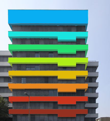
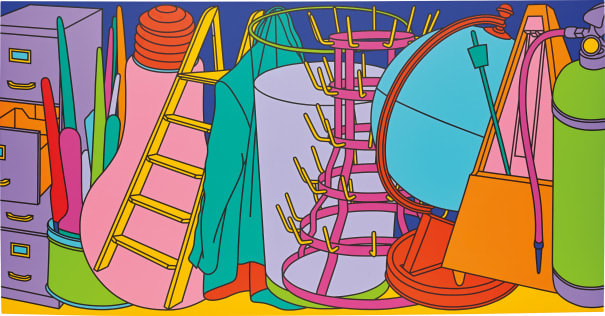
Micheal Craig MartinFirst I found an image i liked and went onto Photoshop. I then carefully selected each shape and changed the colour to resemble Micheal's work. I also chose bright and bold colours to make each shape pop and be more vibrant. Furthermore i changed the shade of the colours to accentuate the shadows and signify where each shadow was and how dark 'twas.
|
Second response, trying to improve on before

|

|
|
|
|
|
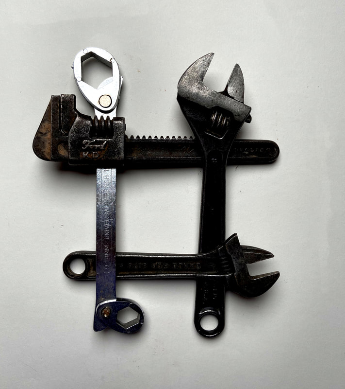
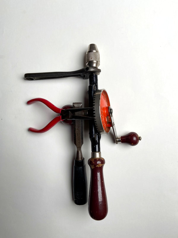
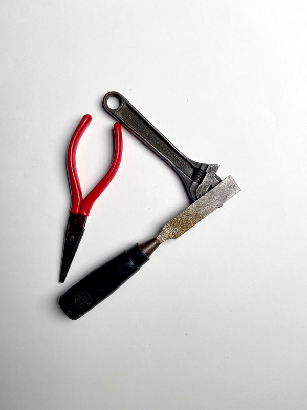
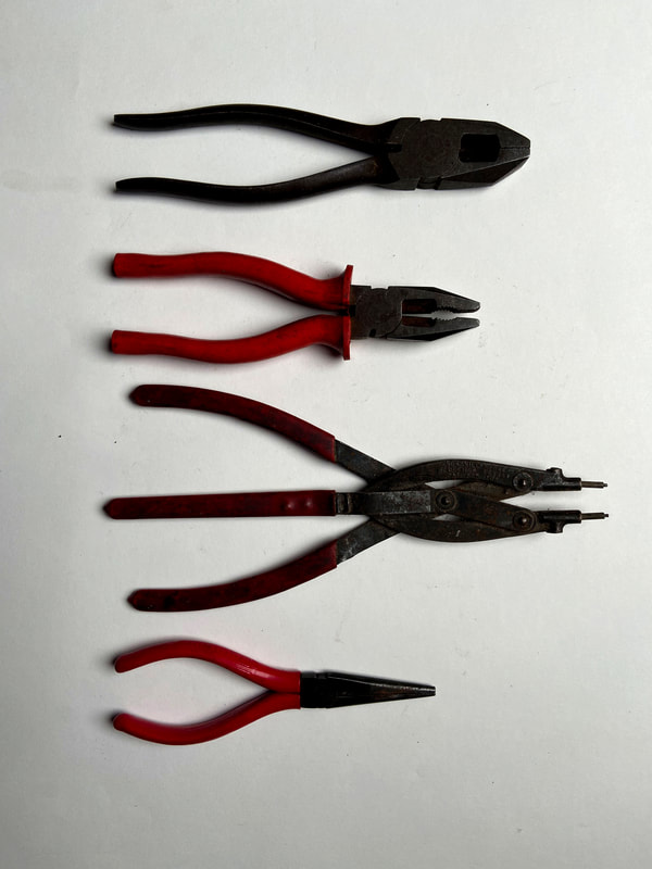
In all my photos in this section i first set up different tools from around my house and in school. After that I set them up in abstract ways and made it so I had different unique shapes and variations of tools. Furthermore when setting up for my second attempt i tried to recreate Sharon Randish Work more.
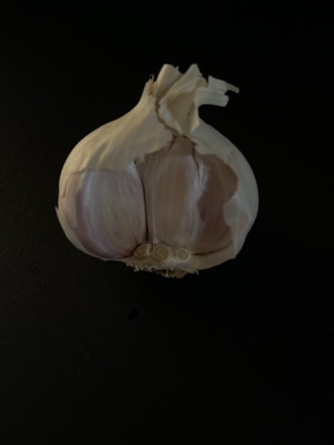
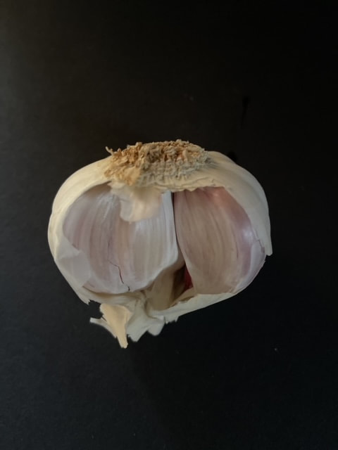
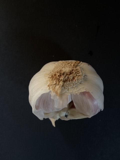
Kitchen still
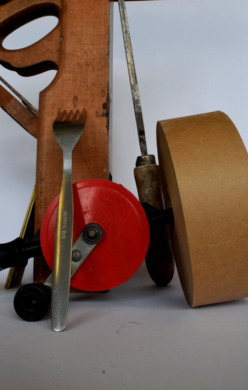
Jan Groover
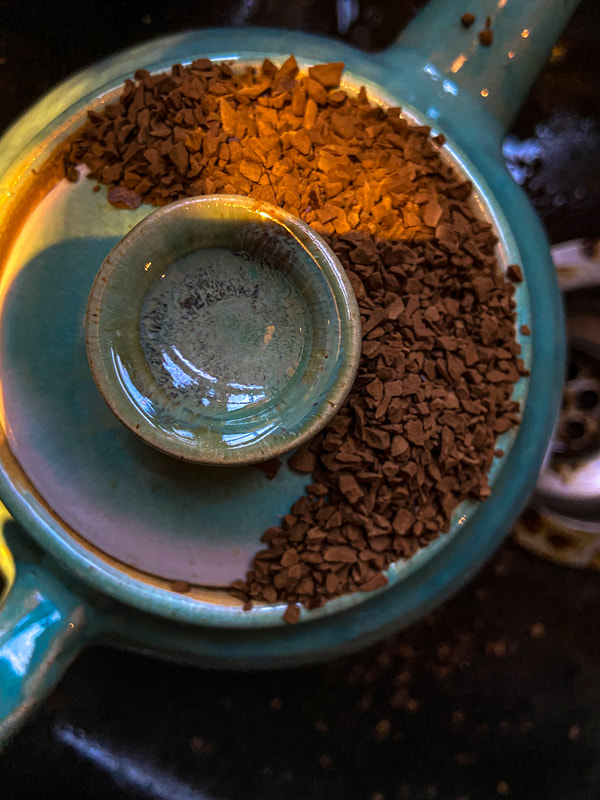
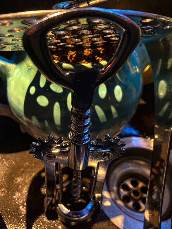
Jan Groover (American, 1943 – 2011) was among the very best still life photographers since the medium’s invention. Groover created her famous Kitchen Still Life in 1978 and 1979. Using a large-format camera, she transformed colanders, knives, spatulas and baking pans into objects of beauty that still hold a visual interest that transcends their common use. Her seductively modern colour palette of greens, pewter, bronze and brown tonalities permeates the space dissected by kitchen paraphernalia. Here are some examples of her work.
|
|
|
Overview of setup

|
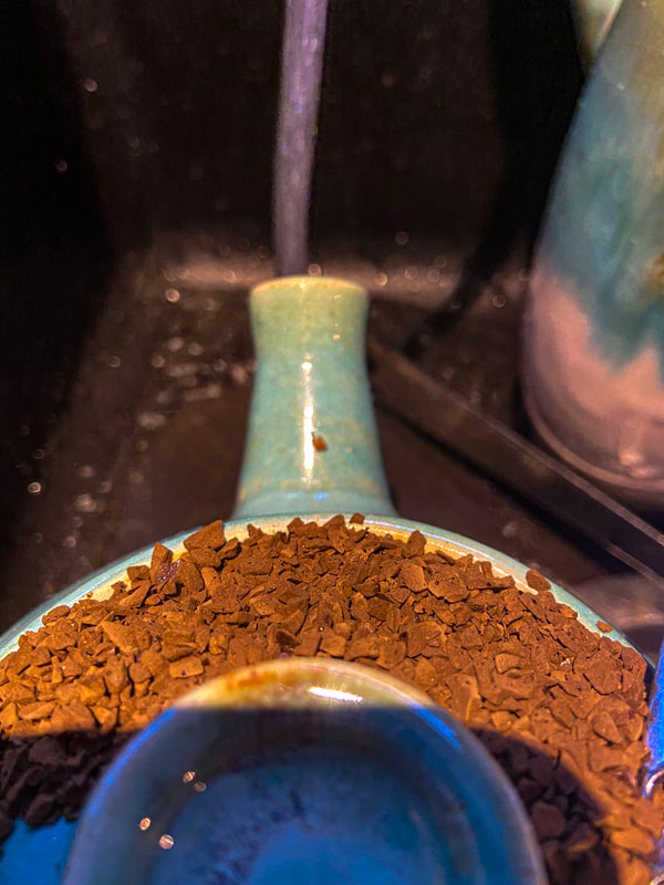
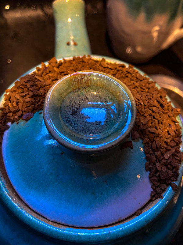
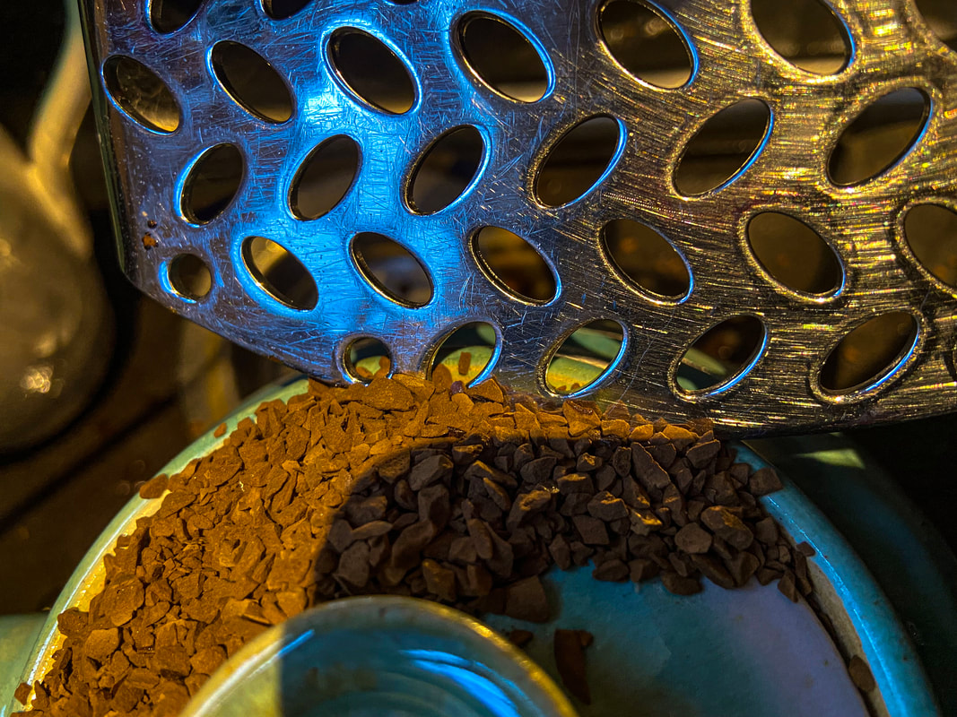
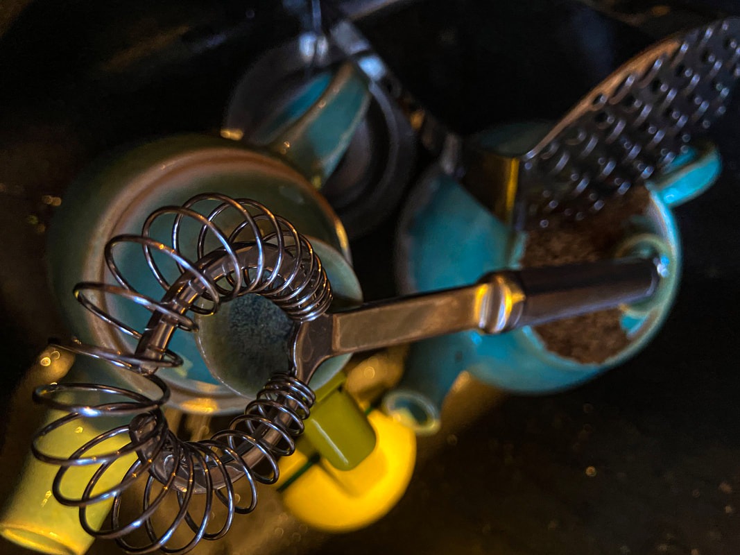
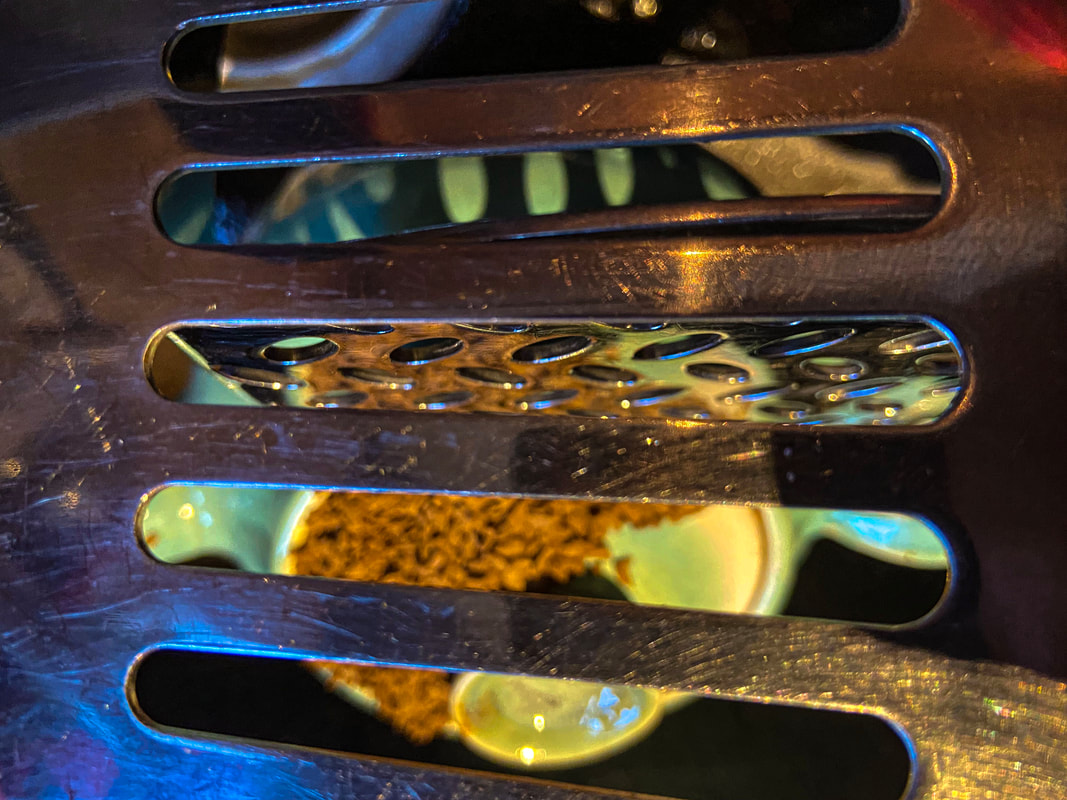
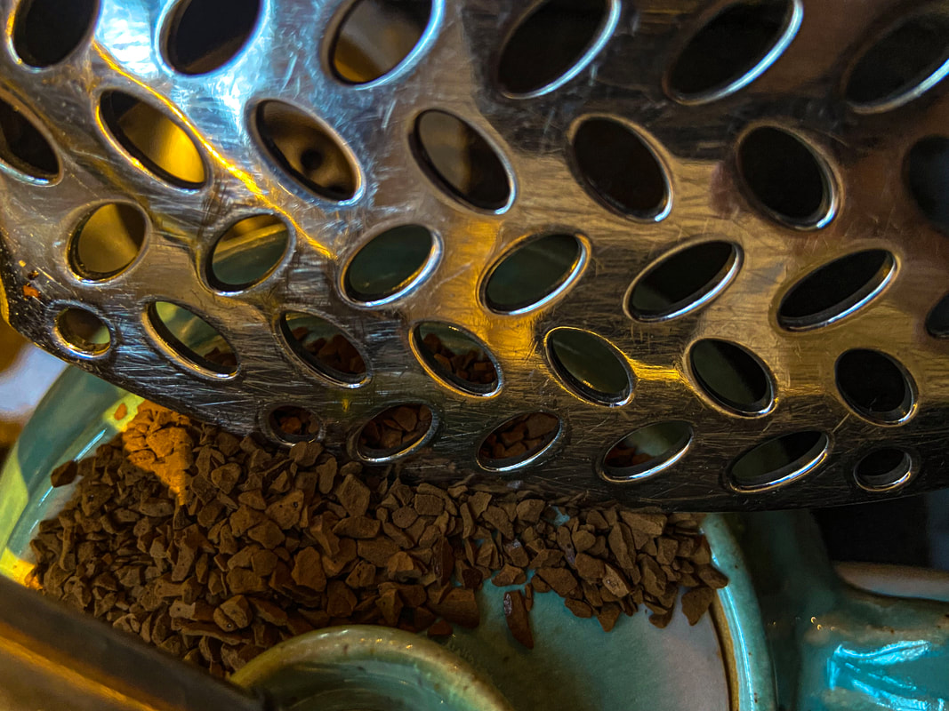
I first thought i would set up different utensils and put them in unique places so that when photographing them i would get cool and different angles you wouldn't normally see. Moreover I added some texture to my image with some coffee which added amazing shadows and detail. I tried to recreate Jan Groovers work an I think it turned out quite well as you can see below.
|
First response
|
|
|
|
|
|
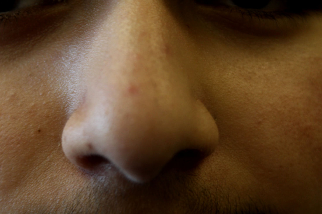
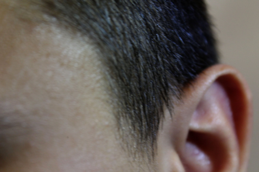
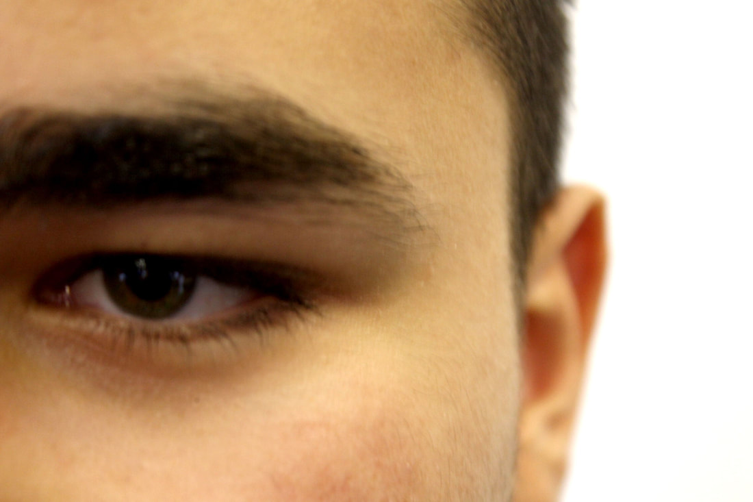
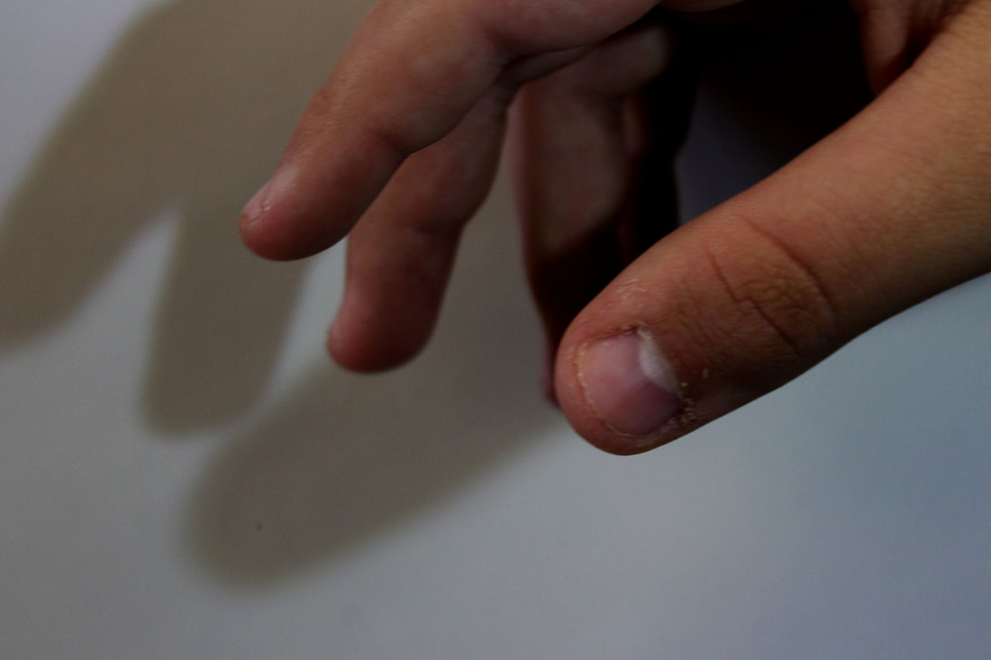
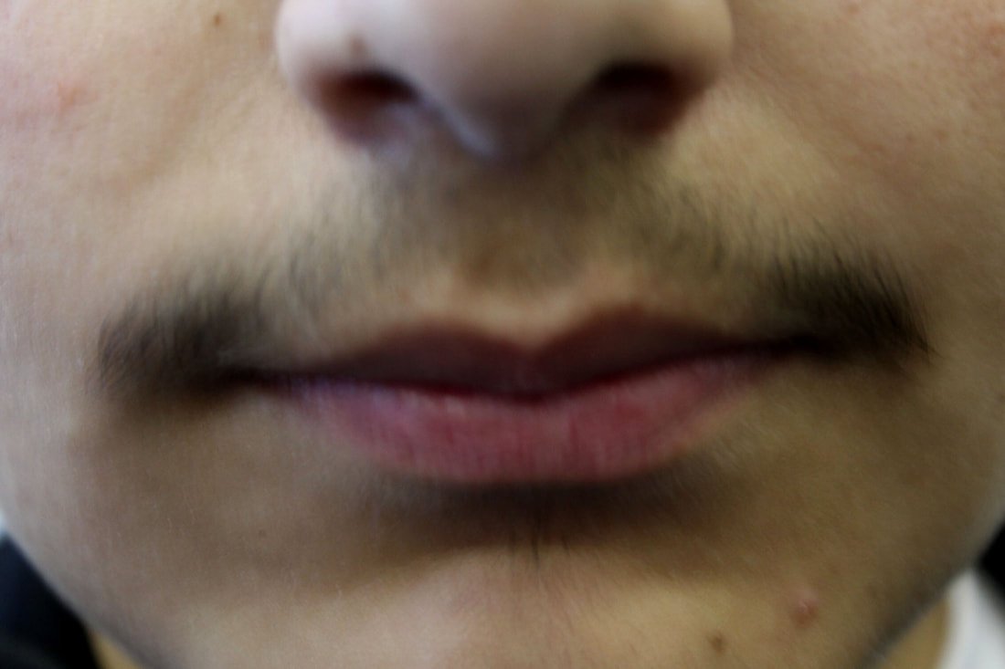
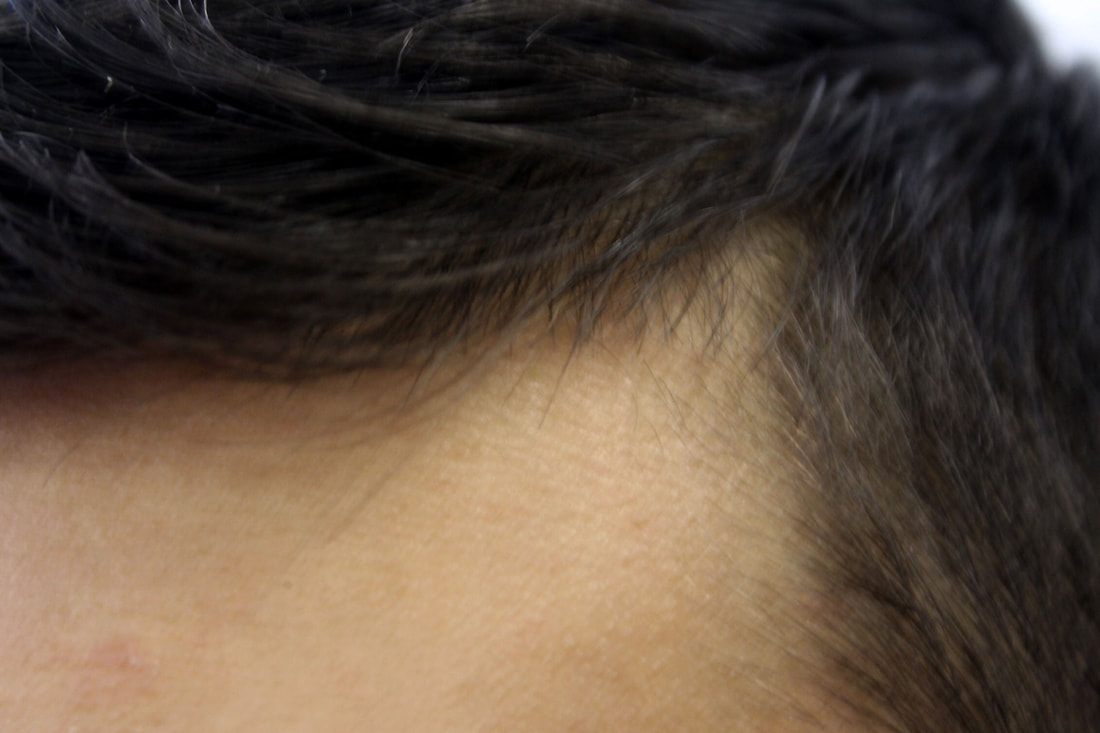
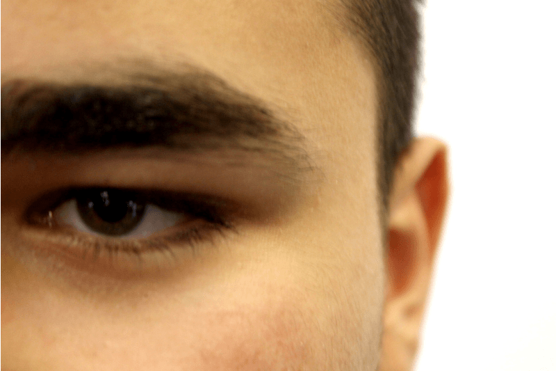
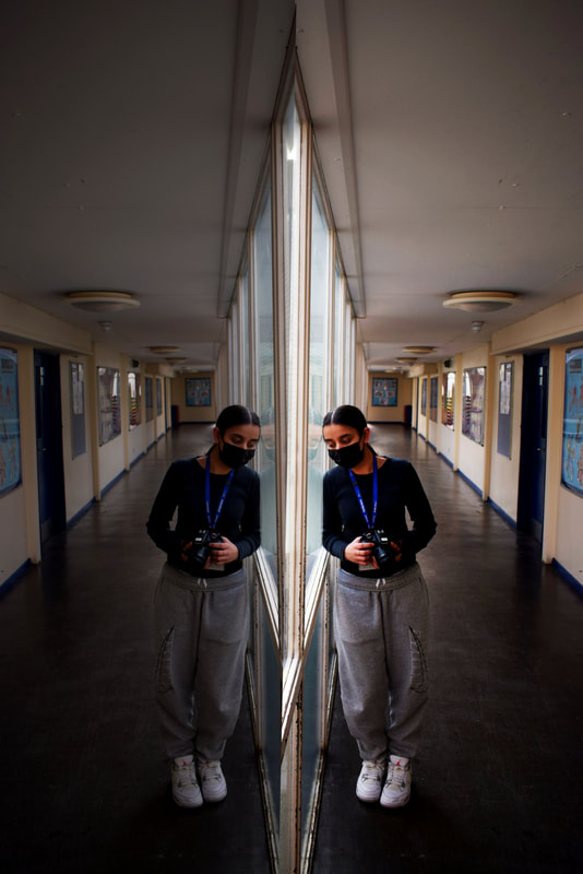
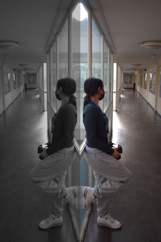
Reflections of a person
Chad Pitman
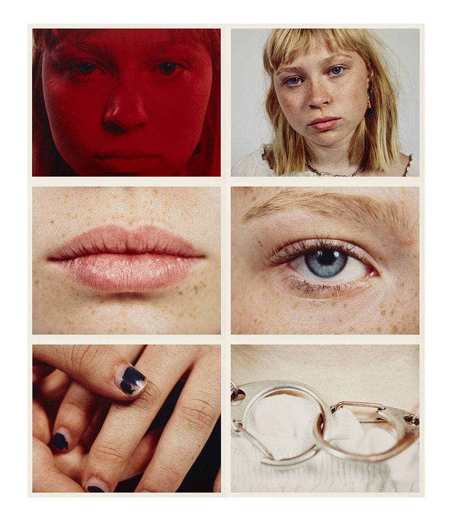
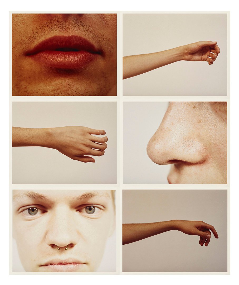
In his series people in progress Chad Pitman takes images that show different parts of a person. In this work he breaks up a person into different parts and focuses on different sections of a persons face and body. By taking the images individually the parts are given new meaning and encourage the viewer to look more closely at the textures shapes and colours that make up a person.
|
|
|
Lauren Marek

|

|

|
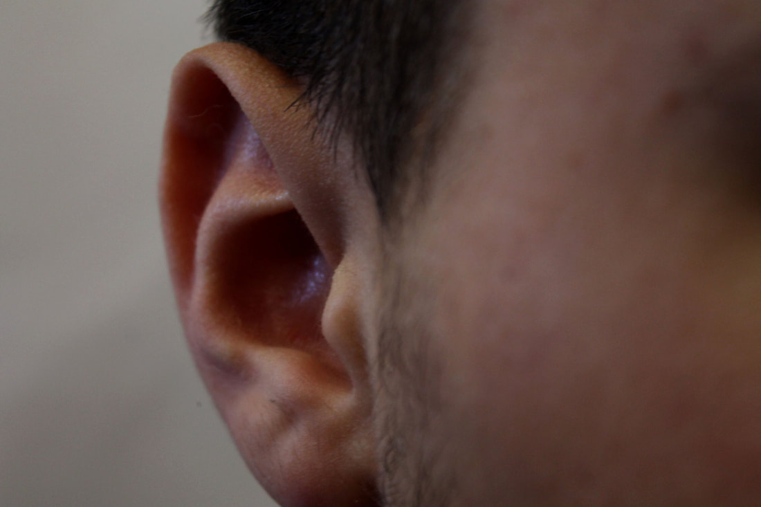
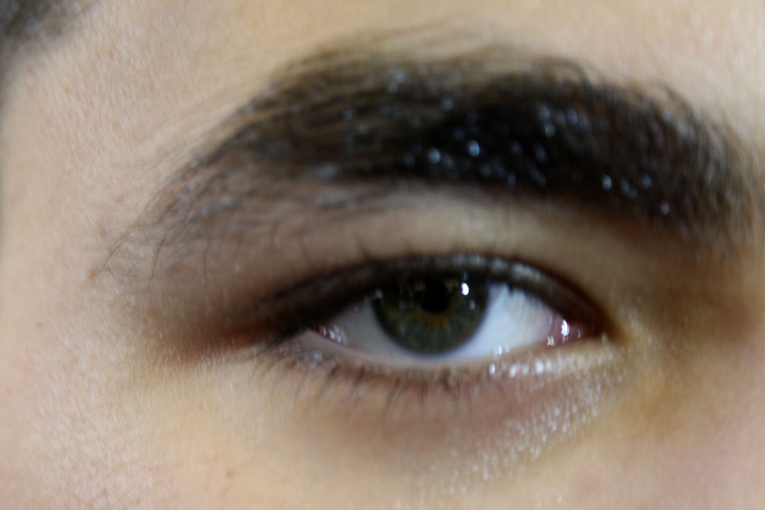
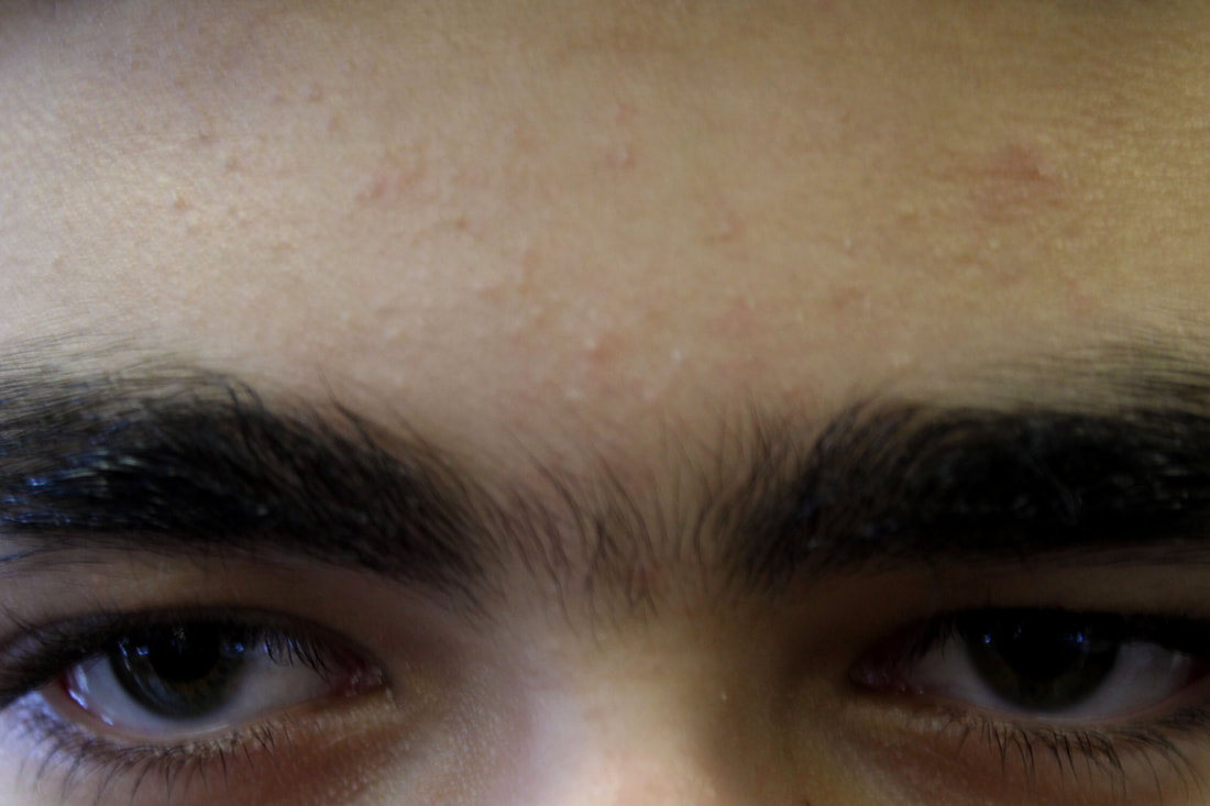
My first attempt
|
|
|
|
|
|
|
WWW: I managed to capture individual parts of the face creating a more angles and also used a light to add texture.
EBI: Unfortunately I captured them out of focus and I could have also had a bit more variety in my choice of positioning. |
|
My Second attempt


Firework in a jar
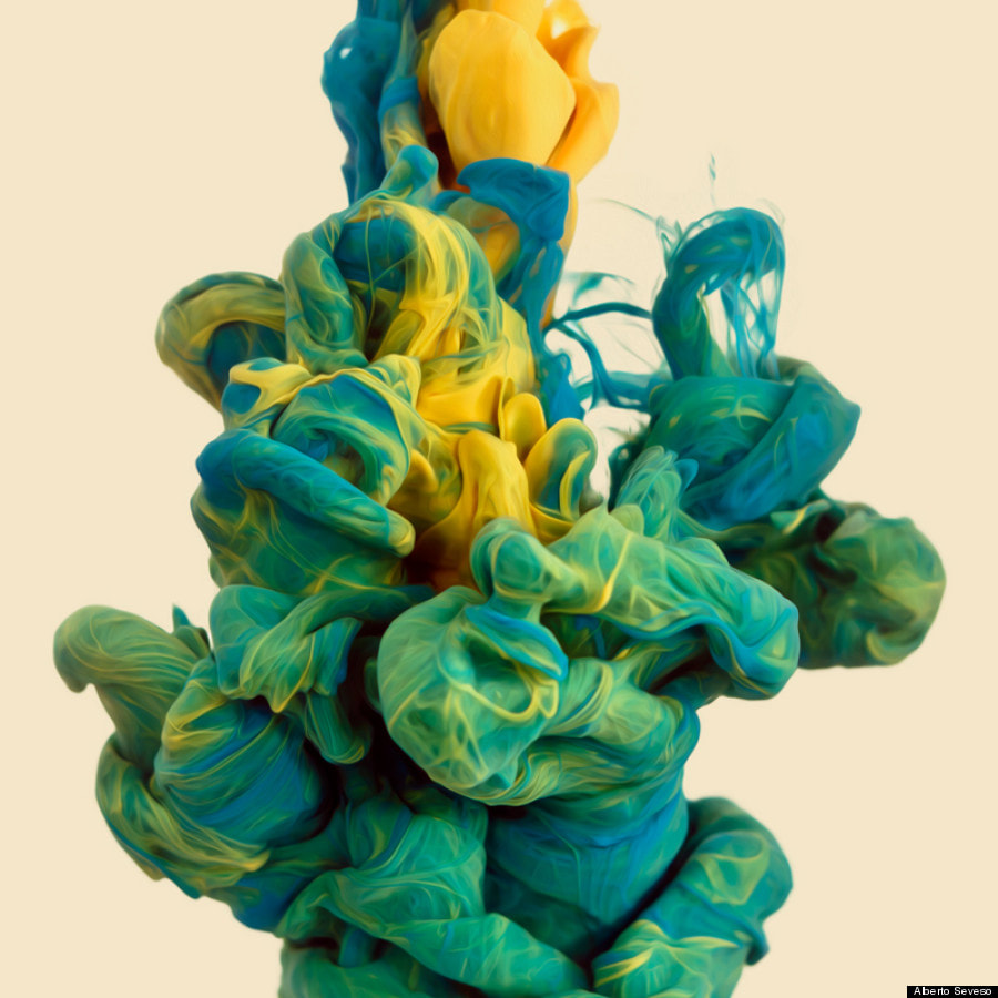
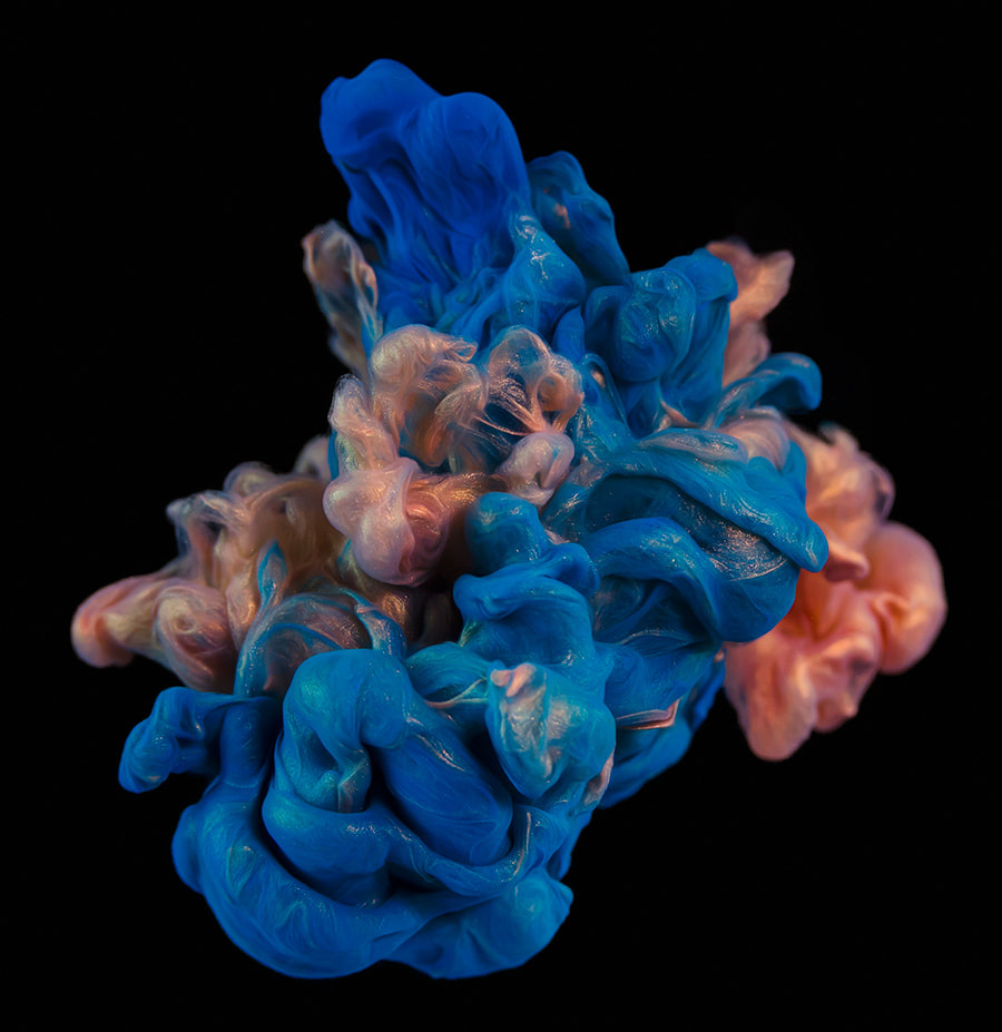
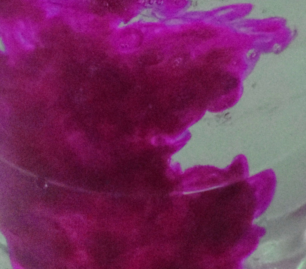
Alberto Seveso
Alberto Seveso is a self-taught Italian graphic artist and illustrator, who was first inspired by artwork on skate decks and music album artwork. His unique pieces have been featured on the covers of magazines and CDs around the world, and he's collaborated with big names such as The Temper Trap, amongst many others.
|
|
What you need
Food colouring , Warm water , Oil (vegetable, olive, peanut – any will work)
Step 1
Fill a glass 3/4 of the way to the top with warm water
Step 2
In a separate glass add a few table spoons of oil and add 4 drops of food colouring – of differing colour
Step 3
Using a fork, give the oil and food colouring mixture a good mix to break up the ‘colour beads’ into smaller ones
Step 4
Carefully pour the oil & food colouring mixture into the glass of warm water and wait for the magic to happen!
How it works
Food colouring dissolves in water, but not in oil. When you stir the food colouring in the oil, you are breaking up the colouring droplets (though drops that come into contact with each other will merge… blue + red = purple). Oil is less dense than water, so the oil will float at the top of the glass. As the coloured drops sink to the bottom of the oil, they mix with the water. The colour diffuses outwards as the heavier coloured drop falls to the bottom.
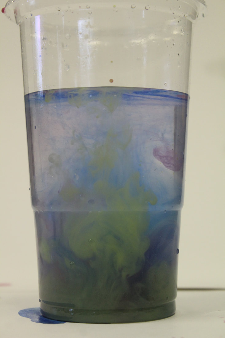
First attempt
|
|
|


|
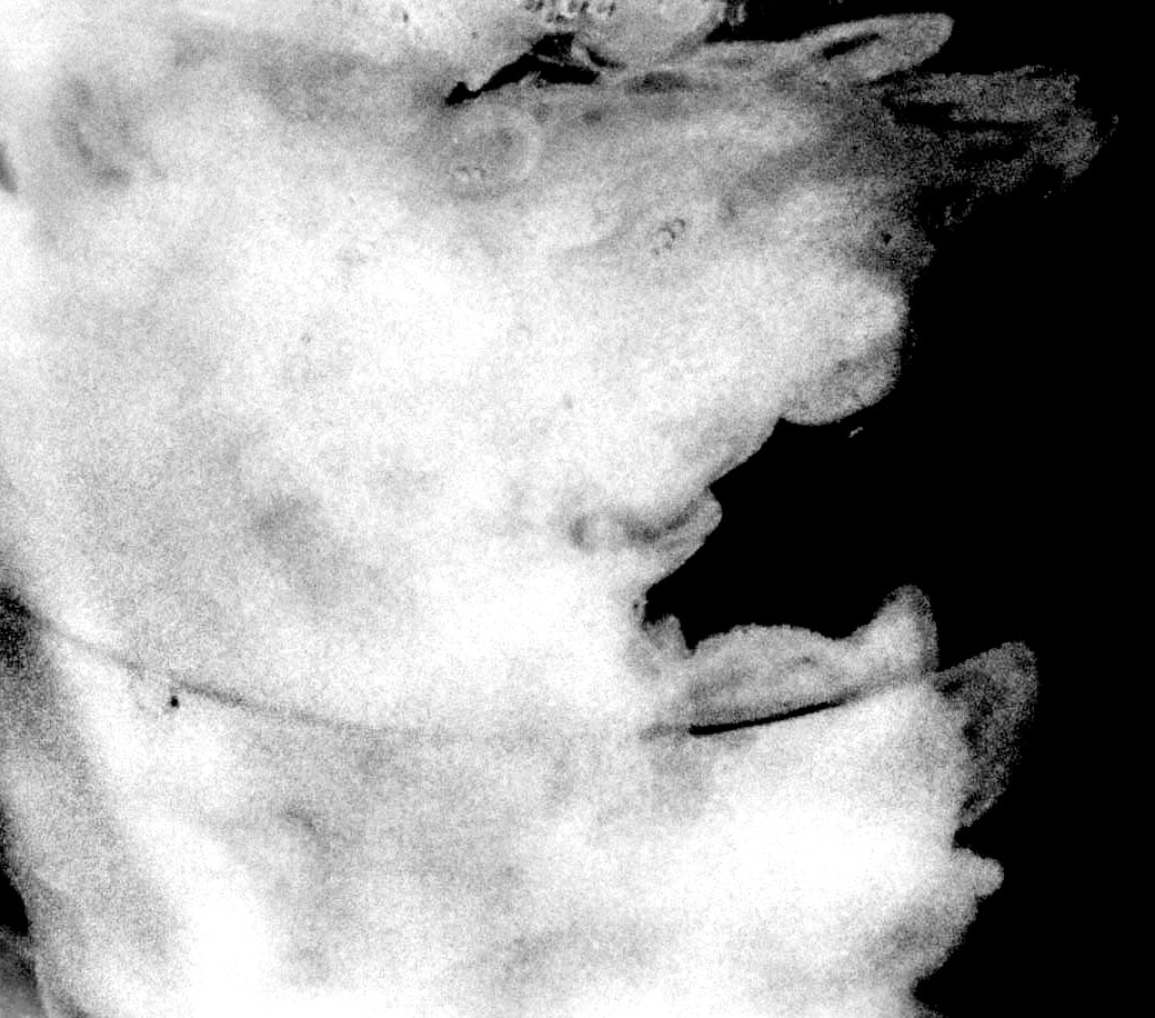
WWW: I managed to capture the ink in good points of it falling. Furthermore, I created a gif of all the photos through photoshop. This created a cool effect of a video like display of the ink submerging in the water. Moreover, through the help of continuous shooting on my camera I managed to capture many moments of when the ink fell into the water.
EBI: Unfortunately when creating the gif i had many photos which in turn when having to inevitably make the image size smaller, also making the image quality low making it look slightly out of focus. |
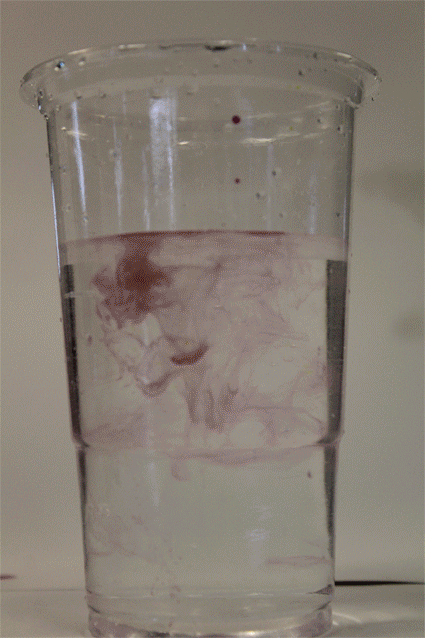
Second attempt
Through my second attempt I used Photoshop to further my images in hue and saturation, vibrance and other darkening and lightening tools. Additionally, I made 1 image black and white and also inverted the colour too create a sense of smoke.


|
|
|
Sequences
Luke Stephenson
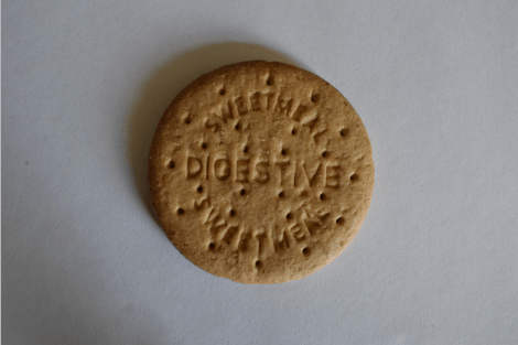
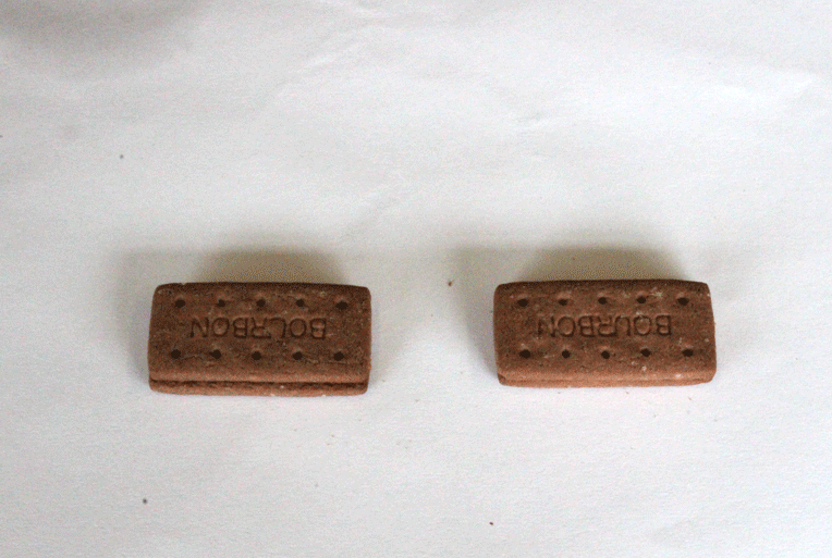
One morning while eating a bowl of cornflakes I noticed that every cornflake within my bowl was unique some what like a snow flake. I decided to photograph every cornflake within a 500g box to show off their individuality and also answer a nagging question in my mind “ how many cornflakes are in a box of cornflakes? So he took pictures of over 7000 cornflakes creating a video.
In this task i was required to take different biscuits and and place the or take away parts of them in certain order to create a gif and also trying to recreate Luke Stephens work.
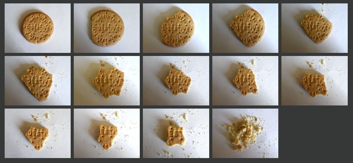
Second attempt


Developing
Ordinary to extraordinary
Ed Ruscha

|
|
|
Born on December 16, 1937, in Omaha, Nebraska, Edward Ruscha grew up in Oklahoma City, where his family moved in 1941. After finishing high school in 1956, he relocated to Los Angeles intending to become a commercial artist. Instead, he attended the Chouinard Art Institute (now California Institute of the Arts), Los Angeles, from 1956 to 1960. Ruscha began his career as a graphic artist but expanded his production to encompass drawing, painting, photography, and artist books that explore the banality of the urban landscape.
Ruscha’s works function as alternatives to mass-media depictions of life in Los Angeles and on the West Coast. His early interest in commercial art and work as a graphic designer and layout artist for an L.A. advertising agency, as well as his distrust and frustration with the traditional hierarchies of painting and sculpture led him to create works that challenged prevalent styles such as Abstract Expressionism. Resisting the labels of Pop or Conceptual artist, Ruscha nevertheless incorporates elements of both movements into his paintings and photographs, and his work influenced the development of later Conceptual art in the United States, serving as a forerunner to that of practitioners as varied as Bruce Nauman, Robert Smithson, and Lawrence Weiner. The deadpan, documentary-style photography of his accordion-fold artist book Every Building on the Sunset Strip (1966) is a quintessential example of the post-Conceptual photography of that era.
Ruscha’s works function as alternatives to mass-media depictions of life in Los Angeles and on the West Coast. His early interest in commercial art and work as a graphic designer and layout artist for an L.A. advertising agency, as well as his distrust and frustration with the traditional hierarchies of painting and sculpture led him to create works that challenged prevalent styles such as Abstract Expressionism. Resisting the labels of Pop or Conceptual artist, Ruscha nevertheless incorporates elements of both movements into his paintings and photographs, and his work influenced the development of later Conceptual art in the United States, serving as a forerunner to that of practitioners as varied as Bruce Nauman, Robert Smithson, and Lawrence Weiner. The deadpan, documentary-style photography of his accordion-fold artist book Every Building on the Sunset Strip (1966) is a quintessential example of the post-Conceptual photography of that era.
|
|
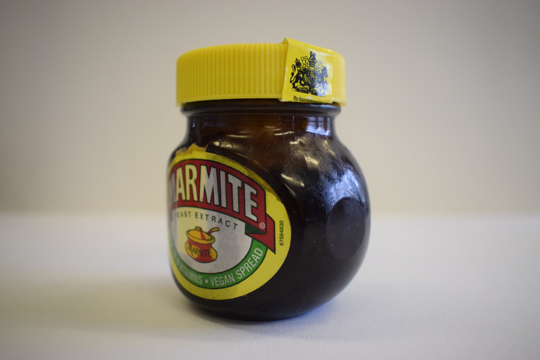
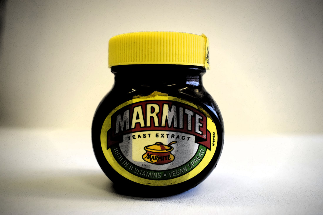
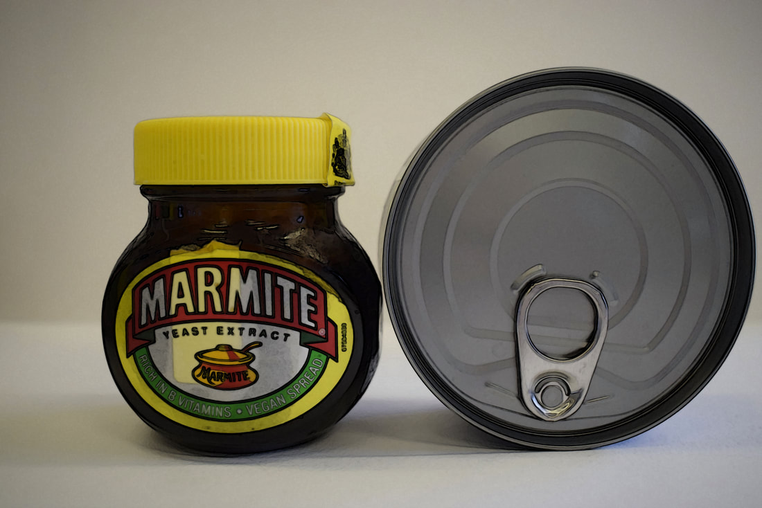
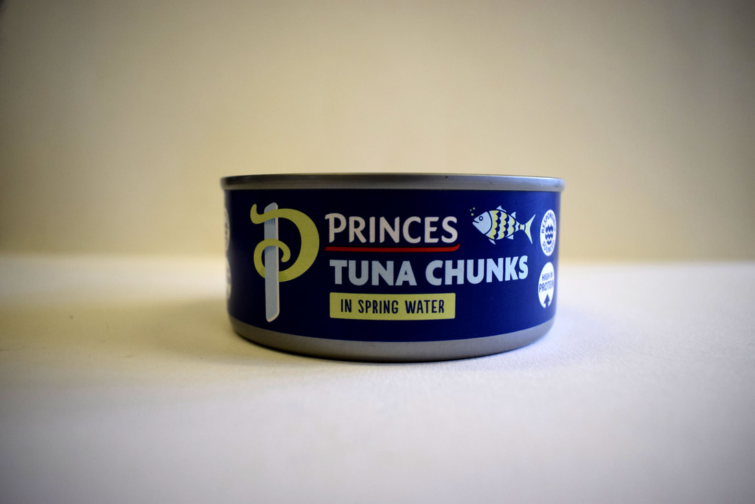
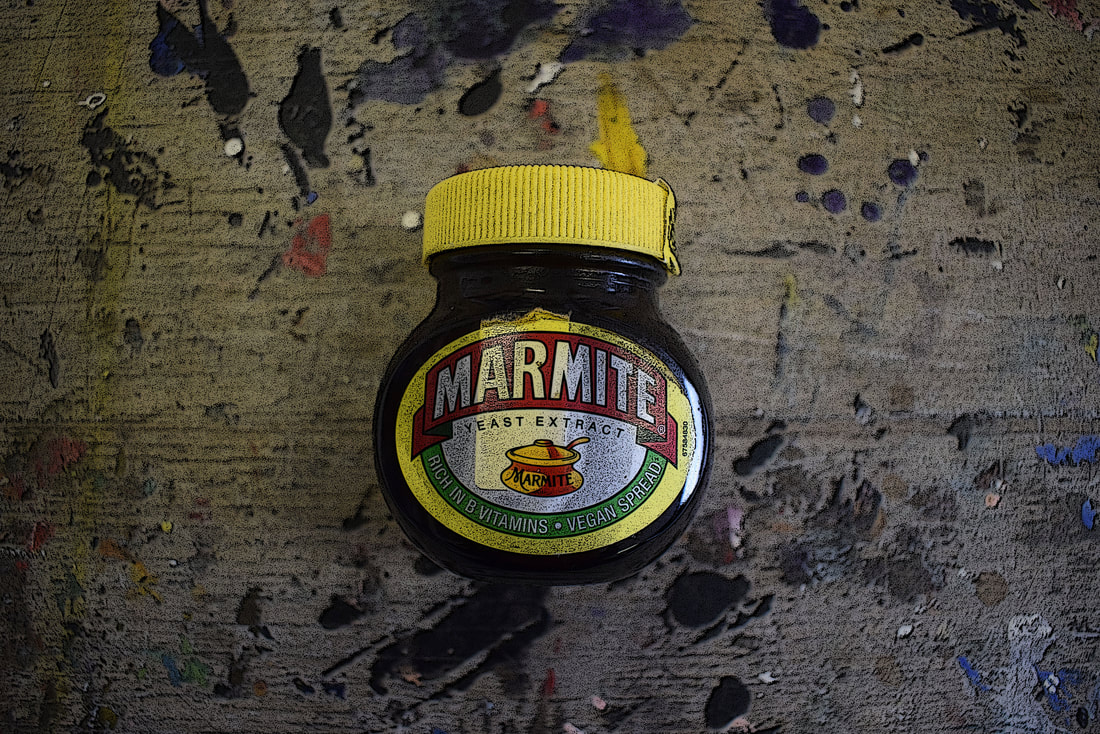
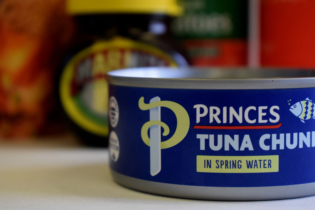
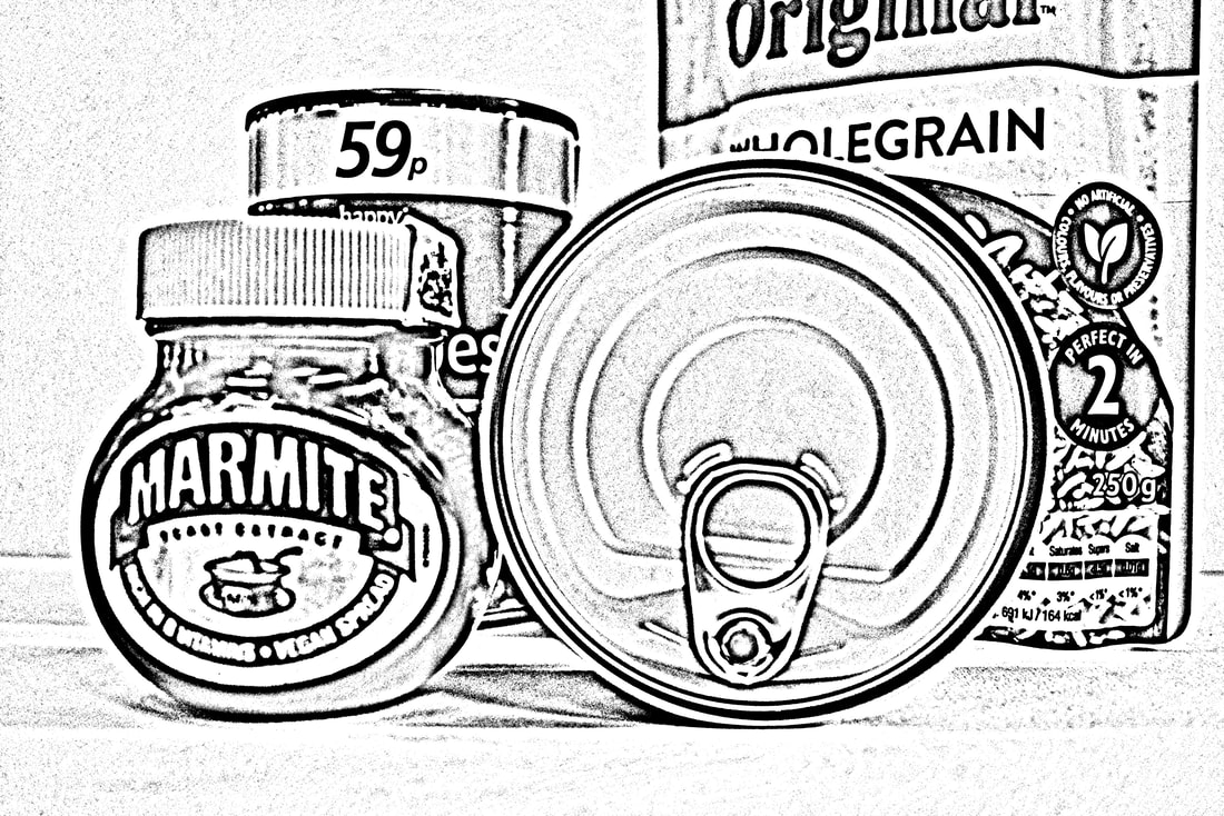
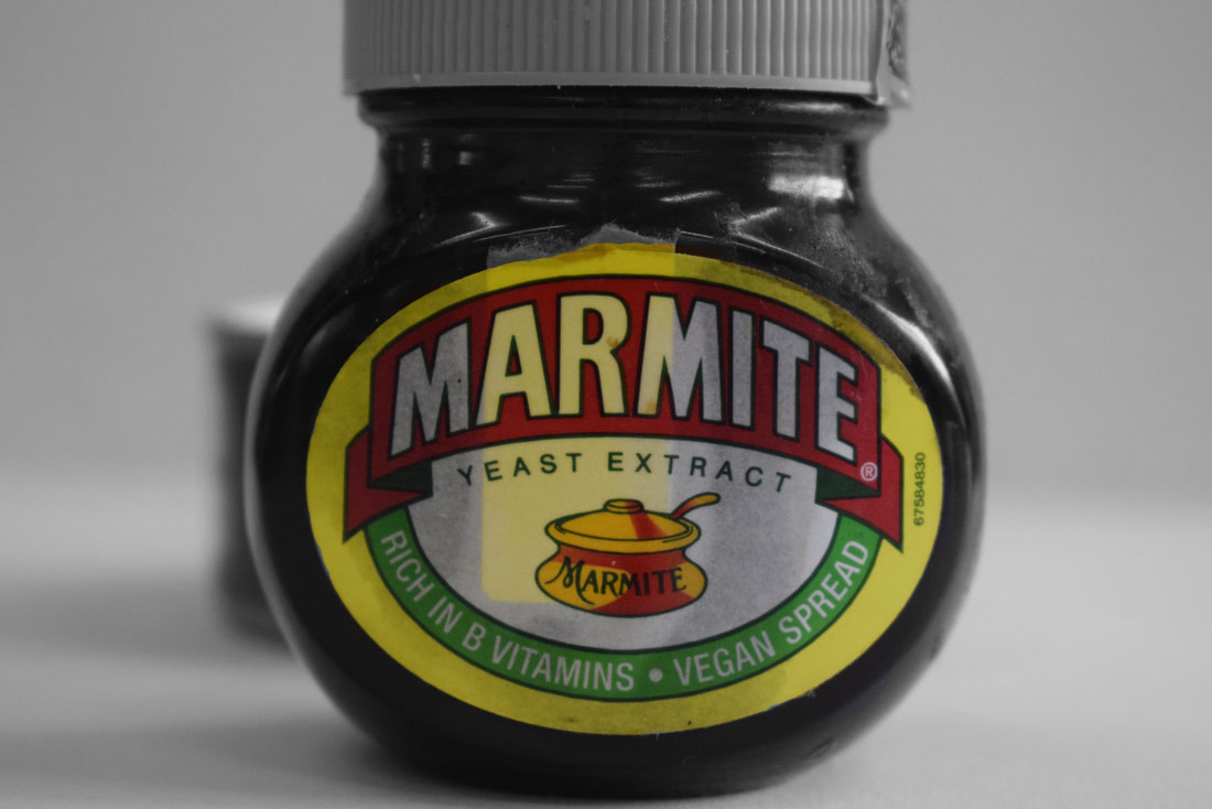
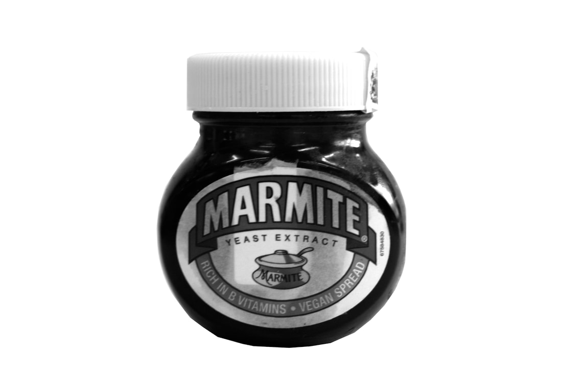
MARMITE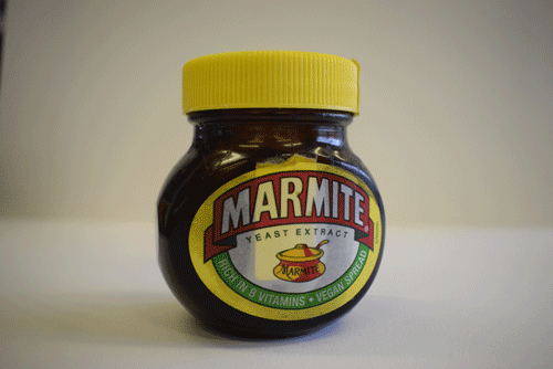
|


|
|
|
|
|
|
|
|
|
|
|

|
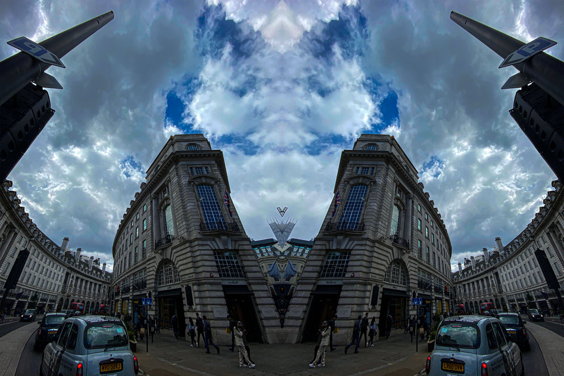
Reflections


|
|
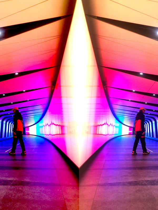
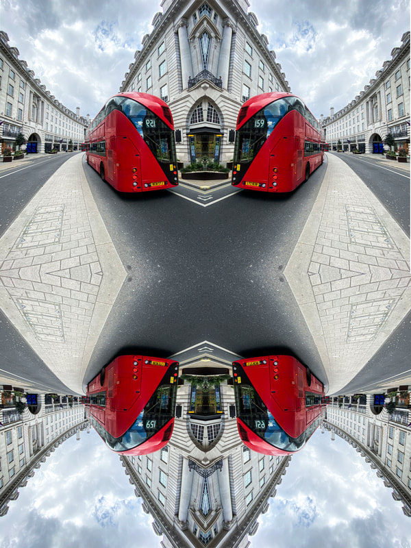
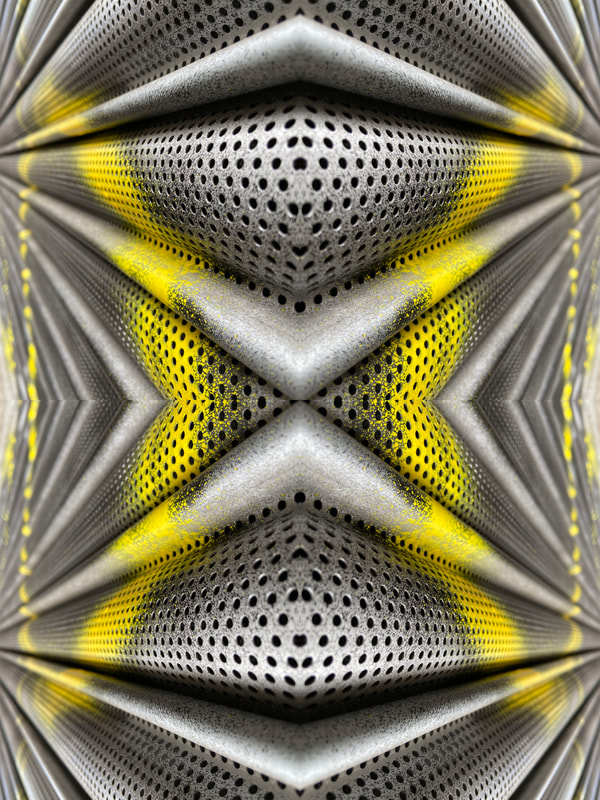
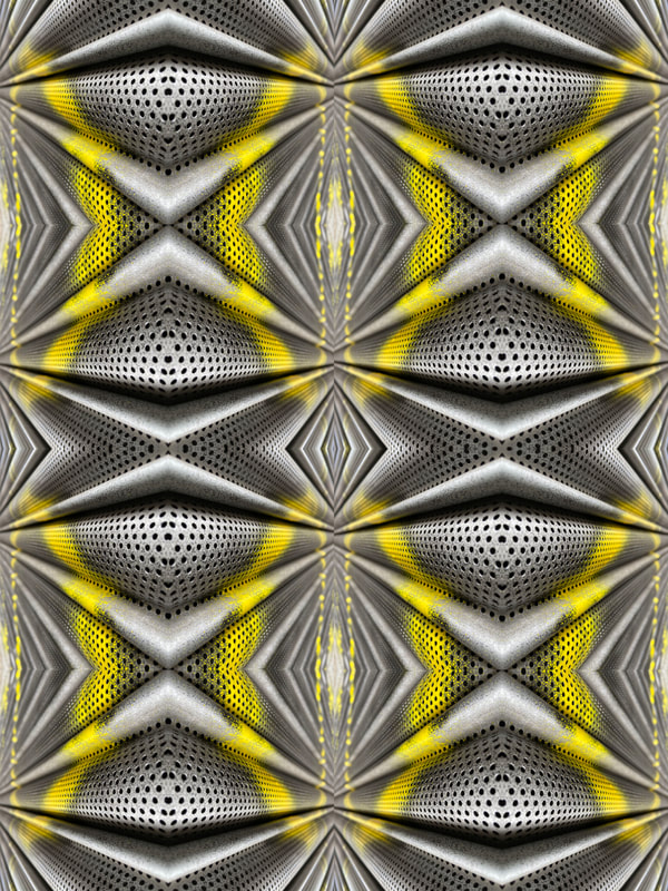
Second Response
In this second response I manually reflected the person on photoshop and once done that i kept on reflecting it by putting the previous image in the corner of a sheet in photoshop and the flipped it horizontally over and then copied them downward to create this cool pattern effect.